Sun catcher: Empire House
Two subtle yet sophisticated pavilions designed by Austin Maynard Architects, delicately stitched to a modest Canberra cottage, honour the interwar character of the home, while connecting it with the outdoors.
Compact in scale and light of touch are descriptions that do not readily spring to mind when discussing current residential building in the prestigious suburb of Forrest, Canberra. Where not heritage protected, older style “Canberra cottages” are often knocked down and replaced with much larger residences that, arguably, more accurately reflect the client’s lifestyle aspirations and bigger budgets.
But sometimes, clients’ and architects’ paths intersect to produce subtle yet exciting interventions to modest original bungalows. And occasionally, such work receives recognition and acclaim. This is the case with Empire House, a project comprising finely detailed alterations and additions to a Canberra cottage. The project’s quiet success was recognized with the 2019 Canberra Medallion, the highest award from the Australian Institute of Architects’ Australian Capital Territory chapter.
The owners of Empire House, Paul and Lindy, commissioned Melbourne-based firm Austin Maynard Architects to transform their interwar bungalow. They had previously commissioned work from Australian Institute of Architects Gold Medallist Enrico Taglietti in the 1990s, so were well aware of the potential benefits of working with an architect. They asked Austin Maynard to develop sun-catching spaces that would provide a long-term home for them and their teenage daughter.
They wanted to preserve the external character and best parts of the old house while adapting it with carefully crafted additions. Importantly, they wanted to retain the relative modesty of the original, with any additions maintaining a compact footprint on the gently sloping site.
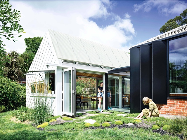
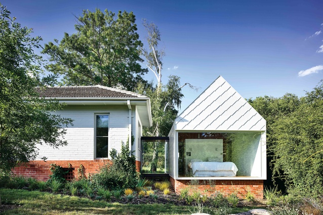
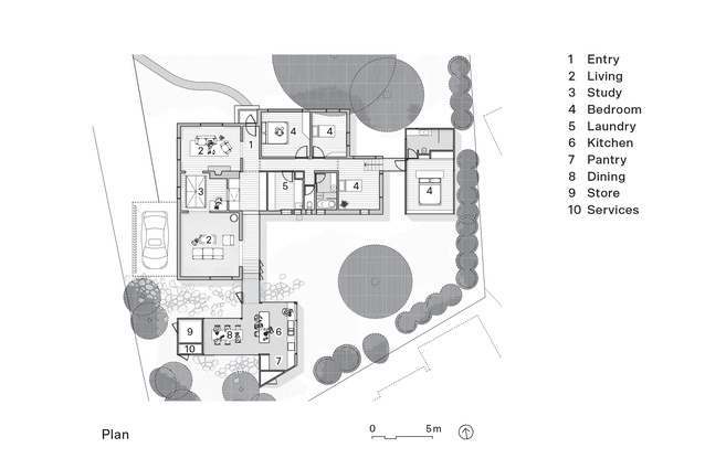
The original bungalow was largely intact and generally in reasonable condition, although the kitchen, laundry and bathroom were deteriorated and awkwardly positioned for twenty-first-century family life. Austin Maynard proposed interior changes and designed two pavilion wings – one for the main bedroom and bathroom, the other for kitchen and dining zones – each attached to the original home by a transparent glass walkway.
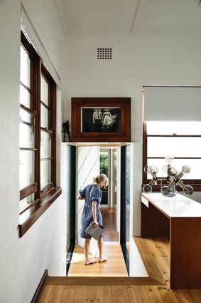
They opened up the bungalow’s interior and created improved sightlines, while retaining much of the original interior detailing and sense of cosiness. The architects skilfully articulated the transition from old building to new. A visitor familiar with the Canberra cottage “style” will feel comfortably at home on entering and then be pleasantly surprised on moving into the contemporary additions.
The linked pavilions are clearly part of the house, yet each displays an individual character. This linking strategy avoids facadism, where only the front wall of a building is retained with a completely dissimilar interior behind. It also avoids potential discord occurring where two markedly different building types are jammed up against each other. Inside, the transition is particularly subtle, allowing inhabitants to move smoothly through the modified original rooms and into the new pavilions.
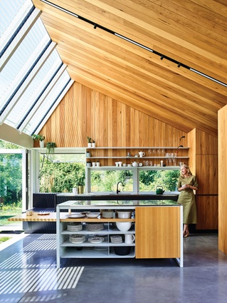
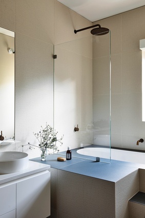
A restrained palette of materials is employed throughout the house, with an emphasis on white walls and finely crafted timber wall cladding and cabinetry. Variations in flooring – timber, carpet, tile or concrete – demarcate active and quiet zones. In the kitchen, blackbutt timber is used on walls and one long side of the raked ceiling. The shorter side of the ceiling is glass, allowing light to flood into the kitchen. Cool neutrals and minimal fixtures define the laundry and the bathrooms, with one including a Japanese-style bath.

Individual rooms have discrete characters and are finished with delightful details. A full-length glass wall provides garden views from the simply furnished, serene main bedroom. The kitchen includes a table extension in the preparation island, while a sunny nook seat is perfectly positioned for conversation with the cook. Unusually, there is no garage. A lightly framed pergola attached to the original house provides weather cover for a car, and doubles as a shaded external space for relaxation.
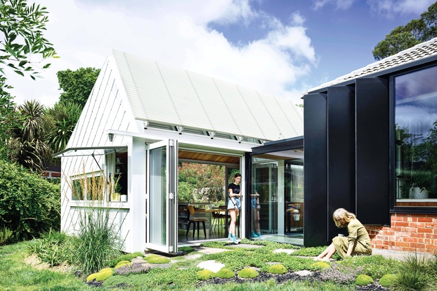
Both architects and clients were particularly concerned with energy efficiency and sustainability in the project, starting with reusing the embodied energy of the original building. Double glazing provides protection from Canberra’s considerable temperature variations throughout its four distinct seasons. Narrow, articulated black-framed windows on one side of the kitchen pavilion link are adjustable for airflow. Windows are positioned to maximize solar gain in winter while avoiding overheating in summer. Rainwater captured from the roof is used for gardens and toilets, while solar panels with micro inverters have been installed on the old roof. Large articulated glass doors allow one side of the kitchen pavilion to be fully opened, diffusing the transition from the interior to the garden.
Externally, the contemporary pavilions’ characters are dissimilar to the original house, though all are white in colour. They are linked materially by recycled Canberra red bricks used at the foundation level of the bedroom wing, providing a plinth for the new structure. But it is the cladding of the new wings that gives the project an extraordinary presence. The pavilions are wrapped with individually hand-finished and hand-fixed shingles. The shingles are set out with great care, with overflow holes and other essential cutouts precisely positioned as almost jewel-like gestures in the surface. Doors are exactly fitted into the overlapping shingle patterns.
The widely travelled owners have accumulated a carefully curated collection of objects and mid-century furniture, which sits happily in its new setting. Empire House is an altogether delightful collaboration between owners, architects and builders, which promises many years of enjoyment to its occupants.
This article first appeared on architectureau.com.

