Enchanted forest: Rose Bay House
This poetic house by Tonkin Zulaikha Greer Architects has many layers, of light and dark, exposure and protection, materials and detail – offering a journey that’s much like walking through a forest.
Tonkin Zulaikha Greer Architects is a firm that “doesn’t design many houses these days,” as director Tim Greer admits. So the chance to see one (outside of a dinner invitation) was for me a rare treat.
The clients for Rose Bay House, Australians living overseas, had researched possible architects to rework a Federation bungalow they’d bought in Sydney’s east. They were enchanted by Tonkin Zulaikha Greer Architects’ (TZG) approach to its civic work, and bravely asked the question, “Would TZG take on an alterations and additions project?” The client and Tim bantered back and forth as online penpals for some time, during which a candid like-mindedness was discovered, and Tim agreed to work on the project.
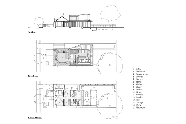
The existing freestanding double-fronted cottage was in a quiet wide street, with a spectacular tree in the corner of the large rear garden. The owners wanted an upper storey of two bedrooms and, downstairs, changes that created relaxed informal spaces for family life, room for visitors and a small pool for the client’s young children.
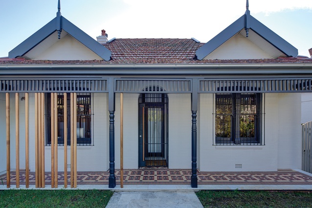
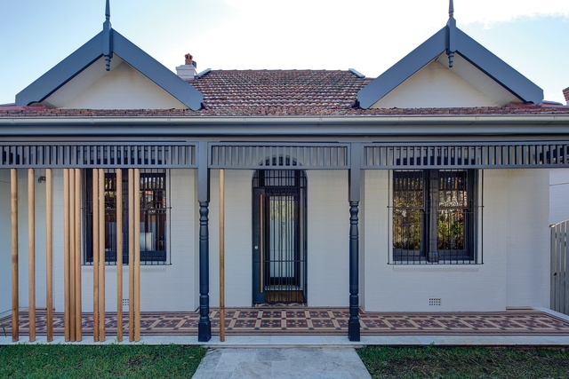
Planning regulations meant very little could be changed at the front of the house, and even the adjustment of front garden walls to create a circuitous entry was challenged by the local council. The new front entry is now an artful composition of solid wall (concealing the front door of the house) behind a light steel fence/gate, a modern reworking of a palisade fence. The discreet side position of the garage was unchanged, but the new garage door is made of translucent white perspex and timber poles. The backlit perspex glows at night, making a warm, welcoming, lantern-like light for visitors arriving to the house.
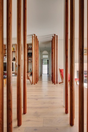
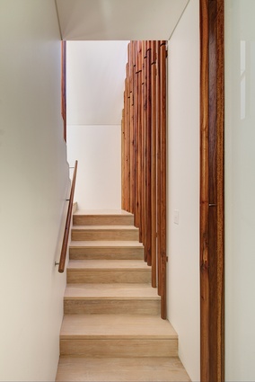
Inside, the most striking feature of the house is a series of narrow poles, “tree trunks” of solid Australian timber, which run intermittently down each side of the central hall. These poles, maybe seventy millimetres in diameter, rotate at times. In other locations they become handles to concealed doors. They are a veritable forest, beautiful things, whimsical and captivating, and their movement makes them light. You feel the sea breeze somehow by running your hands along them. The owners’ boys and their friends play with them, and bounce off them as they tumble along the hall.
Once past the two traditional front rooms, the space becomes much less formal. A sunny spot for winter, with a fireplace, opens to a courtyard to the left. To the right, shelves house books, artefacts and a discreet TV. A further “tree-lined” hallway leads past a bathroom, concealed stair and storage rooms to the main family living areas at the rear of the house.
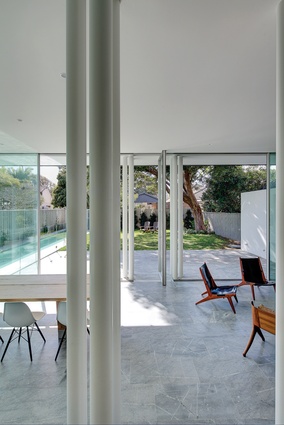
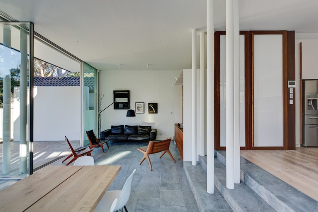
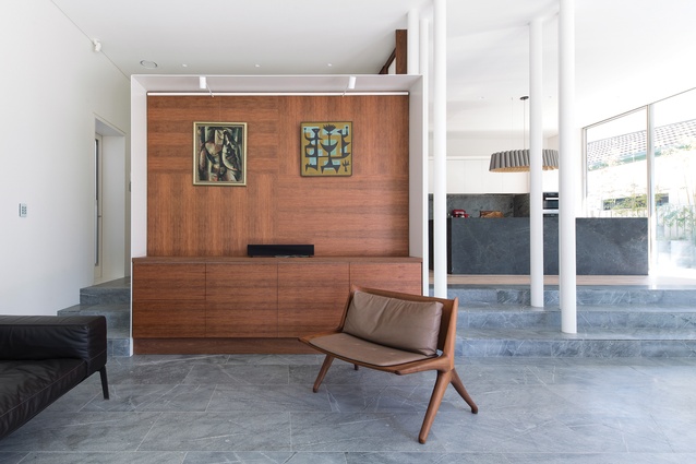
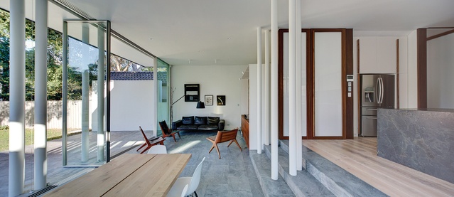
These rear spaces have an exaggerated informality. The end of the row of timber poles in the hall is marked by a cluster of white metal poles. The already-wide house volume is expanded further by large glazed openings to the northern corner, where a lap pool runs along the north-west side boundary. The kitchen has a massive crazy-veined stone slab island bench, and the wide timber floorboards change to large dark honed stone pieces in the few steps down to dining and living spaces.
The white poles in the kitchen are repeated at the garden side of the main room, where they serve variously as structural poles, service poles or downpipes. A large timber dining table has bench seating at one side and Eames chairs gathered around it at the other side. All the glazed wall panels between the living areas and the garden slide back, and automated blinds come down to temper the fierce summer sun.
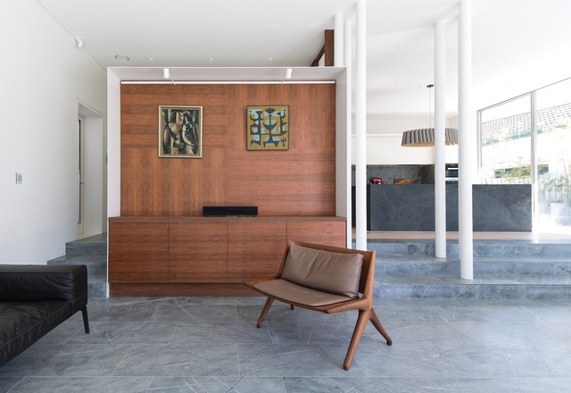
The owners collect beautiful art and have a variety of fine mid-century furniture, much of it in carved timber, so the careful design of the cabinetry supports (rather than competes with) the furniture and objects. The three major cabinetry units – in the TV room in the old part of the house, the wall of cupboards/bench in the new kitchen, and that in the rear living room – have a fine “wrapped” curve of powdercoated white metal around them, a sort of delicate box unit that links these dispersed components.

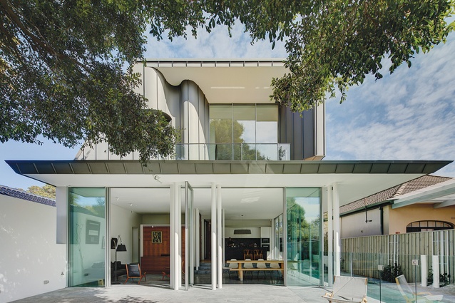
It is only when you are in the rear garden, under the canopy of the large tree, that you look up and realize there is a zinc-clad upper level to the house. Visitors would never know which combination of timber poles and glass/painted panels in the hall might open to reveal the stair. The poles are repeated as balustrades for the stair and, once at the top, a hidden upper suntrap balcony is a surprise, with a small bedroom to the left (and adjacent playroom within the original roof zone).
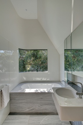
The airy main bedroom has large windows overlooking the rear lawn. Beyond, you find a beautiful dressing area, and a long bathroom with a bath under a curved glass window, an eyrie perched up in the canopy of the massive tree.
This project offers so much more than its house plan. Like handmade paper, it has many layers. There are functional layers, layers of light and dark, layers of materials and detail. But over that there are further, quite poetic layers. There are feelings of exposure to, and protection from, weather. There is a sense of walking through a forest to small and then larger clearings. Ultimately this house is inspired and enriched by (and pays homage to) a beloved backyard tree.

