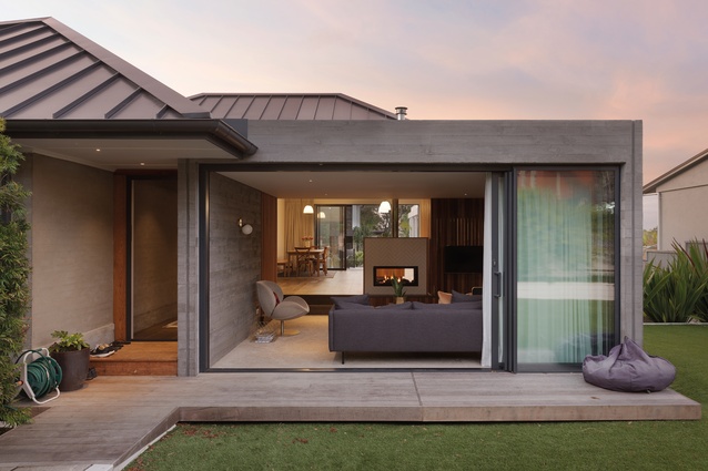
Encore: Saratoga House
We visit a Herne Bay home with a honeyed glow and a sweet-sounding past, transformed by Verso Architecture + Interiors.
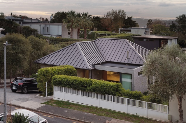
Down a quiet cul-de-sac in Auckland’s Herne Bay is a site of musical infamy. During the so-called golden age of popular music, it was home to Eldred Stebbing and his celebrated business, Stebbing Recording Studios. Yet its new frontage, partially hidden behind manicured hedges and a modernised version of a white picket fence, presents a mystery. What ever happened to this bygone hotbed?
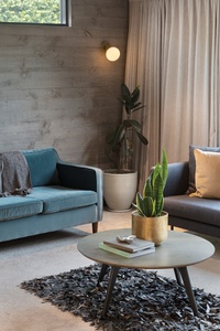
Accents of fibreglass concrete that cut into oak floors, cedar screens that play with light, a bright young cavoodle: it’s clear from when one first steps inside that the answer is cast in the form of a warm family home. Less clear, however, is the fact that its present design has been 18 years in the making.
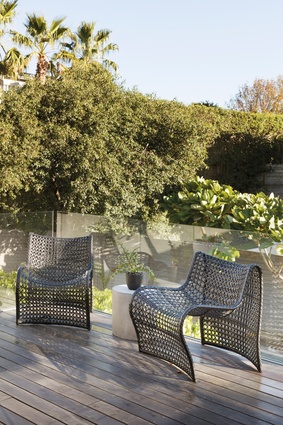
From the time the home-owners, Tony and Antonia, purchased the two-storeyed property, a neglected 1950s’ brick-and-tile, in 2002, the alteration process has been one of gradual metamorphosis, intensified over the last five years, working from the outside in. The first stage — a pool and a deceptively high deck connecting to the main living area — was but a small part of the wider change they hoped to see.
“We wanted to open the whole space up… and create something that was comfortable, and that was never something that felt too fancy to the point where you couldn’t live in it as a family,” explains Antonia. “We were conscious of not doing anything that was overly ‘now’.”
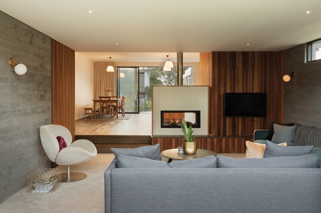
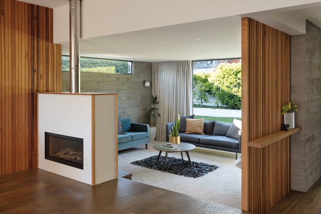
To do this, they sought the help of Verso Architecture + Interiors, who reconfigured the layout by removing a cluster of walls on the upper floor and adding a ’60s-inspired sunken lounge. “We tried to stay true to the old house,” says designer Kylie Willett, who led the project.
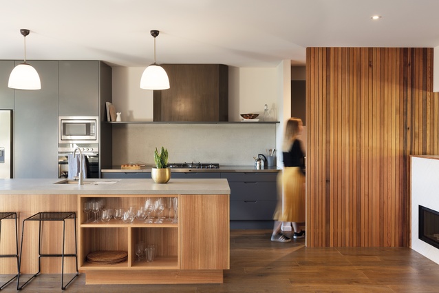
The kitchen, once “squished in the corner”, according to Kylie, has considerable intimacy and comfort, and is balanced between near-industrial materials (stainless steel, fibreglass concrete) and natural ones (eucalyptus veneers, Baltic Sea paint). Surfaces are textured when touched and belie their light weight.
This balance extends to the overall renovation. In-situ concrete and bagged-brick exterior walls reflect the same understated rawness. Screen detailing on the deck, along with a new, private front garden, ensures a continuity of tones and creates tactile interest. A simple analogy might be that, here, the architecture speaks to the interior, and the interior speaks back.

Such harmony is unsurprising for the firm that derived its name from versō foliō, Latin for turning over a page. The design team behind Verso say they are two sides of the same page: practicality on one; creativity on the other.
It was a formula that also fitted the home-owners. They share a similar dynamic — so much so that Antonia worked with Kylie on more practical choices while Tony, an amateur artist when he’s not running a business, advocated for a sense of charisma. The result is a home that resists both facets, just as it resists ostentation and the idea of belonging to a single point in time.
It’s hard not to see all of this as a symbolic shedding of what remains of the home’s past; those remnants have moved, like any point in history, out of everyday cognition and into the realm of memory. “The cover shot of his album was taken in the room that used to be here,” Antonia tells of guitarist Peter Posa’s The White Rabbit and other tunes for playboys, controlling her mirth. “[It’s] a really inappropriate image of a woman in a bunny outfit – which is so much of the time – with him and his guitar.”
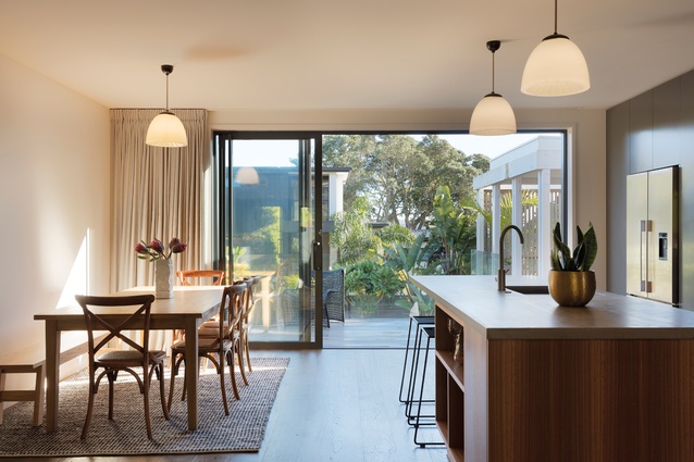
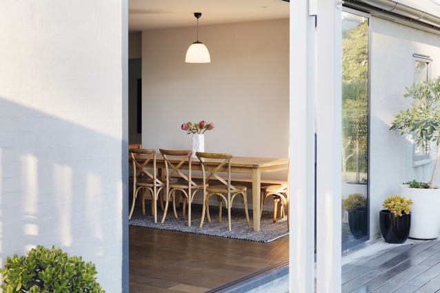
It’s harder still to imagine this happening in their present dining room. Bathed in a honey-like glow, as if it were partly made of comb, the home speaks explicitly of a world set entirely apart.
***

Material Palette
Deisgner Kylie Willett discuss some of the material choices for the Saratoga House.
Tell us about your use of concrete in the kitchen.
The concrete bench and splashback were chosen to keep the interior finishes consistent with the exterior architecture. The application of concrete has been considered and used in contrasting ways. The living room walls were poured in situ so they present in a planked wood texture; the kitchen bench and splashback are smooth, which creates a cohesive relationship throughout the space. We didn’t want to bring in too many elements so we used concrete in its raw form.
And the bathroom tiles are also concrete?
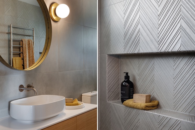
Kylie: Yes. I was in at Tile Space sourcing for another job and, as soon as I saw them, I knew that they were perfect for this project. The textured tile was the ideal way to tie back to the in-situ concrete walls that we had created in stage one of the renovation and it was a bonus that the tile happened to have a 3D herringbone pattern, similar to the white tile layout on the fireplace.
You’ve also used a lot of cedar throughout.
The cedar brings a natural warmth into the space. It was an already-existing detail in the outdoor area, which we decided to incorporate into the home.
This article first appeared in Houses magazine.


