Essential elegance: Jac House
This reductive addition to a four-room cottage by Panov Scott endeavours to “find the essential” and in doing so, embraces human comfort and cumulative experience.
On the morning of my visit to Jac House, I carry a well-thumbed book in my bag. It’s a manifesto by Peter Zumthor, a well-known Swiss architect. In it, he describes what it is to experience architecture.
According to Zumthor, buildings are not objects, but containers, that house and frame our actions and activities. They cannot be summarised in a single gesture, but like a beautiful piece of music are an accumulation of sounds, signs, references and poetics.
Jac House by Panov Scott embodies this same spirit. It’s a reductive addition that endeavours to “find the essential” and, in doing so, is a balancing act: between height and breadth, weight and counterweight, extravagance and restraint.

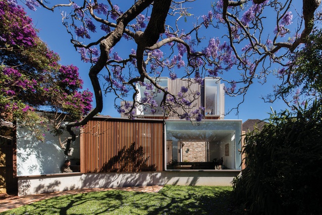
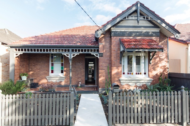
Located in Sydney’s inner-west, the project forms a companion to an existing four-room cottage. From the street, the building reads as a modest, single-storey home. The addition, meanwhile, is barely discernible and neatly peeks its head out from behind the existing ridge.
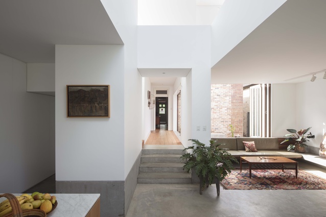
On entering the house you move through the original corridor, which maintains a generous proportion. The pragmatics and poetics of homecoming are given credence, with a small cupboard becoming a space to shun shoes and a hopper window above acting as a playful display shrine – at the time of my visit, it houses a nativity scene in a joyful seasonal nod.
Within this old shell, Panov Scott has made several deft incisions to accommodate new uses. In the main bedroom, a segment of wall pivots open, artfully concealing a walk-in robe with such precision it’s barely noticeable.
The break between old and new is immediate and decisive. Two contrasting rooms – a “hot and dry” courtyard and a “wet” bathroom – define this transition. The courtyard is lined in recycled brick, which was salvaged from the old house, and a concrete plinth wraps one corner. Doors slide back into a concealed pocket and, when open, allow the house to breathe.
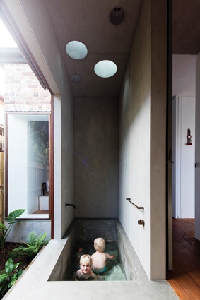
Tucked behind another wall is a bathroom awash in light. The space is deeply sensory and lends bathing the kind of dignity found in Japanese bathhouses. An in-situ concrete bathtub scoops down in graceful, ergonomic lines. Along one edge, the walls pull back, with timber sliding screens revealing a lush garden.
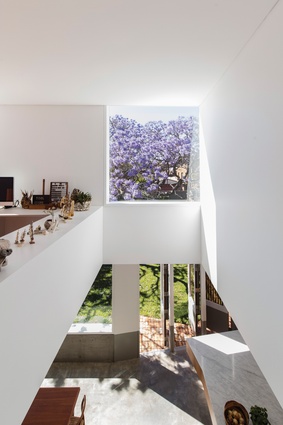
Back in the main corridor, I am tempted sideways by a tight staircase. A winder at the end of the stair turns invitingly, leading upwards. At the top, a narrow bridge crosses to a study, which overlooks an exultant void. The study is a beautiful room, bordered by a continuous ledge upon which the clients curate an ever-changing collection of objects.

The space is light and airy, with ventilation openings swinging out to capture breezes. This upper mezzanine is punctured by several windows, which frame views and admit light. One window bathes the space in northern sun and reveals an abstract composition of tessellated roofs; another holds a clipped view of a sprawling jacaranda tree.
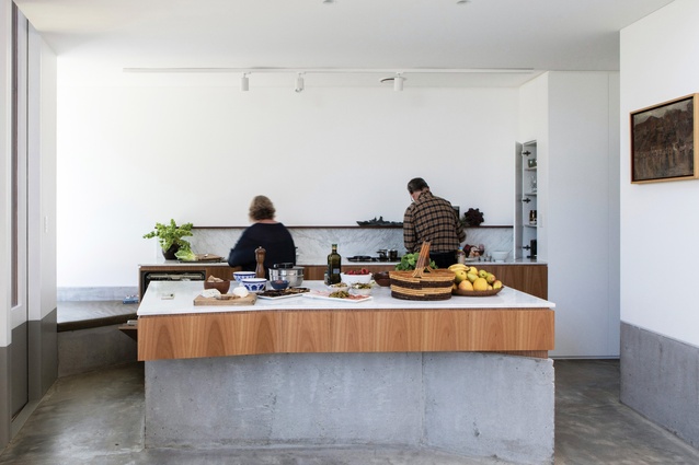
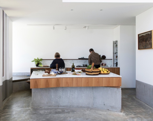
Back downstairs is the heart of this project, which Panov Scott describes as “the great room.” This space unites the living, kitchen and dining areas as a series of intimate, interconnected spaces. The “great room” is hugged by a long, low concrete datum that offers places to perch, lie or rest treasured objects. It has a wonderfully sunken proportion, perfectly suited to sitting and lounging.
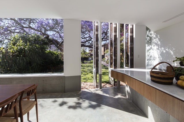
The practice’s skill further reveals itself along the main garden threshold. This facade is composed of fine spotted-gum battens and crisply framed windows. The neatness of the architecture is offset by thick, gnarly jacaranda branches, which twist across the garden. Yet the true joy of this threshold arises as an interior experience.
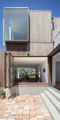
A typical strategy of pull-back doors is swapped for a series of nuanced edge conditions: hinged battened screens, cropped garden views and a triangular corner that forms a perfect place to stretch out with a glass of wine. This wedge is much loved by the clients, who lie there at dusk and watch bats migrate overhead.
The clients – a couple – spent several years searching for an architect before coming across Panov Scott’s work. A period of gentle “stalking” followed, where the pair crisscrossed Sydney and peered over fences to see the practice’s built work.
This project reveals that Panov Scott’s architecture is about many things – light, good proportions, the beauty of measured line and length. Yet, above all, it is about human comfort and cumulative experience. Jac House explores the elegance of the essential – so much so that its frugality becomes luxurious.
After exploring the house I while away a morning with the architects over conversation and cups of tea. Despite the pre-Christmas rush, we ignore bleating phones and overflowing inboxes. Time, for once, is paused. And it is in these moments – of quiet, with the gently beating rain – that one feels the joy and calm power of this architecture, which can take us away from the rush of the everyday.
This article was first published on ArchitectureAU.com.

