Ethereal: 151 Cambridge Terrace
For a commercial office building, 151 Cambridge Terrace has one of the prettiest panoramic views in the country, overlooking the winding tree-lined Avon River in Christchurch. If you perch yourself on one of the upper levels of this seven-storeyed building, large (demolished) gaps in the city are obvious but, from the lower levels, it is hard to notice that, only five years previous, Christchurch was devastated by one of the worst earthquakes in New Zealand’s history.

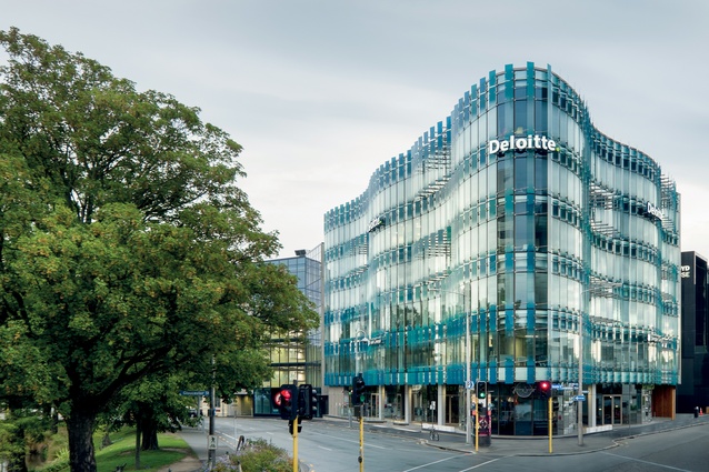
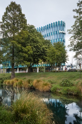
Jasmax’s building at 151 Cambridge Terrace sits at the confluence of Cambridge Terrace and Gloucester Street, a commanding corner site in need of some commanding architecture. “The key driver for the design was the river itself,” explains the firm’s project architect Ken Powrie.
“When we started the project, there were no buildings under construction. There was demolition, the ‘red zone’ was in place and the army was still holding court. The only binding element to the CBD was the river - that was the landmark which people recognised hadn’t changed.”
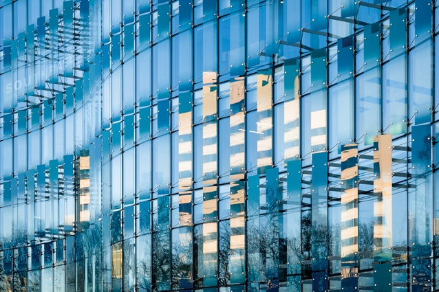
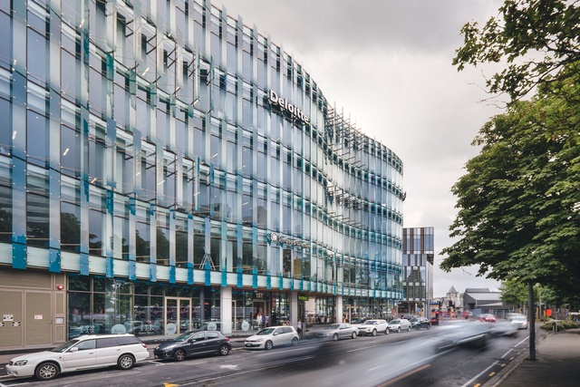
On first view, it is hard not to be struck by this building’s rippling, aqua-coloured, glazed façade that appears to mimic the Avon’s watercourse. I first saw this façade during its early construction and was slightly alarmed to see what appeared to be a dramatic and imposing 7,350m2 building being laid onto this tattered low-rise city, still reeling from it losses. But, now built, it really does seem to welcome in a new era.
Owner Stephen Collin’s brief to the architect was to “provide a high-quality and safe working environment that connects with its context and positively adds to the urban fabric of a ‘new’ Christchurch”. While the curvaceousness of the architecture acts as a device to reduce its bulk at street level, the lightness and transparency of the watery-tinted façade adds a much-needed vibrancy (and positivity, even) to the city.
“We wanted it to be more dynamic in terms of movement,” adds Powrie, “and how it was sensed from the outside as a person walking around it. The identity changes throughout the day, similar to that of the river, so you’re getting that quality of light and subtlety of reflection across the façade, which is what we wanted; it’s a little bit ethereal.”

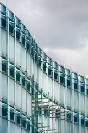
The fins on the façade are fixed but, as you move up or down Cambridge Street, the undulating curves of the building and the angle of the fins make it appear to change, lending it a kinetic quality. The main reason the fins are fixed is for solar gain, massively reducing the overall heating and cooling requirements for the building by about 70-80 per cent.
The ground floor features a bar, café and restaurant, while the main entrance is pushed back from the corner of the building via a laneway, which is accessible from both Cambridge Terrace and Gloucester Street, providing protection from differing wind directions. It’s a nice sheltered place in which to congregate.
“We wanted the tenancies on the ground level to engage with the public so it was important to get the activated edges right,” explains Powrie. “We wanted people to be able to look straight through into the tenancies as they’re unveiled, and to have a real sense of lightness. People come through the main pedestrian route and are drawn in and around, creating a natural flow.”
Above are five levels of office accommodation, with the top levels (4 and 5) occupied by professional services firm Deloitte, while the middle levels have a variety of tenants. The basement includes car parking and some of the latest seismic technology to make this one of the safest buildings in Christchurch.
With so much loss of life in Christchurch during the February 2011 earthquake, the owner was intent that he would only build with a high seismic strengthening solution. As a result, the building is base isolated, floating on triple pendulum bearings, and with a slip-joint so “the entire building can potentially move out 500mm in any direction during a ’quake,” says Powrie. This is equivalent to about 180 per cent of the level set by the new building standards (equal to IL4).
Also, 151 goes against the stipulations set regarding building heights in Christchurch, as part of its Urban Design Principles. “We broke those rules to enable a bigger building here because it needed to have a presence on the corner,” states Powrie. “If we’d adhered to the rules, the building would have had to have been stepped at the upper levels which would have negatively impacted the urban environment. It would have been too small for the actual scale of the setting and the big expanse of Avon River Park. It was more important that it hold the corner properly, creating a proper urban environment for the surrounding buildings.”

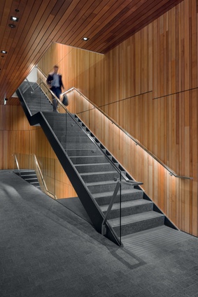
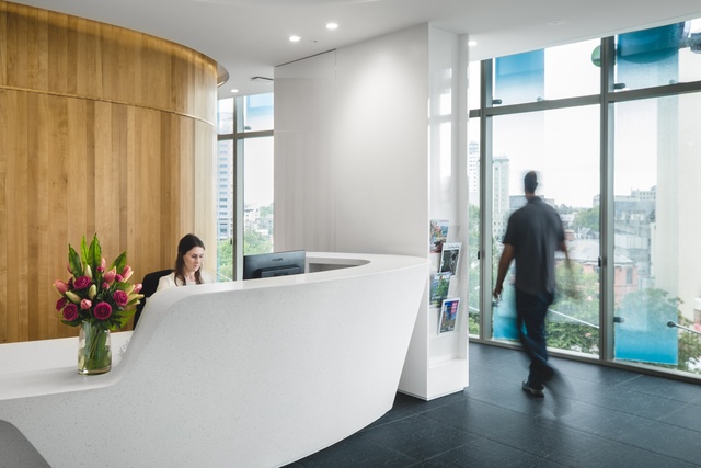
Internally, the material palette carries the urban grain back into the building, with the use of natural stone tiles and timber in the lobbies and stairs, along with polished plaster, creating warmth and tactility in the common areas. Maple beech boards line the walls and southern beech veneers clad solid doors. It has a timeless quality, avoiding clichés.
An interior feature is the scissor staircase, which wraps around on itself. The idea was to activate the stairs, which are exposed so you can see people moving up and down. The stairs and lifts are centrally located to enable the office spaces located around the perimeter of the building to be reached easily – an efficient way to layout the plan within this triangular site.
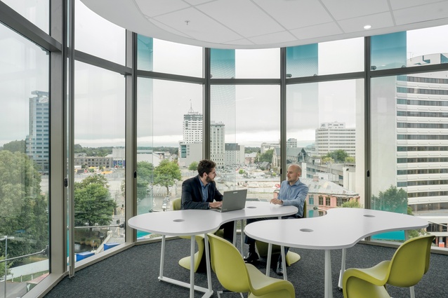
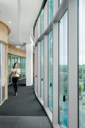
In the research paper ‘Design, Productivity and Well-being: What Are the Links?’ (1998), Judith Heerwagen suggests that the presence of daylight and windows, as well as opportunities for active and passive contact with nature, sensory change and variability, positively impacts on well-being. And 151 certainly ticks the boxes on this front. Jasmax’s workplace strategy was to “give the prime spaces back to the staff,” says Powrie. Rather than being enclosed by offices, staff enjoy wraparound views of the River Avon Park and the surrounding city.
Powrie explains that “the ceiling is stepped back from the edge so there are no spandrel panels; therefore, as you look at the building, there is unencumbered light and glass. You never see a band of broken light, which makes a big difference on the outside of the building, both during the day and night. This achieves a clear, seamless finish to the façade and, internally, the views outwards are enhanced.” It obviously took a good deal of parametric modelling to ensure that it would work. Drop-down blinds are built in to reduce any glare onto computer screens, as you’d expect.
This building seems to grow on you the more time you spend there. I was really impressed by the views and the quality of light that creates a lovely sensory experience, a contrast to what you’ll find in the vast majority of commercial workplaces. Sometimes it pays to ‘step outside the box’, it would seem.
FACADE DETAIL
The façade has a large impact on the overall performance and design of this building. A computer model was used to optimise the level of shading on the fins to improve occupant comfort and reduce energy expense, while still providing a view. There is a fixed clear section of each fin, which is between 0.8m and 1.8m above floor level, that allows occupants to see through the fins while sitting and standing. On either side of this transparent section, there is a graduating pattern that reduces the amount of solar gain through the fin. This pattern transitions from opaque at the top and bottom of the fin to clear in the middle.
The rate of transition was modelled using Integrated Environmental Solutions’ Virtual Environment, optimising occupant comfort, solar gain and building energy use. Low-E Insulating Glass Units were chosen for their neutral blue appearance and high-visual light transmission, preventing heat loss and providing a visual connection between the interior and surrounding cityscape. The laminated glass fins have been digitally printed in tiny aqua-coloured water drops, altering to give a soft fade in and out at head height.
The glass was processed and digitally printed on site at Metro Performance Glass in Christchurch who, with Jasmax, worked closely with Alutech and their Australian-based façade engineer to achieve the desired outcome for the client within a tight budget. The use of Performance Glass EVA lamination provides a durable external outcome that allowed for the deletion of unsightly metal edge capping, originally specified, based on the limitations of traditional PVB lamination.
Although the building may seem complicated from the outside, with its undulating curved façade, the design utilises a standardised curve that is repeated to achieve the design, enabling a fast construction sequence. By utilising base-isolation at the basement level, a simple repeated structural grid could be used for the super structure from the ground floor up. This allowed the majority of the superstructure to be prefabricated off site, which again speeded up the construction programme.

