Te Ao Mārama: Exit at the hokohoko
In the last in our series, Amanda Harkness visits Te Ao Mārama’s retail and hospitality offerings, designed by Ignite in association with Studio Pasifika, and Jack McKinney Architects, and finds evidence of artful adaptation and reuse.
Charles Darwin knew a thing or two about survival. He knew it was not the strongest of the species that survived, nor the most intelligent, but the one most responsive to change. And the recent Te Ao Mārama rebuild, together with the earlier addition of the South Atrium, are both stories of adaptation: perhaps, too, for the sake of survival. Big gestures such as the suspended tanoa and floating glass roof on top of the neoclassical building speak of change and progression in a brave new world.
When Ignite teamed up with artist Carin Wilson of Studio Pasifika to conceive the design for the new Hokohoko Museum Store, Wilson told a story of how in the 1930s, around the time when the museum was built, Māori culture was at its lowest ebb. The compounding effects of the Land Wars, the influenza pandemic and the First World War had led to a decline in population and, in turn, had endangered Māori language and culture. And so it was that Sir Apirana Ngata began a journey to pursue the revival of Māori arts and culture.
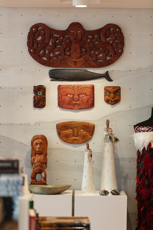
“This story of adaptation and evolution resonated with us,” explains Ignite project lead Nathan Carey. “Just as the Māori people had to change, so, too, does the museum. And we started thinking about materials that communicate this idea of change: presenting layers of time, contrasting textures to convey progression, the juxtaposition of old and new, and storytelling through the adaptation of materials.”
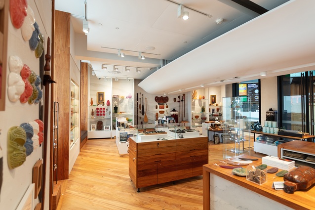
Where its predecessor had been long and deep in plan, with plenty of wall space, the new store’s crescent-shaped floor plan is wide and shallow, with heritage windows lining the length of both interior and exterior walls. “We had to be clever about using the spaces in between the windows,” says Carey, of the outer walls. “They are such a beautiful feature, you have to think carefully about what will be merchandised between them.”
The windows have been framed with recycled rimu, crafted by Wilson: some as carved panels, others featuring a stepped poutama pattern, which, Wilson explains, is a metaphor for the cycles of human endeavour or ascending stages of growth. “A vertical step represents the challenge and stretch to engage with and master new skills, while the horizontal component suggests a plateau of assimilation and consolidation.” The deliberate, unresolved termination at the top indicates that learning is a never-ending, lifelong journey.
The locally sourced reclaimed rimu surrounding the windows flows through to countertops, flooring and cabinetry, with seemingly simple display cases belying a challenging build. “We worked closely with Dimension Shopfitters to develop a custom merchandising system with layered drawers that can be opened for additional display according to stock levels,” explains Carey. It’s a clever way to make the most of the space between the floor and the top of the counter as well as to provide for the shop’s storage requirements.

The raw, imperfect joinery is offset against white, highly polished, square forms, appearing to float on mirrored plinths. Meanwhile, floating above, is the Jasmax-designed ‘shield’, which effectively houses the services throughout Te Ao Mārama, albeit at a slightly lower level than, perhaps, might be considered ideal. While Carey concedes “it’s a beautiful form that wraps through the spaces”, he and the team were keen to leave it to its own devices. A pinstripe dado line of thin brass forms a demarcation, above which everything is crisp-white, reflecting the galleries at the front of the museum.
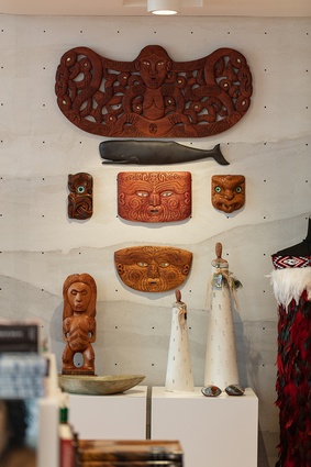
It is the wall treatment below this line and at either end of the store that is the master stroke in the fit-out. A mineral plaster render developed in collaboration with Pilkington Interiors, it appears to reference centuries of layered earth and sediment but is, in fact, a unique, highly sophisticated pegboard. “It’s a bespoke display solution, designed to provide the flexibility needed to showcase the Māori and Pacific art pieces in the best way possible,” explains Carey. The system, which features hundreds of holes with threaded inserts, adds minimal visual clutter but offers maximum adaptability.
Hokohoko retail manager Vicky Thomas says the design team has successfully created so much more than a generic retail offering. “A museum store is a cultural retail space and an extension of the museum experience, so it has to create a link between history and living culture,” she points out. “The store’s design really elevates the large collection of artworks that we promote, and acts as a home for it, but also plays host to our visitors in a warm, welcoming space.” All the better for promoting the revival of Aotearoa’s cultural artworks – Sir Apirana would have approved.
Across the atrium to the east, in a space that mirrors that of the museum store, is Tuitui, one of architect Jack McKinney’s latest hospitality designs. It’s undeniably a step up from the previous incarnation – more of a pole vault – with first impressions closer to fine dining than to meals for over-excited little people.
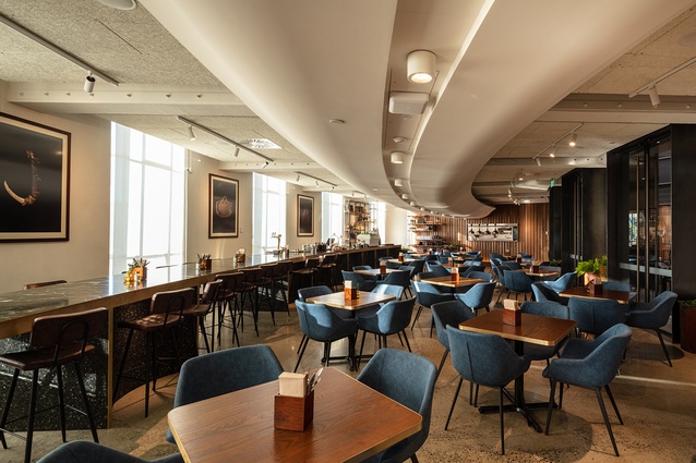
McKinney’s grand gesture is an impossibly long, crescent-shaped service counter, which runs almost the entire length of the bistro: “about 16 metres, give or take”. Topped with richly veined, dark-green marble and evocative of a beautifully carved piece of pounamu, the sculptural island performs several functions across its trajectory. Offering intimate double-sided seating at the northern tapered end, it progressively widens to a central bar area and then finishes off with café and counter food at the kitchen end. A wide brass band wraps around the top, “borrowed from the bowl in the atrium”, and mosaic-clad, scalloped sections form the base, referencing the museum’s neoclassical Doric columns while at the same time providing pockets of enclosure for diners.
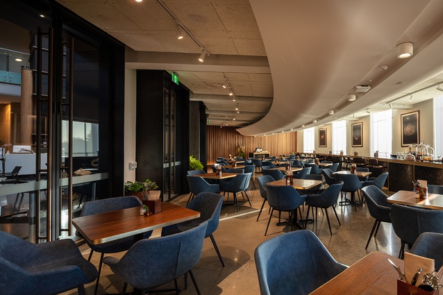
The fluted profile is continued on Tuitui’s two end walls, this time in panelled Canadian hemlock, oven-baked to protect the soft wood from harbouring mites, which could run amuck in the museum collection, but with the pleasant side-effect of a smoky fragrance.
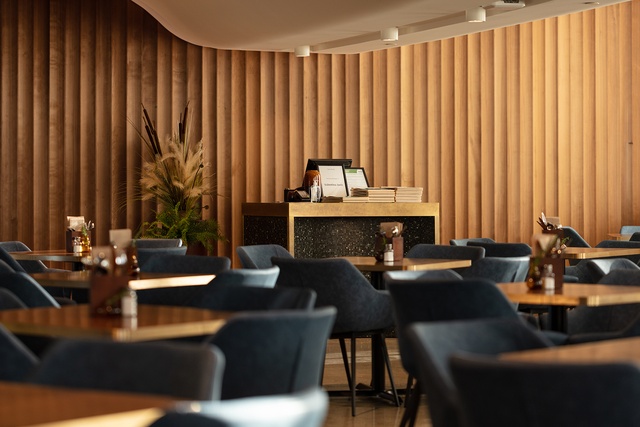
The materiality of the grand service counter is repeated at the maître d’ station and the brass banding is also deployed on the 16 tables dotted across the polished concrete floor. McKinney had hoped to hang reproductions of exhibits between the east-facing windows on the exterior wall, “to bring the collection into the dining space”, but, in their place, are four arresting, oversized photographs referencing both kai and tuitui, of which the latter translates to weaving, binding and bringing together.
Tuitui owner Brian Sewell says that where the interior sit-down, table-service offering is “slightly more grown-up” and designed with international visitors in mind (he and McKinney modelled it on a New York diner theme), the more informal café space in the atrium is ideal for families, providing children with room to play and, presumably, to make a little more mess.
What McKinney has created here is perhaps more pared back than we would expect from previous form – he admits that it’s the clear lobster bisque that has come from the seafood chowder he started with – but he also points out that the heritage aspect of the building required the lightest touch possible so as not to mask the beautiful, historical elements. Treading lightly aside, the colossus-like scaling of the Doric column-inspired counter at the heart of Tuitui certainly leaves an impression.
In part one of the Te Ao Mārama series, Albert Refiti discusses the vitality of naming, the cross-cultural myth-histories and the moana architecture of the refurbishment. Read more here…
Part two of the series features Chris Barton ontemplates the new column-fins of Te Ao Mārama’s design. Read more here…

