Fabulous Darling
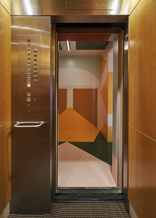
The wonder of this apartment begins before you’ve even opened the front door. Emerging from the lift, guests are welcomed by a dazzling mural – all criss-crossing angles and bold colourblocks in bottle green, maroon and yellow offset by the palest ice blue, mint green and dusty pink. The artist responsible is Esther Stewart, based in Daylesford in regional Victoria. Fresh from a menswear collaboration with fashion house Valentino, Stewart delivers here a stunning modernist prelude to the extraordinary apartment within.
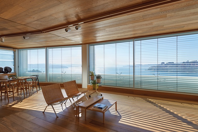
Occupying a whole floor in a 1968 building, the apartment overlooks the blue waters and even bluer skies of Sydney Harbour. Downsizing from their family house to a 160m2 apartment, the clients enlisted the services of architects Tony Chenchow and Stephanie Little of Sydney practice Chenchow Little to deliver their new home. They sought a welcoming space with a degree of formality and a sense of surprise.
The resulting apartment was awarded the top prize at this year’s Australian Interior Design Awards, as well as winning a residential award and a Best of State award for New South Wales, and has been announced as Australian House of the Year.
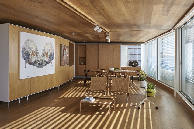
In plan, the building is almost trapezoidal, widening from front to rear, with floor-to-ceiling windows spanning three structural bays across the north-eastern façade. “The floor plate fans out toward the view,” Tony explains, “so we wanted to accentuate the unusual geometry of that faceted façade.” It is reflected in the angles of the floorboards and ceiling panels, as well as the track lighting that follows the angles of the façade.

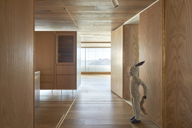
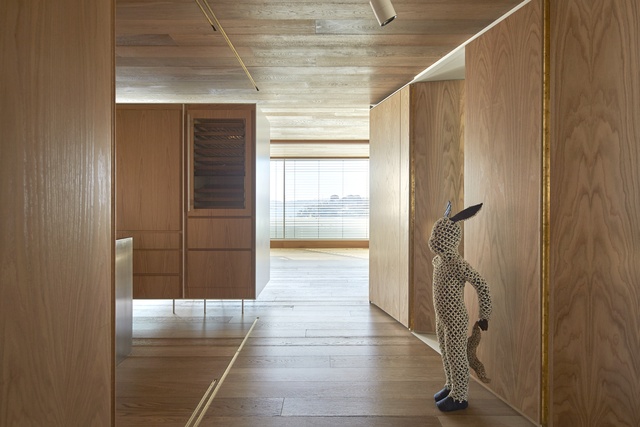
There is something almost nautical in the crafted timber surfaces that line the apartment, recalling the sixties architecture of the building itself. “The client didn’t want a white space; they wanted materials that would give them warmth and intimacy,” Tony says. “The timber gives the space a sense of homogeneity. It doesn’t separate the different planes.”
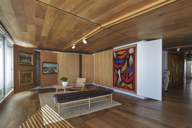
One of the primary objectives was to open up the apartment and relieve the compartmentalised layout of the original interior. Brass inlays in the floor and ceiling trace the alignment of the original walls, while a series of joinery elements read as insertions in the space. Sitting up on steel legs and reaching to just shy of the ceiling, there is something lightweight about them, a delicacy that belies the quality of their construction and the way they structure the internal volume.
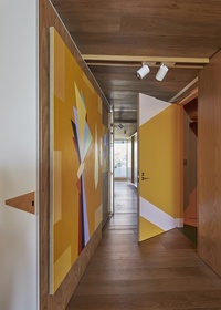
Central to the brief was a need to accommodate the clients’ extensive art collection. In the hands of a less capable team, this could have resulted in a staid and static area set aside for display, but Chenchow Little’s solution activates and enlivens each room. Inspired by Sir John Soane’s Museum in London, the team has introduced an array of sliding and hinged surfaces that glide and fold to maximise available hanging space.
This deceptively simple approach evidences the skilful craftsmanship that characterises much of the firm’s work. “There are all these little complex moments; it all has to do with the detailing of the joinery,” Tony explains. The effect here is impressive – some twenty-five pieces of art and sculpture are on show at any one time, turning the compact apartment into a true residential art gallery, with the client playing the role of curator.

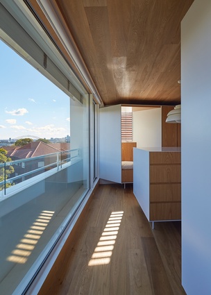
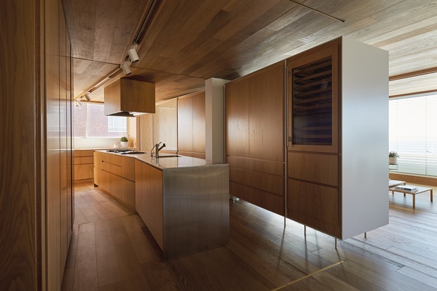
Alongside the living and dining zone, a lean galley-style kitchen continues the apartment’s maritime theme. Concealed appliances and abundant storage line the walls, while an elegant island bench kinks at its midpoint to mirror the angles of the rear façade. Above, a discreet timber-wrapped rangehood becomes a sculptural wooden box. “A lot of work went into eliminating bulkheads, grilles and services,” Tony says. “You don’t really want to see them.” A pass-through at the western end of the space accesses the dining zone, offering a visual connection but still providing some separation. A compact laundry is tucked around the corner.
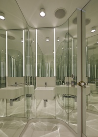
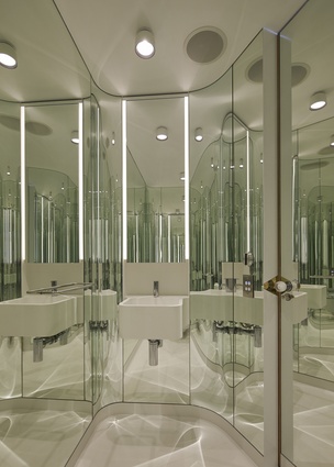
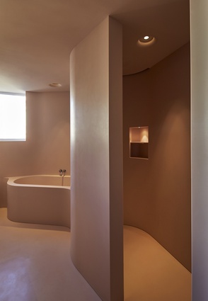
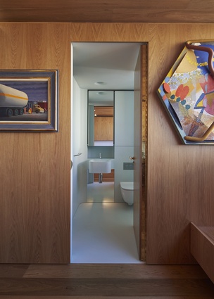
A central hall bisects the apartment, running from the living and dining zone at the rear past the entry to the master bedroom at the front. The hall also provides access to the guest bedroom and ensuite, along with a playfully executed powder room. Its green-hued glass curves around each wall, creating a jewel-like mirrored cocoon. The client wanted each of the bathrooms – one blue, one green, one pink – to have a sense of fun. “We imagined them as another world within the real world,” Tony says.
At the end of the hall, the master bedroom looks out across the Sydney suburbs to the south-east. Half of the space is given over to a generously scaled dressing room. The walls are lined with joinery surrounding a central storage unit. In the western corner, a window seat offers a quiet pause – beneath a Jørn Utzon–designed pendant light, this spot for repose gazes back toward the bridge and another of Utzon’s iconic designs, the Sydney Opera House.

