Fearon Hay’s first Melbourne project unveiled
Architecture practice Fearon Hay Architects has unveiled designs of its first project in Melbourne, a residential development located in the bayside suburb of Brighton.
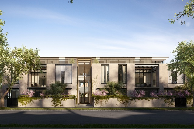
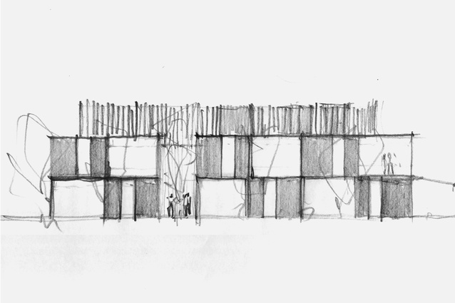
The proposed development, named Lindsay Brighton, will occupy a large site with a 50-metre-long street frontage. The three-storey building will accommodate 11 apartments, of which two will be penthouses. Landscape designers Eckersley Garden Architecture have been appointed to landscape the private gardens.
The site formerly belonged to Brighton’s Trinity Uniting Church and included a car park, a tennis court and “a community garden popular with local apartment dwellers,” Reverend Ian Cayzer told Bayside Leader in 2013 following the sale of the land.
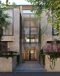
Fearon Hay director Jeff Fearon said the church, which sits at the rear of the development, provided a central entry axis that informed the arrangement of the apartments. The large setbacks along two boundaries mean the building will be bordered by green spaces.
“It’s the position of the internal street,” Fearon said. “The street carves all the way from front to back, which we’ve aligned with the church. We thought, with a beautiful, ornate brick church surrounded by green space, we can’t have an entry that just goes into a dead-end space and is a darkly lit single lobby.”
The “internal street” will divide the building into two parts and will have a secondary effect of breaking down the proposed building’s mass.
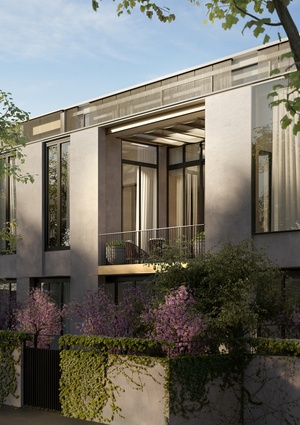
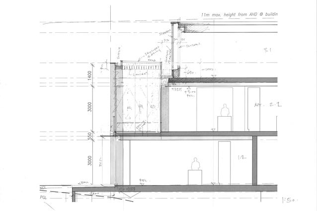
Fearon Hay’s method of carving is also applied to the creation of outdoor spaces for the middle-level apartments. Instead of balconies jutting out of the building mass, the open spaces will be subtracted from the volume of the mass, in an effort to create a pared back, homogenous whole.

Carving away at the mass also allowed the architects to create corners, a process that is intended to “maximize light and air in the design,” Fearon said. This technique is reminiscent of (albeit not directly influenced by) a design method proffered in Christopher Alexander’s A Pattern Language, whereby rooms of a house are arranged so that each has windows on two sides to bring in light.
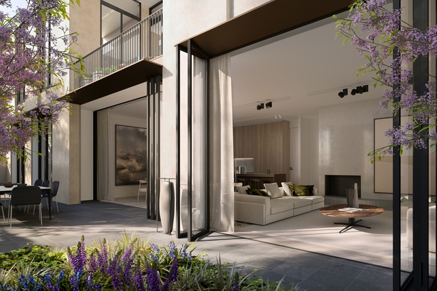
To further maximize light penetration into the first-storey apartments, Fearon Hay’s design manipulates the vertical space in the indoor and outdoor living areas by lifting a part of the ceiling and canopy above the floor level of the second (penthouse) storey. From a streetscape point of view, this manipulation of the elevation will also help the second storey receed.
Trent Skurrie, director of developer Jacmax, said the design will add to the quality of outdoor space for the first-level apartments. “Everyone always wants ground floor and everyone always wants the top. It’s always the middle that people don’t want,” he said. “This changes the whole dynamic, having this extra height and extra volume.”
The internal street together with the carving of outdoor spaces from mass will govern how the apartments in the development are arranged. “I would say it’s like a game of Tetris, but it got more complicated than that,” Fearon said.

