Fine grain of detail: Mosman House
This house balances generosity and intimacy with detailed craftsmanship and comfortable day-to-day living.
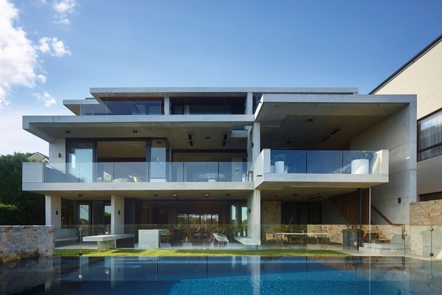
Sitting in a prominent position overlooking Sydney Harbour, Mosman House balances the generous proportions of the architecture and the monumentality of concrete construction with a focus on everyday living, comfort and informality. It is the result of a close collaboration between the architect, interior designer and client in which both the bigger picture and a fine grain of detail drove what they wanted to achieve.
“In designing a house of this size and in this location, there is a temptation to be over the top in terms of scale and formality so that it doesn’t feel human,” says Shaun Lockyer of Shaun Lockyer Architects. “Here, there is an intimacy to the scale of rooms while still being generous, and the natural and rawer materials, which one might not naturally associate with a house like this, give it a relaxed feel.”
Mosman House is home to a family with two teenage children. After approaching a number of Sydney architects, the client engaged Brisbane-based Lockyer, who designs houses described as ‘subtropical-inspired regional modernism’; that is, the architect draws inspiration from modernist architecture in regions such as South America and South-east Asia, which have similar climatic conditions to Australia.
Like these modernist houses, the client requested a concrete, timber and stone material palette and a strong focus on indoor–outdoor living. “In addition to the desire to realise an architectural idea that would have resonance, beauty and purpose, we wanted to create a house that was going to be a fantastic place for this family to live,” Lockyer says.
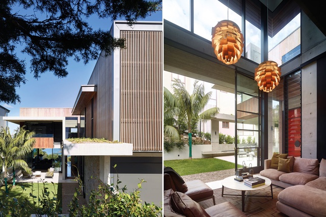
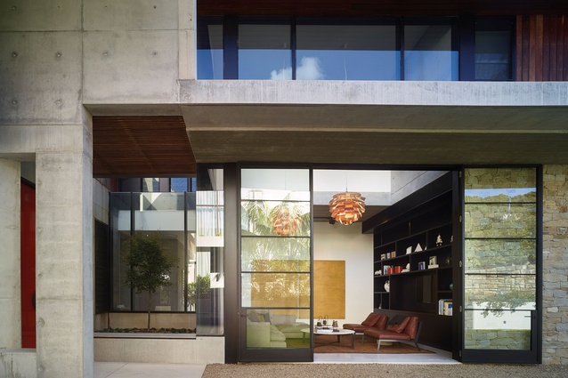
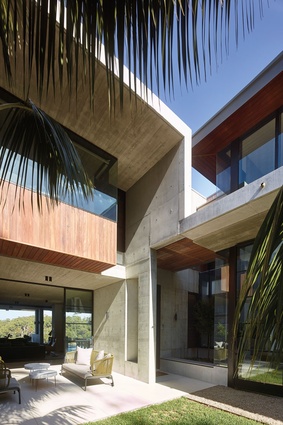
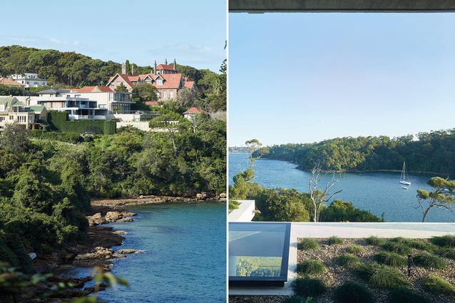
The house is composed of a series of concrete platforms and cantilevers that provide a strong horizontality, as well as protection from the sun and rain. Granite-stone walls complement the coastal landscape, weathered-timber cladding warms the concrete aesthetic, and black-framed glass doors and windows create transparency through the otherwise solid house, allowing for water views from the front garden.
A series of green roofs on top of the platforms offers a soft green foreground to the Sydney Harbour backdrop. “It feels like you’re looking through something rather than over something, and it creates a connection from built form to landscape to water,” Lockyer explains.
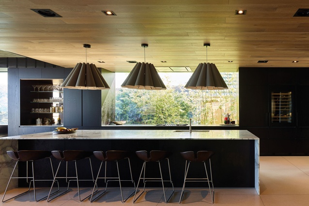
Family living and entertaining take place on the main level of the house, approached via an informal garden that provides a gentle and welcoming transition from the street. Here, an open-plan kitchen, living, dining and sitting area stretches the width of the house, extending out to the terrace, and a television room opens to the courtyard and internal garden.
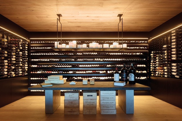
The master bedroom upstairs looks out to the harbour while the children’s bedrooms are located closer to the street. Downstairs, guest accommodation, entertainment and lifestyle amenities include a family room, wine cellar, bedroom, steam room, sauna, swimming pool, deck and lawn.
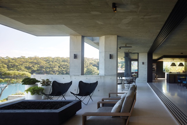
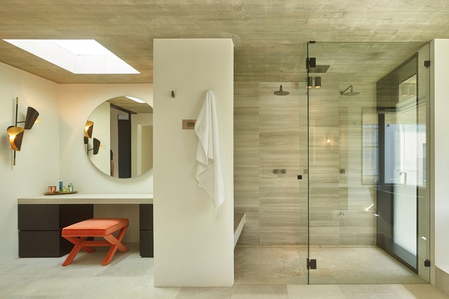
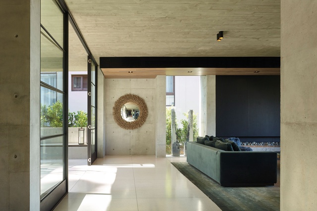
As the concrete, timber and stone palette continues inside, meticulous attention has been given to creating texture and detail. The timber-grain concrete ceilings and staircase walls offer tactility and warmth in a material that’s traditionally cold, and the linearity and grain, which is somewhat visually deceptive, mediate the softer and harder materials throughout the house: French Oak floors and ceilings, smooth concrete walls and polished terrazzo floors.
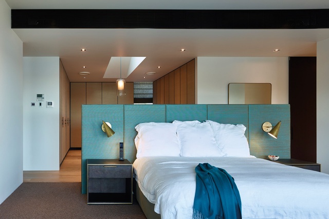
Within this robust framework of the house, each room is comfortable and welcoming with its own distinct personality. “We wanted surprises in different rooms; to not be too predictable,” says interior designer Justine Hugh-Jones. “It was a way of creating a more intimate scale within a house that has strong architectural form.” Joinery is black stained in the living areas but varies in private and personal spaces, such as bedrooms and bathrooms.
The furnishings likewise introduce warmth, comfort and individuality with relaxed forms, jewel-toned hues, dramatic pendant lights and striking contemporary art to reflect the family’s style and personality. “The client is very stylish and adores drama and colour in her choices; but they’re a relaxed, fun and welcoming family,” Hugh-Jones explains.
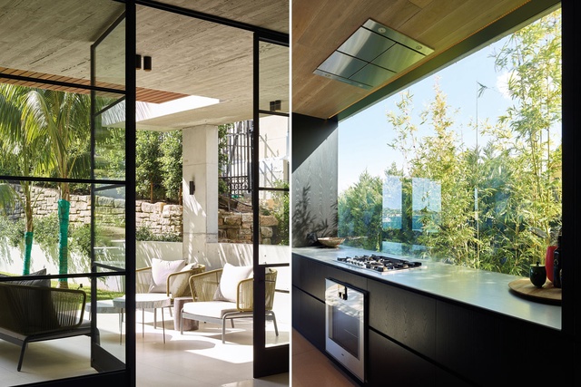
Indeed, Mosman House has ultimately been designed for the family and with a focus on their day-to-day living. “Even the most menial task is celebrated in some way,” Lockyer says. For example, the laundry, kitchen and pantry are flooded with natural light, and a frameless window above the cooktop offers garden views.
“Good architecture heightens the experience of everyday living,” he continues. “If it’s done well, the architecture becomes subservient to the experience of living in the house rather than dictating or dominating how people live in a space. That’s when it’s really good.”

