Fine-tuning a few elements
Pip Cheshire traverses influences in his design practice, from the shoebox to Donald Judd to Don Clarke to the raw and the cooked.
I have to admit my design practice has probably been unduly influenced by the shoebox and I wonder if this has its genesis in the all-encompassing authority with which the ‘Wellington school’ strode the land when I was at architecture school. There seemed, at every award and competition, to be a series of assemblies: those wonderfully coloured collisions of cubes, tubes and cones tumbling down the impossibly steep hillsides. It was alien territory for a student from the flatlands of the South Island and even Peter Beaven’s flamboyant reworking of Christchurch’s heritage of colonial gothic seemed restrained in comparison.

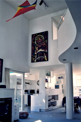
Despite my reservations, the eclectic energy of early 1980s’ Ponsonby had me working at full tilt and the Vernon townhouses were a solid work-out in leveraging the shoebox proportions of a single living room within a highly decorated stacking of plaster boxes. The outside carries all the marks of its postmodern age: the tiled chimney detail, the decorative pipework and a host of incidental elements. For all that, the double-height living space inside the front unit revealed the richness of experience possible within a fairly stiff rectilinear form, despite my undisciplined insertion of a piano-curved mezzanine and Mondrian-inspired sideboard and kitchen storage. I fancied, at the time, that the living volume received something from Le Corbusier’s Ozenfant studio, the double- height space with a stair crawling up one end, though, of course, both would have been appalled were they to have set foot in that flamboyant confectionery.
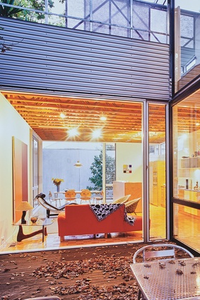
The Bambury House was a more robust and disciplined manipulation of a rectilinear form, enforced to some degree by a difficult site with flood plain and protected trees. The project owed something to the Villa La Roche, Koolhaas’ Villa dall’Ava and the Case Studies but had its own programme, in which a large terrace bit into the ‘shoebox’, forming a link housing entry and vertical circulation while separating living pavilion and private bedroom wing. The house is less burdened by extraneous programme and is happily free of most self-conscious excess, and its design suggested the potency of comprehensive engagement in a restrained formal parti, rather than reaching for bits to add on.
If I needed some academic context for my reservations regarding what seemed like the wanton addition of form upon form in pursuit of Wellington’s hillside picturesque or my own pursuit of the representational, it came later in Donald Judd’s essay: ‘Some aspects of color in general and red and black in particular.’ In that text, he argues for the spatial complexity created when few elements are in play: a flat plane, two rocks and maybe a stick. “How far apart are the two rocks? Is one larger than the other? Two rocks of equal size and the space between them is a situation which is very different from that of a small rock and a large rock with the same space between.”
Judd goes on to describe ever greater complexity as a stick is laid over the two rocks, suggesting that this is spatially so complicated as to defy analysis by all, except him. Compared with the staggering number of forms that we architects hurl at the simplest of projects, his proposition bespeaks distillation as a critical design strategy. Rather than the addition of forms to house one or another function, the distillation of space and form into yet apparently simpler constructions inevitably produces an intensification of experience as fewer components are brought into play and the finer nuances of dimension are fine-tuned to gain greater leverage.
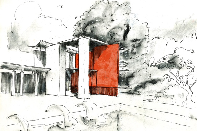
The Congreve House challenged the clarity of Judd’s proposition with a brief combining generosity of public programme with intimacy of family life. Despite the layered brief, I sought to edit such that Judd’s clarity might be glimpsed, along with David Mitchell’s advice that everything in a building should be doing at least three things and that adding something for aesthetic or functional reasons was never enough by itself. The sketches progressively eliminated walls, compressing and powering up the intensity of one’s experience of the spaces by a concomitant concern with those remaining elements of construction that engaged the senses of tactility and surface reflectivity, and aural and thermal definition, and which promoted a palpable sense of mass.
All Black fullback Don Clarke’s heel digging into a sodden Lancaster Park has long seemed a suitable riposte to Glenn Murcutt’s “touching the earth lightly”, reflecting a national history of topographic manipulation in Aotearoa as hilltops were reshaped into defensive constructions. And so it seems that we might build that way here in this land that, in the words of Rewi Thompson, is still making itself. Rūaumoko’s shuddering continues to reconfigure the land just as a new culture is being forged between the many tangata tiriti and tangata whenua.
If the thingness of a building is defined by compressed spatial experience and a sense of solidity, the architectural burden of more laden programmatic expectations than those of Judd’s reduced schema demands some sort of taxonomy. In the case of the Congreve House, this was not much more than a path from city to sea. The path is a stratagem, organising circulation within the house, separating public and private realms and creating, in this case, a rather minimal processional along which the imagination is encouraged to fly. Along the way, a series of events is organised, some referring to the specifics of place, in this case the site’s relationship with Rangitoto, and some to personal mythologies, such as a re-imagined eyrie beneath an aircraft carrier flight deck and a lift from Fellini’s Juliet of the Spirits. Others refer to the clients’ lives and physiological responses to space: specifically, two conditions of engagement with the open clifftop, that of protected and that of unprotected outlook.
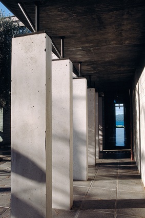
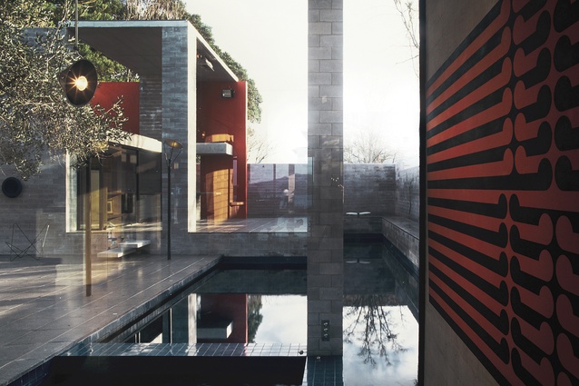
The austerity of the house’s reduced material list relied on adherence to a programme that overlaid a few worked timber or steel elements on the more robust concrete carapace, constructing a tension between base and worked materials. In perhaps its most poignant manifestation, the bony, dyed concrete of a column in the living room passes through the dark-stained oak flooring in a moment of tectonic delight from which much of the house’s material programme might be understood. Though the contractors were appalled at the dodgy concrete, the fines having run out of the boxing leaving chunky aggregate, I was delighted and wanted to enter it into the pottery awards.
Further along that same cliff, another path orders the Clifftop House, a vertically stacked collection of boxes of a great deal more sophistication. Though the spaces remain rectilinear, the surfaces – both inside and out – are heavily worked with stone, plaster, glass and steel. But, there is a moment of singular clarity, such as the column and oak offer: a wall of polished bluestone separating a glazed switchback circulation lantern from the house’s vertically stacked main rooms. One descends from the entry, dropping four storeys to the pōhutukawa-ringed clifftop platform at the water’s edge.

The stair within the lantern serves the stacked rooms, each level with bedrooms, and living, eating and working spaces accessed through a wall of polished granite blocks running through the house, separating served and servant spaces. The polished wall reflects Rangitoto Island to which it points. Like the columns’ bony concrete, something of the house’s locus is revealed as a subliminal connection is made between polished basalt and the volcano ahead.
Recent additions to the house deal with an expanded social brief and have been organised around a new connection, north and south, along the clifftop, culminating in a folly glimpsed across the garden. The garden house as mirror, seen across the site and reflecting that in which the viewer is located, is an interesting opportunity to comment on the house programme. In the Congreve House, a pool house is the house writ small, using the same architectonic regime but pulling apart the elements to create the barest of enclosure and probably reflecting an early visit to Tschumi’s Parc de la Villette.
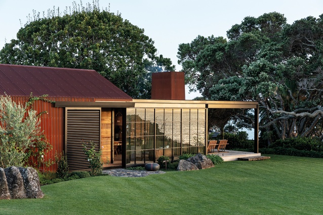
The folly along the cliff is the antithesis of the main house, a seemingly simple borrowing of an early miner’s housing of canvas, rusted iron and rough-cut timber. This is a wry borrowing that transposes the rustic with the sophistication of the house and that has its genesis in follies like the transplanted temple at Stowe and the Chinese ballroom at Newport’s Breakers.
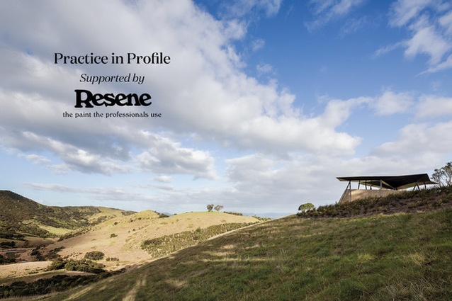
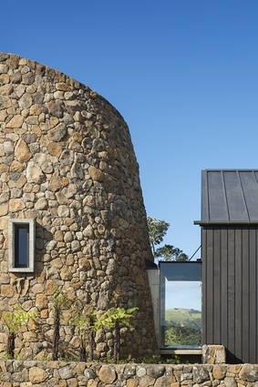
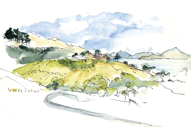
Circulation considered as a processional route organises the Hilltop House in the northern Bay of Islands. There are no casual visitors; the site is some 30 minutes from Kerikeri down a dusty road before entering the property through two stone walls arrayed like open hands. The house is glimpsed and lost as one approaches, spiralling up to the hilltop site. Leaving your car, you enter a cloister through a portcullis before the house opens up left and right, ahead and behind, above and below. The approach is ordered, with sight lines and markers that seek to draw the larger site into the house and project its presence across the farm. I had strong reservations about building on such a dominant hilltop within the farm, it being exposed to view from the valleys below and the many coastal breezes. A wind rose from a nearby weather station revealed the wind blew with equal strength and consistency from every point of the compass, begetting a cruciform plan creating sheltered outdoor spaces in every quadrant. The house was threaded between two existing pōhutukawa, which provide a psychic anchor to the site and a foil to the rectilinear form when seen from afar.
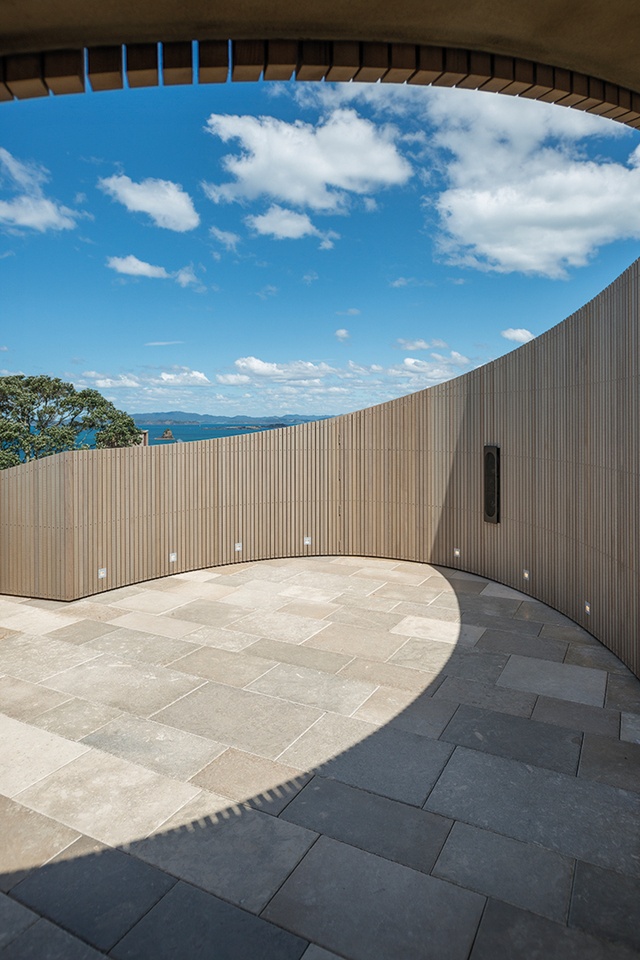
Unlike the Congreve and Clifftop Houses, the processional approach at the Hilltop is centripetal, with elements flung from the central entertaining hub to create spaces providing shelter from the winds, privacy, reflection and celebration. A number of design strategies ties the composition into an extensive encampment; these include formal axial connections to distant landscape features, implied connections to places of pre-contact importance and informal routes to secluded delight. Though built in a single burst of construction, the aesthetic programme for the house proposes an assemblage of elements arising from incremental occupation in the site: the stone-clad tower alluding to early commercial activity in the bay, an adjacent barn-like gabled form suggesting farming use and low flat-roofed wings a contemporary addition.
Just over the fence from the Hilltop House lies a structure commemorating the first formal engagement of Māori and Pākehā, the 1814 sermon by Bishop Selwyn, invited here under the aegis of local chief Ruatara. Not surprisingly, the project had a fraught nativity as church and mana whenua struggled for a common understanding for whether or not such an event should be commemorated and, if so, how. After a few false starts, the project was distilled into a contemplation of the ways in which whenua use marked the two cultures coming together: the incised hilltop pā site and kūmara furrows on the south flanks of the valley, and the number-eight-wire fence and sheep on the north.
The structure we made is an open shelter: parabolic rammed-earth walls surmounted by a triangulated canopy of composite construction. The project built on my earlier life running a fibreglass-moulding factory, updated with contemporary manufacturing in which we modelled in Rhino, passed the digital model across for structural analysis before being passed again into Catia software for detailed reinforcement specification and fabrication.
The juxtaposition of objects and materials with apparently different values has informed many projects and is a common thread in the wider studio. I have referred to the raw and the cooked, appropriating Lévi-Strauss’ binary oppositions to describe an overlay of machined, finished items, such as the highly calculated and manufactured canopy at Oihi, on the raw, brute construction of the rammed-clay walls. The exploration and juxtaposition of elements that are different in kind, be it finished, processed and cooked, or raw and rustic, have a parallel in using modest or humble materials in special ways in a strategy that Nat [Cheshire] has labelled ‘humble special’. This has the familiar being made unfamiliar by its context, be it in association with other materials or within an unfamiliar context.
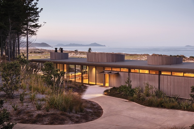
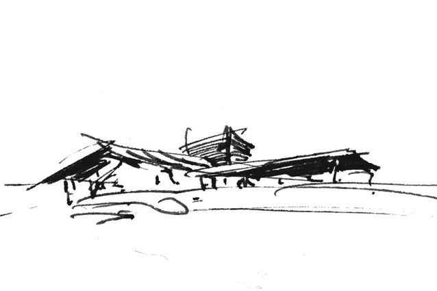
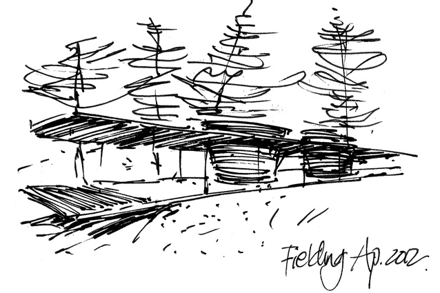
Further down the coast, a late reworking of the shoebox plan forms a pavilion amid the dunes. It began life as a polemical drawing to illustrate a way that a holiday might be had in a modified Philip Johnson Glass House. Of course, the project is required to deal with the full panoply of 21st-century holiday equipment and a lower floor was added. I had often enjoyed the Palladian description of ‘necessary rooms’, his plans being composed of a number of ‘salons’ while the necessary rooms are squeezed into those interstitial spaces that allow the Villa La Rotonda to be such a clear diagram. I presume the necessary rooms were those spaces we seem to spend a lot of time detailing these days: the bathrooms, and the cooking and storage spaces.
The Dune House reverses this order and the necessary rooms are the primary enclosures of the house: timber-clad conical forms containing bathing, cooking and storage, and around which a salon flows, with only minimal enclosure made for bedrooms. There are no axial alignments, no privileging of distant views; it is a pavilion.
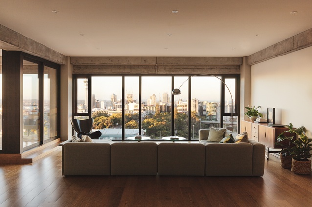
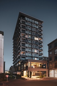
The SKHY project in uptown Auckland is a complex redevelopment of a moribund office and retail development that has very many apartment types designed to reflect the particularities of a project. It is made up of large and small apartments with no views, bigger and smaller apartments with great views and workspaces with no outlooks.
The most interesting are those large volumes low in the tower whose outlook is blocked by the blank wall of an adjacent apartment block. The spaces are tall, with remnants of the old office building’s concrete frame lending a robust sense of firmness and the generous plan dimensions set by the column grid give a good degree of commodity. We inserted raw, unpainted plywood boxes, each containing bathroom and laundry facilities and supporting a kitchen along one side. There are no other walls, the boxes being carefully located to offer a purchaser the possibility of forming partial enclosure of sleeping or working areas through the introduction of furniture elements, screens or curtains.
In such a reduced format, there is great freedom and, again, I am reminded of Donald Judd’s commentary on the complexity and richness to be achieved within the careful manipulation of few, very few, elements.

