Flexible space: AW Architects
Those who have remained in Christchurch since the 2010 and 2011 earthquakes are a resilient bunch. Many Cantabrians testify that the sense of community in the area is stronger than ever, and a lot of the new architecture that has risen from the wreckage is proof of the strength and resourcefulness of its residents.
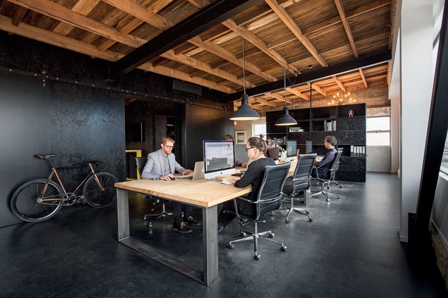
This flexible space, shared between four design companies, exemplifies creativity and community. The office is contained in a building that used to be a print company’s offices but, after the earthquakes, only the front section remained. AW Architects, one of the original inhabitants, first worked to make the building inhabitable. The firm added structural reinforced mesh and new steel K-braces to the existing concrete block and timber structure, with a plaster finish, says design director Prue Johnstone.

“Where we added, we tried to be honest. The structure is rough and industrial, and it reflects the history of the building with both the earthquakes and the previous uses. The new elements contrast this, with sharp joinery, colour and texture.”
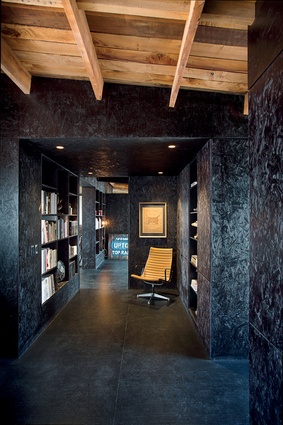
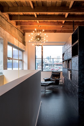
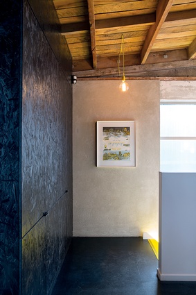
Material choices reflect the creativity of the office residents. Black rubber adds a subtle shine to the floor, while also providing some softness to the concrete underfoot. Particleboard is used as a finished wall treatment throughout, painted black to create a textured backdrop to the furniture, artwork and objects. This material is used also for the custom-made cabinetry, some of which doubles as separators between different zones.
“Being design companies, we had a lot of books and items that needed shelving, and we wanted to have the ability either to put them away or to show them off when clients were in. These cabinets can face into or away from the workspace. By using the same material as that used for the walls, there is unity, which allows the work to stand out,” says Johnstone.
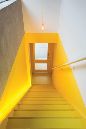
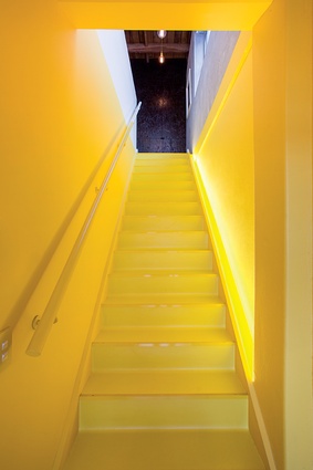
With this dark, textured backdrop, yellow and metallic elements add visual depth to the design. The yellow staircase introduces a sense of ceremony to the office’s entrance: important in an area with so much activity, change and build.
“This was an easy, accessible way to imprint on the building. We looked at a lot of colours but yellow was repeated in the conversations we had with Deflux Design. Despite being bright, it is neutral without many immediate associations,” says Johnstone.
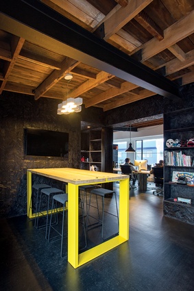
Lighting is a mix of industrial and domestic fittings. To reflect the mostly residential nature of the work carried out by the designers, more refined fittings have been used in the reception area and bathrooms. Over the main workspace, vintage French industrial fittings have been used. Adjustable spots were installed above the standing desks, which are flexible workstations.
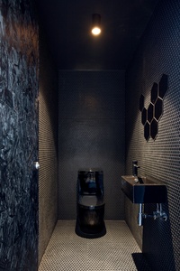
The layout of the office is adjustable as rolling barn doors can remain open between the meeting and work zones, or closed off for privacy during presentations to clients. Two existing shear walls informed where the bathrooms would go. These are designed like yin and yang: all black tiles in one and white in the other. The aesthetic is more cultivated than it is in the rest of the offices, with the hexagonal tiles lending shine. Externally, the doors are made from the same oriented strand board material as is used for the walls, meaning they are concealed from view when closed.
While the area where the office is based is quieter than it was before the earthquakes, Johnstone sees a change developing.
“The neighbouring buildings have gone the same way, with architects and designers moving in. A few cafes and bars are opening up. There is a feeling of being surrounded by like-minded people who see the potential of the area in the wider scheme of how Christchurch is proposed to grow.”

