Flux and flair: Public Library
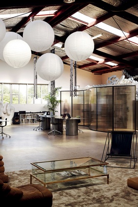
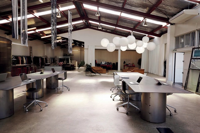
Very little is bolted to the ground in this fashion sales and PR firm. The result is a vibrant and edgy space that is constantly evolving.
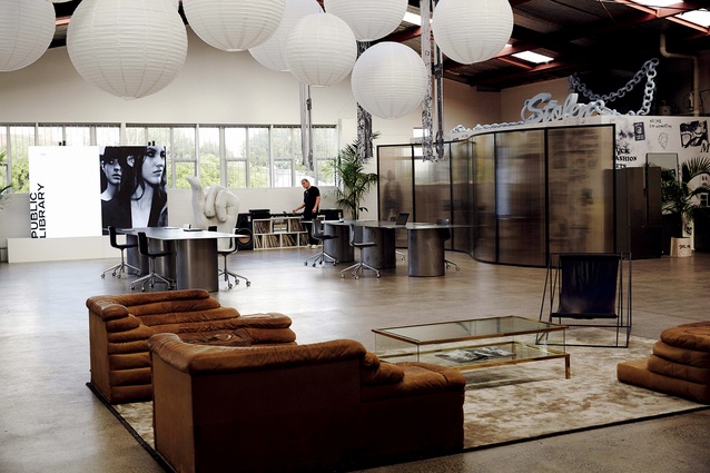
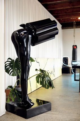
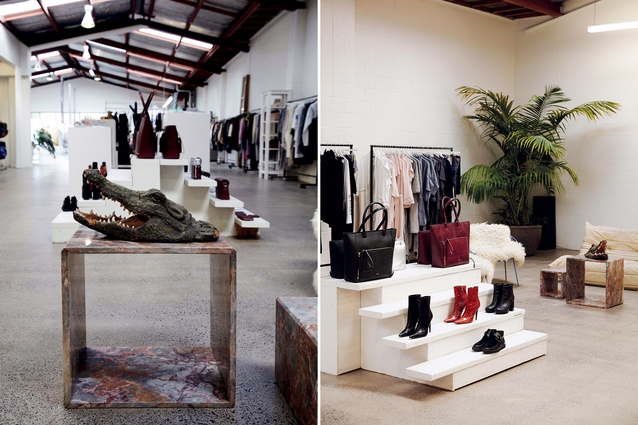
There is someone skateboarding in front of the sales area and, at the back of this warehouse, a couple of fashion-model-looking types are having a powwow next to a plastic crocodile head. It is 4pm in Grey Lynn and somewhere in this surrealist workplace there is also a life-sized, half-woman, half-revolver statue. There is a mannequin hand-painted by artist Rob Tucker and a dog roams around freely.
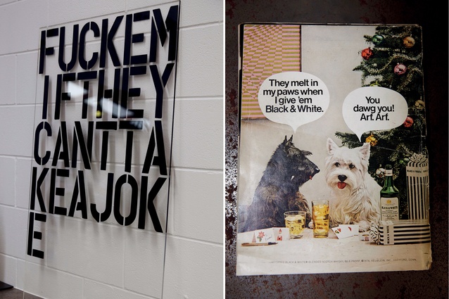
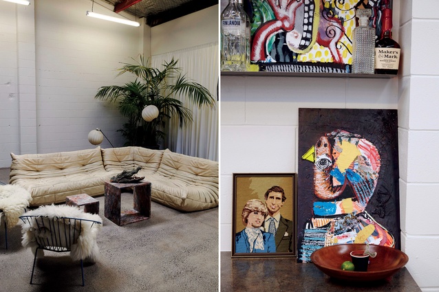
“Fuckemiftheycanttakeajoke” says the Christopher Wool-inspired poster leaning on the kitchen counter as if offering an excuse for the vibe here. Not that it needs excusing. Public Library, the firm that occupies this warehouse, specialises in public relations, sales, brand activations and event management for fashion and alcohol brands, many of which exude edgy, street-savvy personae. One can assume that nonchalance and cheek are crucial tools of its trade and this workplace and the way it is used reflect that to a T.
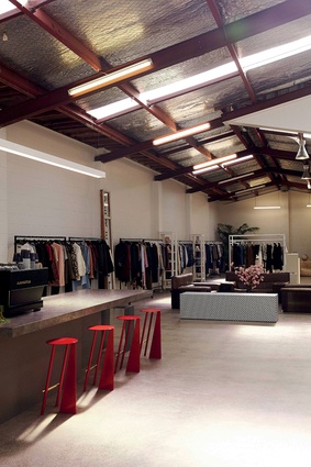
Dan Gosling, Public Library’s ringmaster, explains how the company had outgrown its previous space: a stunning, multi-storeyed, vine-covered brick building in Auckland’s Eden Terrace. “I had been looking for six years,” he explains, mentioning that the high roofline and ample underground parking here were key drawcards of this former carparts warehouse.
“It was full of racking,” Gosling offers; “the floors were painted and chipped, the toilet block was disgusting and it was falling apart.”

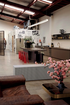
Yet, the challenge was part of its charm. Gosling, a self-confessed dedicated follower of interior design and furniture, took it upon himself to revitalise the vast space by refreshing its surfaces, subdividing it, designing furniture, a toilet block and a new kitchen (alongside B&E German Kitchens), and letting light in through light wells.
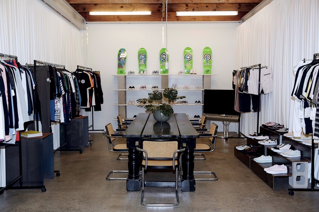
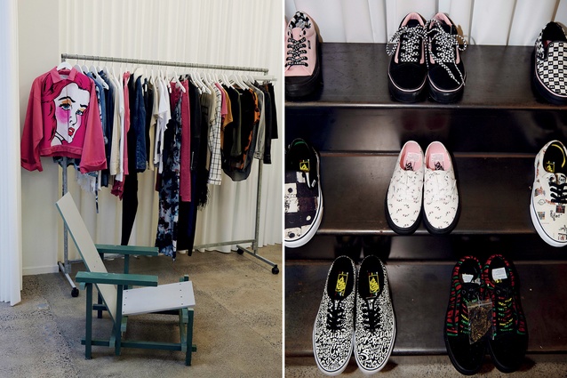
The main needs were large meeting rooms where hundreds of seasonal garments could be hung and showcased to potential buyers from across the country. They required warehouse facilities and, most of all, flexibility. All of this needed to be done on a minimal budget.
“It was a really cool process to go through. We ripped everything out. We painted everything and ground all the concrete floors and that instantly transformed it,” says Gosling.
“We talked about having coloured curtains; we went through the process of wanting to have red cellophane coating,” he continues when asked why they opted for a white palette rather than a vibrant, fashionable colour scheme. “We have so much colour going on in all the clothes and product that we decided to let them do all the talking.”

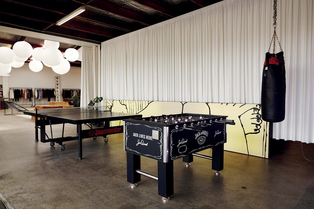
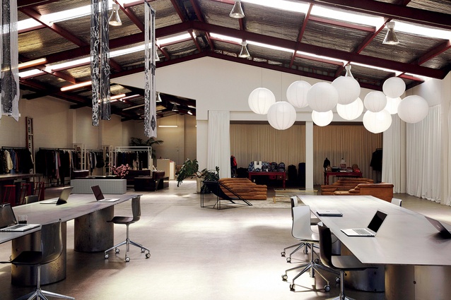
The subdivision of all the meeting rooms and warehouse was achieved by suspending long PVC plastic sheets (normally used for banners), which hang very much as curtains do but require little maintenance. Gosling: “We wanted something that could float like a textile but without the cost,” he says, explaining that, at $1.95/metre, the material was hard to ignore.
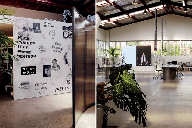
To separate the bathrooms from the desk area, Gosling conceptualised a large room divider, semi-transparent and with inbuilt coloured lights that could create a changing game of shadows across its wavy surface. “It is a design feature with a functional purpose. I wanted to add movement into the space and it turned out to be one of my favourite things!” he says.
The huge steel desks, like the room divider and many of the furniture pieces here, were designed by Gosling alongside SaintLeo and the driving theme was one of mass while not sacrificing on flexibility. “The space is so large that we needed something big. But the pieces are on hidden castors; we have a lot of events here and we need to be able to pack everything up and re-invent the space.”
Since moving in here, the company has staged brand activations; among other iterations, the space has been turned into a mini Japan and, on another occasion, a greenhouse was brought in to act as Santa’s grotto.
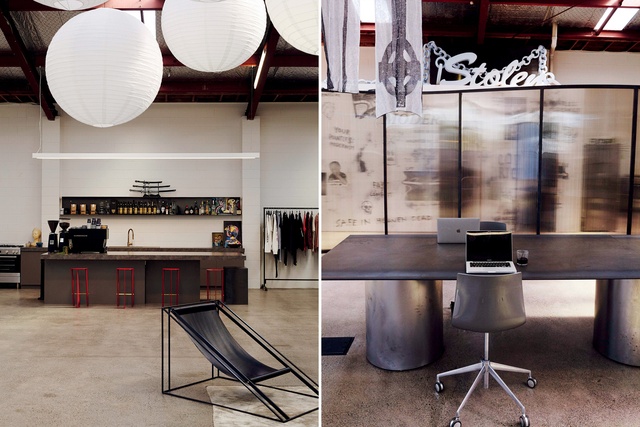
Grounding the space further is a series of large, sculptural, vintage furniture pieces. Gosling has amassed a significant collection of European furniture from dealers in Amsterdam and some of those pieces live here, giving the warehouse just a touch of bohemian elegance that further cements the business’ fashionable persona. Among them are comfortable statement items like: a three-piece Ubald Klug Terrazza (for De Sede), the Sofa Brigadier by Cini Boeri (for Knoll) and three Togo sofas (Ligne Roset).
Yet, it is the flexibility of this warehouse that makes it most interesting. The rear of the space is soon to be turned into a photography studio. There are plans to make a bedroom on the second floor for those travelling in for business. There might be a white basketball hoop, which will be camouflaged against the white brick wall.
The loading dock acts as a games room with ping-pong table, punching bag and beer/smoko space that gives perfect views to the street. There are three stereos and a turntable, and a huge Panasonic video wall, and the entire warehouse is dotted with artworks and decorative or sculptural pieces, each of which, at some point, has been used as marketing collateral.

