Following the whenua
Mark Southcombe visits Parsonson Architects’ Long House in Wellington’s Churton Park and finds a home designed with both landform and landscape in mind.
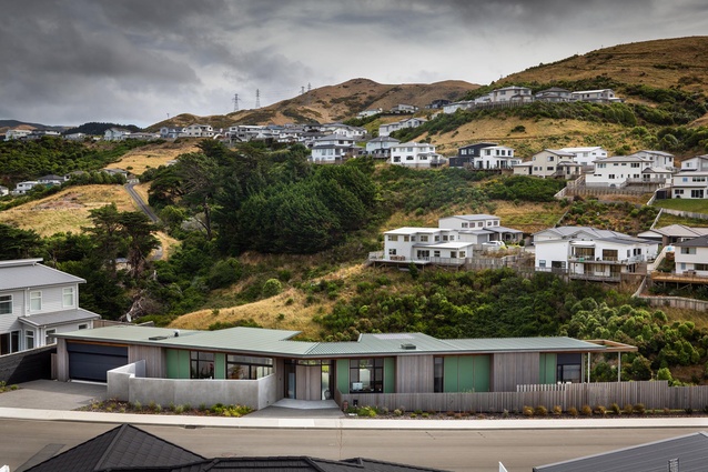
Driving down the hill and around the bend in Rochdale Drive in Churton Park, Wellington, you have a view across a suburban valley to a long and low house. Despite its calm, settled-into-the-landscape character, the house is very distinctive. You can’t miss it. People walking past on the footpath are intrigued and stop to comment. It’s a house that advocates for architecture.
The understated design quality of the Parsonson Architects-designed Long House is highlighted by the contrast with its context – Churton Park’s snaking suburban subdivision of bulky, barely designed houses of similar age, material and colour. Like most ubiquitous ‘design’ and build suburban developments in Aotearoa New Zealand, it is a sprawling suburb of similar oversized houses on undersized sites, relieved only by cookie-cutter, medium-density terrace housing, and a drive-on supermarket, retail and community services development.
Churton Park ‘village’ is 10 minutes’ drive from Johnsonville and a mere 15 minutes from Wellington via the motorway, and has a decile 10 primary school; there are 6000 extra homes awaiting development in the, hopefully, not-too-distant future. The way the subdivision develops will have a long-term impact on Wellington so let’s hope the Long House is a catalyst for some more design quality and diversity.
Many of the current sections and houses seem to have been sponsored by the suppliers of tanalised-pole retaining walls. The rolling hill landscape is being gradually populated, site by new site, too often with significant excavation on sites above the road and significant fill on sites below the road, creating nominally flat, easy building platforms that step their way up and down the slopes and are substantially separated from the surroundings, even when they adjoin them.

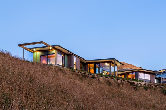
To see a long, low house, with minimal site disturbance and retaining, emerge in this otherwise consistently engineered landscape milieu shows what is possible with an appreciation of landform and landscape. The house looks as though it is on a much larger site that has been unconstrained by planning proximities.
The section is an oddity within the subdivision, caught between the road edge of a slope and the valley and new reserve below. It is narrow and long, no doubt originally conceived as a potential duplex or two-townhouse site. The architects saw the opportunity and possibilities of a leftover site arising as a quirk of topography, and noted that its adjacency to the reserve below and the street corner meant a house on the site would not be crowded on all sides in the future. The architects were involved closely with the client and developer in the site selection, and recommended this site rather than alternatives with more expansive views higher on the hills.
Known as the Long House, the building hugs the top of the hill and gently steps down the slope along its length. It has a close proximity to the street and footpath, which was negotiated with the developer to be moved slightly away from the house in places to give it more space. This creates a more urbane relationship between the house and street than typically occurs in suburbs with street-front yard setbacks. People stop and talk to the owners here because they can. This social proximity is carefully measured, with most of the house turning its back on the street and, where it does open up in the street direction, it is mediated by a solid-walled morning courtyard.
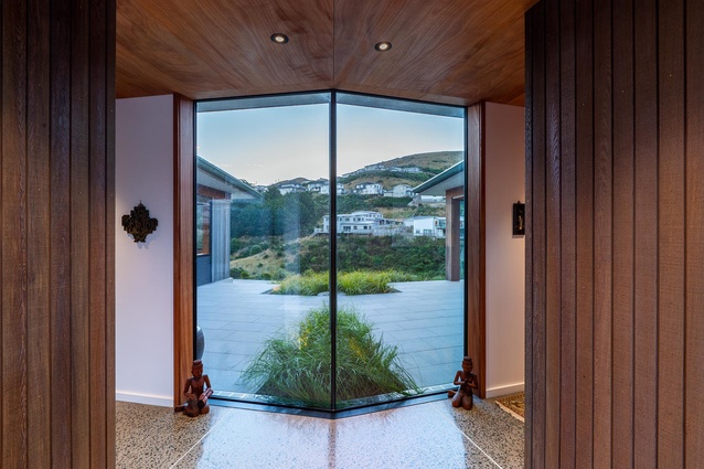
The house has a predominantly one-room-deep linear form that is bent in the middle, away from the street, to follow the contours. It is at this pivot point that you enter, through a double-splayed set of doors that also pivot with the bend. You arrive facing into a view through a central western courtyard and look across a valley to the houses and landscape beyond. The deft negotiation of public and private is also seen in the vertical cedar extending inside and out, with adjacent windows partially clear and partially translucent, giving a glimpse both inside out and outside in. Privacy is created, yet the exterior public realm is also engaged.

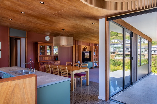
The planning is clear and simple, as is the shallow mono-pitch sectional form. Entry is between living and bedroom wings created between two extra-width living spaces: an evening lounge and a sheltered, exterior dining room and associated cooking and preparation area. From entry, there is a progression along the house, past a living space adjacent to the entry, kitchen, dining and lounge, and through to a laundry and service rooms, service courtyard, and a garage on the south.
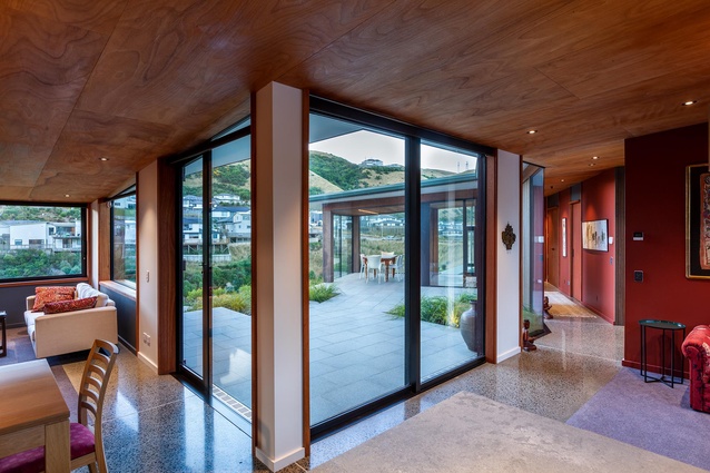
In the other direction, an office faces towards the street and a passage bends before stepping down two steps leading to the bathroom, spare bedroom, en suite and primary bedroom, located at the end of the house and opening onto a north-east courtyard. The Long House also creates space. It is integrated into its landscape, shaping the exterior as much as the exterior shapes the interior. Wide eaves moderate sun and give shelter. Four exterior courtyards are created to follow the sun and shelter from the wind outside as the weather changes.
There is also a crafted attention to detail with, for example, on the outside, the playful, layered fence design as you approach and the extra-thick roof depth (for passive house-type insulation), visually split by spoutings set down from the roof edge to divide and create a shadow line around the fascia. Downpipes free stand. On the interior, architraves extend from floor to the ceilings and accommodate a thicker door head between them, expressing the lintels visually and creating panels within the interior walls, which are subtly expressed through changes in colour.
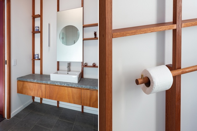
There is a significant amount of detailed furniture and joinery that creates consistency and order through the house. Bathroom details, combining vertical and horizontal accessibility rails and a roll holder within the overall panel design, gently remind us that inclusive design needn’t be obvious or clunky.
The disciplined design extends to a simple material palette. The interior consists primarily of painted walls, Eucalyptus saligna interior trims, Okoume plywood ceilings and polished concrete floors. On the exterior, a combination of painted, flat HardiFlex sheet sections with natural-finish, cedar battens contrast with naturally finished cedar sections, showing modesty, enlivened by landscape-sensitive colour that has helped to settle the house quickly into the site.

The house colour is a subtle but welcome contrast to the cream, beige and grey of the neighbourhood and subdivision. Greens and red-browns referencing the client’s original Craig Craig Moller house in Eastbourne are carefully combined with timbers finished with natural wood oils, neutral off-whites and charcoals, both inside and out. The colour use is restrained yet essential and distinctive, varying and juxtaposing panels of colour in a painterly way, integrating the spaces and forms as a three-dimensional composition.
The Long House gives a lot back: a not-so-gentle reminder of the huge value of the design experience of the architects, who have translated the brief and site possibilities into a calm oasis amongst the suburban clamour. Let’s hope this clarity of realised vision might also inspire land developers to see the deep value of site-sensitive design. Imagine the environmental quality if an architectural studio such as Parsonson Architects were asked to design a wider subdivision, as is now starting to occur in some places in Aotearoa.
The value of this approach is also evident in the study of past site-sensitive subdivision design, such as Turere Place in Whanganui by architect Michael Payne. In the Long House, the long legacy of Parsonson Architects’ houses exploring the spirit of place is extended; in this case, it is also opening our eyes to the enduring, underlying spirit of the whenua, even in suburbia.

