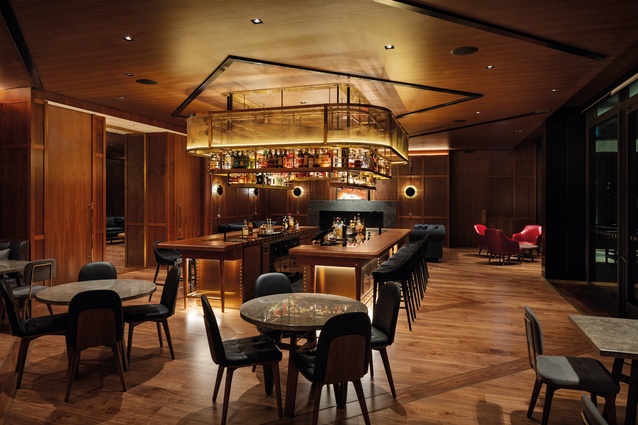
Found in translation
Jeremy Smith samples the high life low down at the a r + d and Bossley Architects-designed Park Hyatt in Auckland’s Wynyard Quarter.
[Editor’s note: Jeremy Smith visited the Park Hyatt prior to the August 2021 COVID-19 restrictions being imposed, when the entirety of New Zealand was in Level 1.]
I once visited the 51st floor of the Park Hyatt Tokyo to see a friend living out a fantasy high in the sky. Amongst the expected comforts were a distant view of Mount Fuji, a city far below and complete silence. This is the Lost in Translation bubble and the very hotel captured in Sofia Coppola’s 2003 movie. As actor Bill Murray puts it, in playing a role written specifically for him, “The more you know who you are and what you want, the less you let things upset you”. Hard to be too upset way up here, I suppose, but the paradox is real. When my eyes were tired and I could no longer see the mountain or the city, I could have been anywhere. So, what translates in luxury hotel life when you lower these highs?
The question sits front and centre in Auckland. For, whether counting population and urban space, airports and transit systems, high-end fashion stores and sporting events with yachts, or, conversely, difficulties with housing and life at the other end of the scale, Auckland has set an international course. Amongst all the upgrading, the five-star, $300-million Park Hyatt
has opened on a key waterfront site and carries an equally international cast: our own Bossley Architects, the a r + d team from Singapore, Conran and Partners from London on interiors, a Beijing developer and a client in Hong Kong. How does it place? I get all method-actor, go stay the night, and find something not only comfy but generous in the low-down.
I almost manage to book myself into the Park Hyatt Vienna on the way. This is the first taste of internationalism; a different kind of web connects those having this kind of life. There’s a language and consistency to keep you on your game. This might not be a question troubling many architects; apartments have individual tuning, while boutique seems to mean anything goes and even rooms out the back carry a one-off charm. What might be found in translation is all part of the architectural riddle for chain hotels following a kind of modernist dream and establishing an international style that works from Tokyo to Vienna to Auckland.
For Park Hyatt, this includes something of place rather than straight hotel cookie-cutting: think Kenneth Frampton Towards a Critical Regionalism1 or, in our case, some welcoming manaakitanga. Differentiating the experience is part of the playbook but so, too, is not upsetting the comforts. Most things luxury are found at arm’s length. It’s that velvet rope outside exclusive retail and why penthouses are up top.
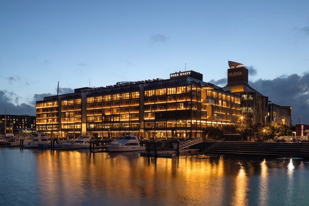
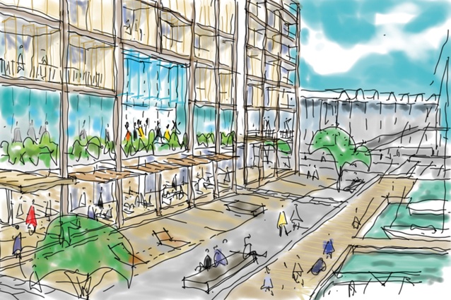
It is this high life that has been transcribed down to the Wynyard Quarter. The site is a full block between Julian’s old sea wall2 and the more-recently reclaimed wharf-side promenade, and comes with strict height limits, a streetscape on all sides and views across the viaduct. Throw in the armada of fancy boats moored into the foreground and there’s no hiding up in the crow’s-nest here. This Hyatt is far closer to deck, and both longer and wider than it is tall. At only seven storeys, the city’s flavour should be easier to taste so, as I imagine many of these jet-sets start the day, we begin with lunch.
Joined by architects Pete Bossley and Peter Sisam from Bossley Architects, we choose from the in-house collection of ground-level restaurants and bars which open outwards via a colonnade to the city’s public promenades around the building. As Sisam describes his conversing with a team from various corners of the globe, we settle into a corner café that admirably doubles as the hoteliers’ staffroom. The team’s keenness to provide an Auckland experience starts in this open colonnade and its broadening of the streetscape. The colonnade runs the building’s full perimeter and, with carparking banished to the basement, allows multiple pedestrian entries. “There is,” Bossley remarks, “no back door.” He might add “and no back elevation”, for, up above, the façade’s screening cloaks all four sides. This block-building from the ground up generates the place-making.
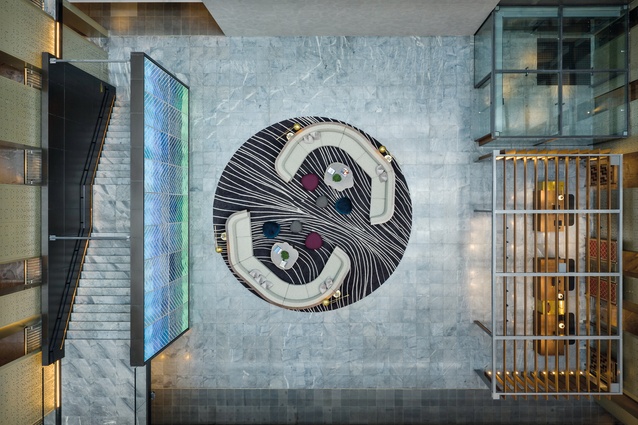
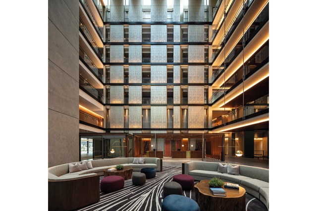
While rectilinear on the outside, the building is, in fact, a square figure of eight and a single room deep. Reception rests inside one of two enormous voids, each daylit from above and articulated whare-like with ribs out. These atria are then interlaced with a rounded circulation silo and upper walkways edging the void. Perforated riser panels intermittently provide shelter and, with circulation ends glazed or extruded outwards, wayfinding is visibly simple.
“Open a door, any door,” and you find Auckland in your view as you move from in to out. On the second floor up, that means opening to activities: a 25-metre covered external pool, gyms, spas and interconnecting event spaces with performance kitchens. There’s a social relationship with Aucklanders in play here: a wedding in set-up, flowers hanging for a Women in Business conference and tall chef hats that come with fine food. I doubt I’ve seen it all. A jazz band feels nearby. It might even spill out to the raised floor within the atria for the full surround sound. Those walkways layer like an amphitheatre from which to watch.

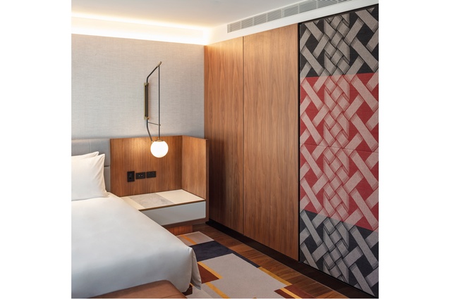
So, with the cars in the basement, the public interface on the ground and activities on the second floor, next up we find a pillow. Here’s where shimmering screens manage the proximity to life outside. There are 195 beds, one per room, and 15 arrangements. Some reach to the building’s edge, others sit in a little, but each is inviting and large in area (the typical room size is 48m2, compared to a standard hotel room at 32m2), and moves quickly to the view. Configurations broaden at the corners or as you ascend but entry, dressing, bed and living generally parallel powder and bathrooms on the way to the outward glazed doors. There, the external screens slide or pivot to change up the ventilation or transparency, with the practical sensibility of the air con turning off as the doors open.
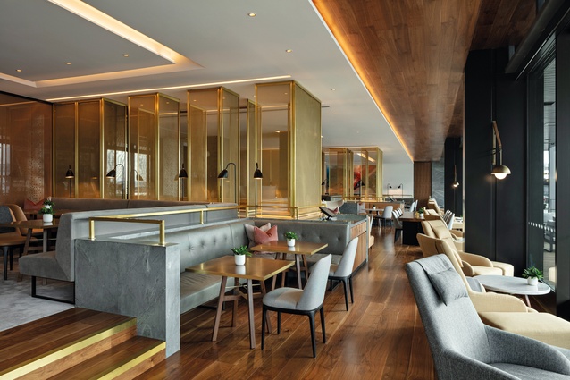
The interiors are part of the narrative-driven international styling which Tina Norden from London’s Conran and Partners developed from our “enviable New Zealand lifestyle”, numerous trips out and collaborative readings into the history and contexts with architects, iwi and artists. The palette is restrained, natural and smoothly detailed to tone in with the building. Added to the softly coated mesh screens are warming timbers alongside grey stone and exposed concrete, woven artworks, appointed furniture and soft material layerings to lounges and bedrooms – tapestries of “probably the most democratic, open and laid-back high-end hotel we have designed”, says Norden. There’s that taste of Auckland.
Up top, the screens give way to balustrades and private decking as the outer wall insets and forms a mansard shape to accommodate height limits. This perimeter translation feels more lost than the colonnade below but, perhaps, that is the point. Grand pianos are grand and, just as the Presidential Suite’s wardrobe clearly exceeds most airline baggage allowances, the view here is something else. Welcome to the seventh, come 51st, floor. Incredulously, we are still lower than the masts of the super yachts moored below. That you can still open a window speaks volumes about life in our part of the world. But, think also of how many extra hotel rooms might have been found in lieu of the colonnades, entries, view shafts, event spaces and setbacks. Making architecture requires personal and place-making generosity and this contribution grounds a stay here to Auckland.
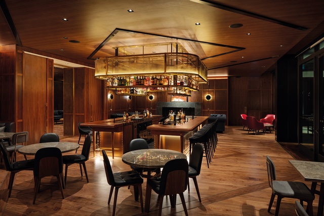
International brand hotels aren’t the realm of many architects. Yet, amongst all the nearby offerings, the a r + d and Bossley team lights a welcome entry. Wander past at night and the screens glow and shimmer with an artistry that feels like a full house while many of the neighbouring buildings seem otherwise occupied. Inside, our internationals are no doubt safely tucked up in their beds and cloaked with a fine taste of Auckland.
Perhaps being international actually means understanding ourselves and the collective responsibilities of kaitiakitanga. If nothing else, the building highlights the architectural efforts needed to transcribe life down as well as up. Most continue to live at low levels and, if the Pacific site is the “edge between land and water”,3 as Mike Austin so cleanly describes it, then the internationalising here is the down-low contribution. If Bill Murray comes to stay, I hope he spies a very normal-looking dingy or three tied up outside and goes for a walk to investigate.
Park Hyatt Auckland feels a very different kind of movie for, as Sophia Coppola concludes; “The unexpected connections we make might not last, yet stay with us forever”. It’s all found in translation.
1 Kenneth Frampton, ‘Towards a critical regionalism: Six points for an architecture of resistance’, in The Anti-aesthetic: Essays on Postmodern Culture, edited by Hal Foster, Port Townsend, Wash., Bay Press, 1983.
2 The eastern side of the Freemans Bay reclamation was defined by a solid concrete wall, known as the east wall. It became known as Julian’s wall, after A. T. Julian, the contractor who built it.
3 Mike Austin, ‘Regional identity in the Pacific’ in Culture-Space-History, Proceedings of the Eleventh International Conference of the Association for the Study of People and their Physical Surroundings, Ankara, Turkey, Vol. 5, 1990,
pp. 143–150.

