Four techniques: Lawrence Nield
2012 gold medallist Lawrence Nield highlights critical techniques for architecture: modelling, carving, casting, opening.
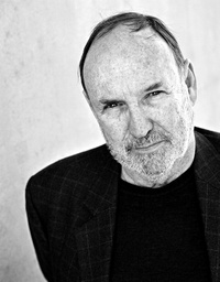
“Architecture is the framing of the lives of people and materials in response to circumstance and situation.”
In the substance of architecture, there are four critical techniques for the crafting of materials: modelling, carving, casting and opening (aperture, porosity and transparency). These techniques allow an architectural element to be made into an apparent constructive fact.
First: modelling and carving. Modelling is additive: clay is added to clay, brick is added to brick, tile rests on tile, panel is connected to panel. Jointing is expressed and celebrated. Carving is reductive, the result giving the appearance of coming from a bigger lump of timber or stone. Though made out of elements (modelled), a picture frame, to give a simple example, could be constructed to make it look as if it is carved from one block of timber. Classical columns seem to be cut from one block of stone. Again and again we seek to unify an assembly of components, by secret jointing, by mitre cutting, by cover moulds and moulding, or by rendering and painting. We want to communicate a “wholeness,” a sense that the building is carved from one enormous piece of material.
A modelled clay figure can be cast in bronze or concrete, so to modelling and carving we should add a third process: casting. Cast concrete can look like a timber frame or a massive bridge abutment. Cast-iron lace on the balcony of a Sydney or Melbourne terrace looks quite different from a carved timber balustrade. We are containing a fluid that slowly hardens. Particularly with in situ concrete, we remember the lost formwork. But precast is just another panel delivered on the back of a truck.
The fourth, very significant technique is opening, which is the making, ordering and handling of aperture, porosity and transparency. Often we want modelling to communicate carving, or carving to appear to be modelling, or casting to look like either modelling or carving, or “opening” to get us to see “thickness” and “substance”! We are making apparent constructive “fact.”
Nothing gives life to fabric and buildings more than apertures, porosity and transparency. Apertures allow connection to, and understanding of, air and wind. They make darkness and light. Openings proclaim habitation – or more often a story of habitation. Orderly habitation is often portrayed by openings, while shutters, curtains, vines, flower boxes and barbecues on balconies are less orderly, but intriguing, signs of habitation. We are surprised to see habitation in some buildings today, as they are so sealed and shiny.
Adrian Stokes famously expressed the importance of porosity: A loggia of fine propositions may enchant us, particularly when built aloft, when light strikes up from the floor to reveal over every inch the recesses of the coffered ceiling or of vault. The quality of sanctum, of privacy, joins the thunderous day. A loggia secures the interior to the exterior, it eases the bitterness of birth: affirms that in adopting a wider existence, we activate the pristine peace.
The four techniques apply just as much today as they did yesterday.
Carving/casting
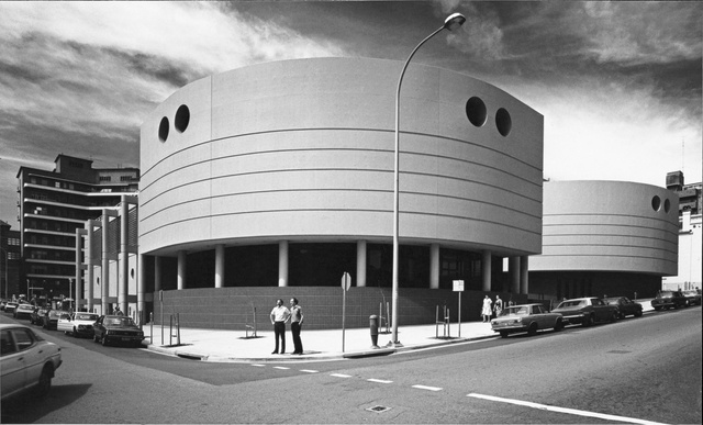
My first major design was the David Maddison Building - the clinical and research building for the innovative School of Medicine of the University of Newcastle completed in 1981. An aggressive environment potentially attacked the building from both sides. Sand and salt-laden air came from Newcastle’s beach and sea onto the east of the building, while the west caught the acid rainfall out of the steelworks. We thought from early on in the design process that we would use stainless steel (and painted concrete). We developed the profile and the detailing to make the stainless steel wall as though it were made of one piece. Brake presses in Newcastle profiled the stainless steel. There was no visible jointing - the joints were hidden behind the columns. The profiled return corner pieces were handcrafted by a car smash repairer. The stainless steel appears “carved” and smooth, contrasting with the rough, matt painted concrete. Smooth steel flues grow from the steel walls - handrails catch light and air.
Casting

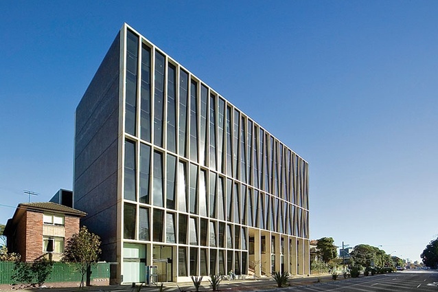
L5 at UNSW is about casting concrete as thin, 250 mm intersecting blades, which are both structural and a brise soleil. In situ concrete with white cement in the mix was poured into well-crafted waterproofed forms to give precise “light” blades still proclaiming their hard substance. Brushing back to reveal the shiny silica transcribes the material some way back to the original limestone. Drabness is prevented. Brick and terracotta easily communicate their fired clay origins and the skills of the layers. The modelled brick on the side elevations of L5 contrasts with the unitary lattice of cast concrete.
Modelling
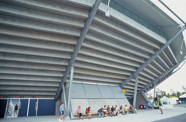
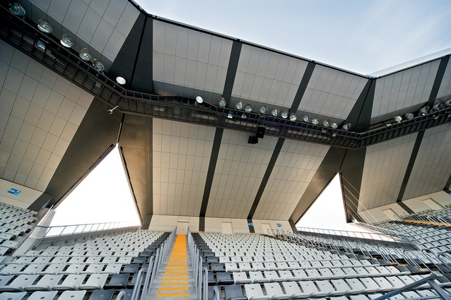
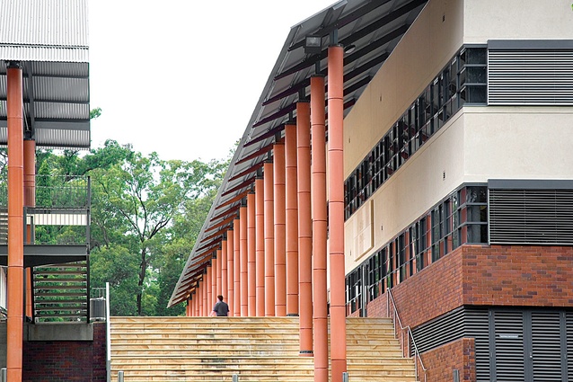
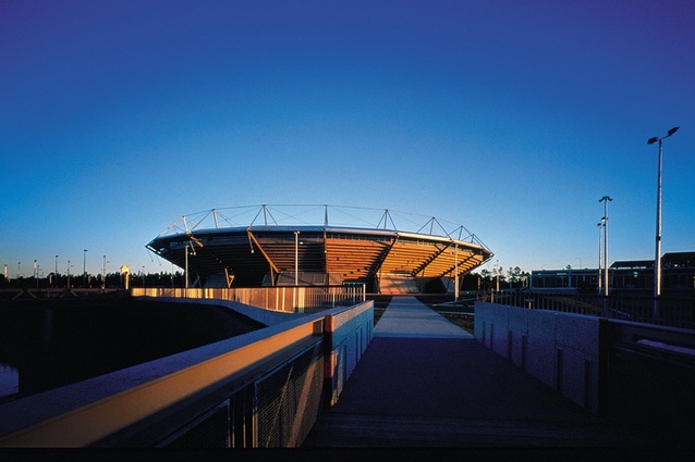
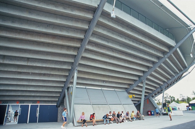
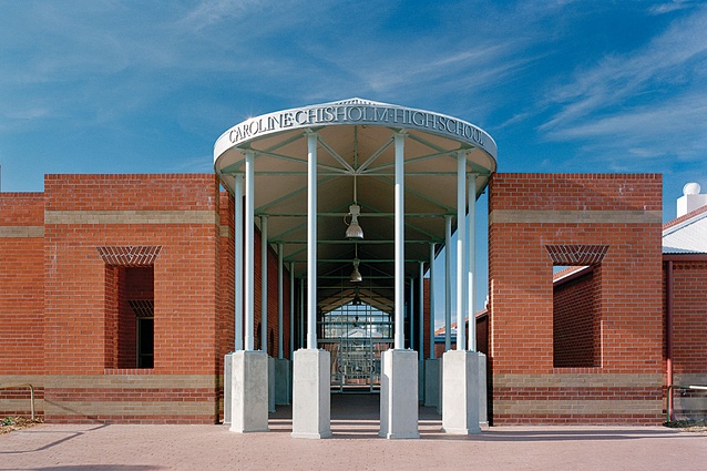
Most buildings are additive, or “modelled” as a composition of components. At the Sydney International Tennis Centre precast concrete seats rest on raking beams. At Caroline Chisholm High School brick rests traditionally on brick.
Carving
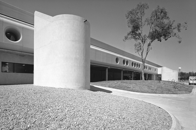
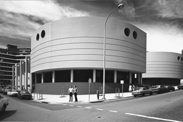
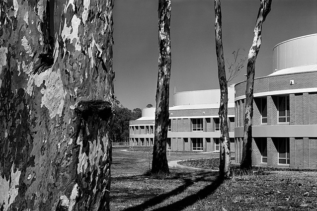
Mount Druitt Hospital was designed using aluminium at almost the same time as the David Maddison building. The three curved, two-storey nursing units on the north-east are walled with clear anodized ribbed aluminium and shaded by multiple curved aluminium louvres over glass-reinforced cement-clip on bathrooms. The opposite south-west elevation two-metre-deep holes, in glass-reinforced cement, let shaded light deep into the treatment and diagnostic areas. Above the deep shading is more ribbed aluminium running seamlessly for 150 metres. Again, crash repair shops made the specially chamfered closing pieces to keep the visual strength of the wall. To be continuous and to curve, the louvres are a complex three-piece assembly of two extruded pieces linked by a varying aluminium sheet. The louvres seem unsupported, grabbing the air. Concrete, glass-reinforced cement and the shine of the aluminium make a building with a scale from rough to smooth.
Carving/modelling/opening

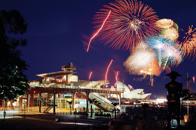
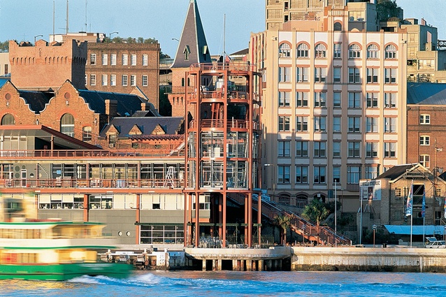
At the Overseas Passenger Terminal at Circular Quay there was an architectural metamorphosis that uncovered the rugged plate web steel structure and added a round tower framed with rolled I-beams and channels. The steel feels heavy and immovable against the floating ships. Originally twin splayed escalators (now removed) at the southern end made complete circulation comprehensible. Railings take hold of the air and light.
Opening
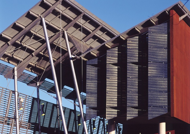
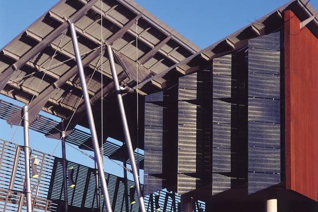
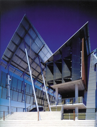
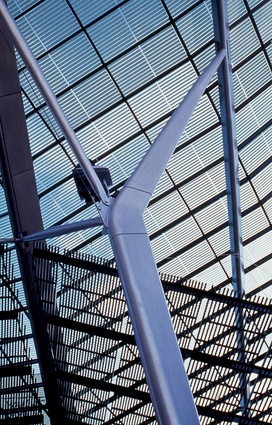
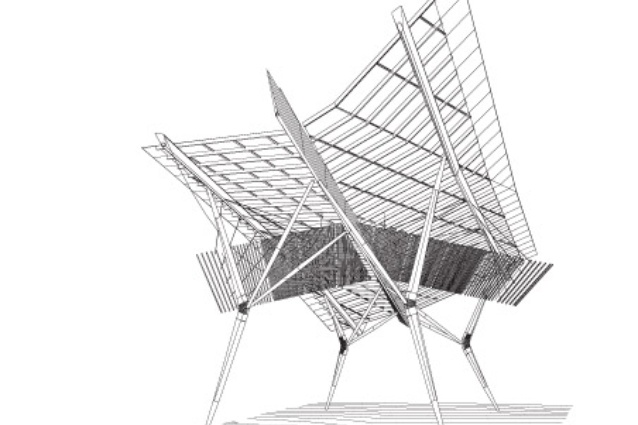
The University of the Sunshine Coast Library and Queen Street Mall structure (1999) in Brisbane use glass and bring together steel framing, porosity and transparency. These active frames juxtapose perforated mini Orb, glass and timber slats and fritted glass to produce flickering light and shade. The processes of porosity and transparency work best in strong light. The slats and screens seem to be grabbing the air – the air becomes a material of the building.

