Fox Street office
Scratch any surface and one is bound to find some history. Take for instance Fox Street, in Auckland’s “oldest suburb” of Parnell; in the late ’60s an anti-Vietnam War protestor flung dynamite into what was then a Navy depot there. It was also on this street that, back in the late 1910s, during the early global shift from horse and carriage to motor vehicles, the Colonial Motor Company set up a small assembly plant where Ford’s popular Model T, and some of its nascent tractors were cobbled together.
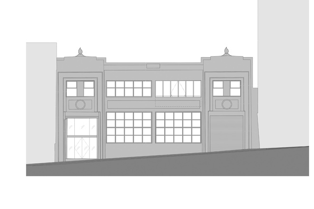
That same property, which was originally designed by Wellington’s J.M Dawson in an early art deco style – is now home to RCP, a project management firm, which in 2012 enlisted Fearon Hay Architects to scratch the building’s surface in search of visual histories.
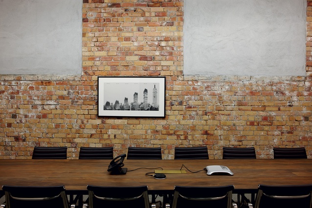
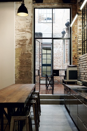
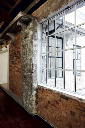
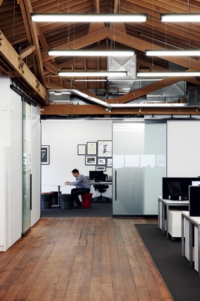
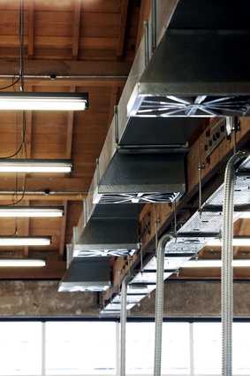
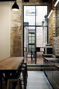
What the architects uncovered was a rich palette of textures, tonalities and shapes. The freshly exposed bricks ranged from pale yellow through to burnt charcoal, and varying degrees of sunset red. Porous concrete pillars have been exposed and left to serve an aesthetic rather than purely functional purpose. Chunky wooden rafters on the second floor have been brought out, the heavy bolts and metal reinforcements lending the structure an almost maritime feel. Air conditioning ducts, water pipes, infill shear trusses have all been purposefully highlighted.
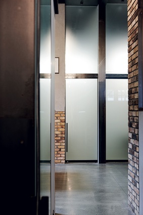
To call the end result industrial, however, would be too narrow a definition; this could have been a heavy and masculine overstatement but, thanks to some almost gentle detailing, the resulting space strikes a nice balance between industrial and human scale. For instance, most doors leading to meeting spaces are made out of semi-translucent glass with thin, dark metal framing and elegant long handles. They evoke, in a way, the frailty of Japanese shoji screens. Hand-applied textures (window putty, cement on bricks, soldered joints on hand rails and paint on the lift casing) have all been accentuated rather than slicked out, serving as further testimony that human hands were responsible for this space.
“We wanted to expose the fabric and extend it… and in the places where we needed to create division and privacy we made a simple move of using white free-standing walls and spacial definitions apart from the brick and timber. It was a simple move to create insertions rather than force connections between spaces,” says architect Jeff Fearon.
The materials and treatment of this space echo those of the Imperial Buildings in downtown Auckland (another Fearon Hay, award-winning project). “The Imperial was a catalyst for us to to do this project… yet the main difference was of course that I wouldn’t call the Imperial a ‘light touch’ project. We had to do a lot of structural work there to unlock spaces whereas this was a lot more light touch. It was more about looking at what was already there and making it work,” says Fearon.

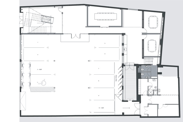
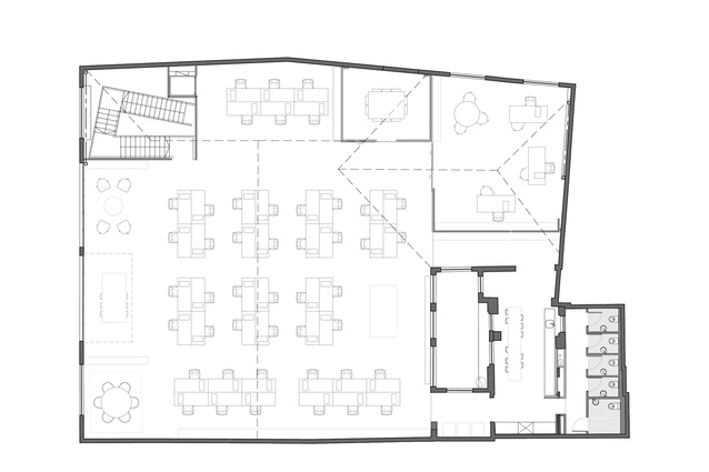
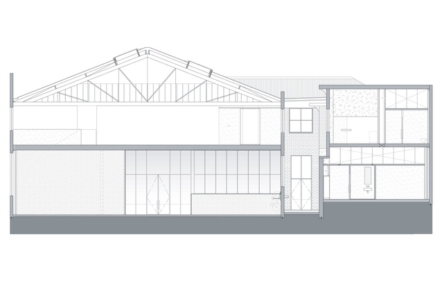
One of the main and immediately obvious assets of the buildings is a small internal courtyard – now used as a social space – which acts as the main light source for the building. “The lightwell had potential for a focusing of social and meeting spaces on the lower and upper floors,” says the architect. “We used this as a central organising device for the rest of the work and extended it to create a footprint into the circulation spaces.”
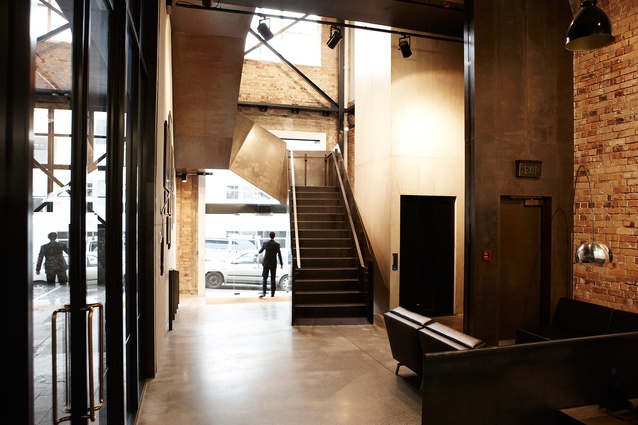
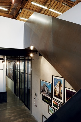
Also immediately noticeable is the ample, steel-plate staircase which welcomes one to the building and stands solid as some form of sculptural origami.
“It was a design mainly shaped by restriction,” says Fearon with a laugh. “We probably say that a lot about many of our designs, but this one came about from trying to find the most sculptural result to a series of spatial restrictions.” These restrictions included fire cells that needed to fall into specific areas, accessibility requirements (in terms of gradients and ramps) and how close the stairs needed to be to the lift. “Yet we also liked the idea of winding your way in, in an elongated fashion, and being brought close to the textures of the building. It was an experience that we enjoyed and wanted to pass on.”
There are many other small, accidental surprises to this building. The restrooms upstairs are guarded by a heavy, John Tann vault door (Tann is widely considered to be Britain’s first safe maker). The walls on the old Colonial Motor Company garage are a patchwork of materials (including the odd weed growing in between the brickwork), colours and a partial advertisement from years gone by. Former windows that at one stage were sealed with raw concrete have remained that way.
The refit’s deceptive simplicity sees interior design as a form of sculpture (the subtraction of material finishing until one finds the perfect shape or surface texture); it plays with various dichotomies (old and new, fragilty and strength, obscuring and exposing) and, most of all, it evokes a variety of readings and highly eclectic influences.
The Fox Street project has already earned Fearon Hay Architects two major awards: Gold in Spatial Design – offices and workplaces – at the Best Awards and the Heritage category at the NZIA Auckland Architecture Awards. The accolades, in this scribe’s humble opinion, are undoubtedly deserved.

