Fresh palette: The Rabbit Patch
Walk into most childcare centres and you will be greeted with a rainbow of clashing colours and zany patterns, with a backdrop of practical, commercial-grade surfaces. Not in this one.
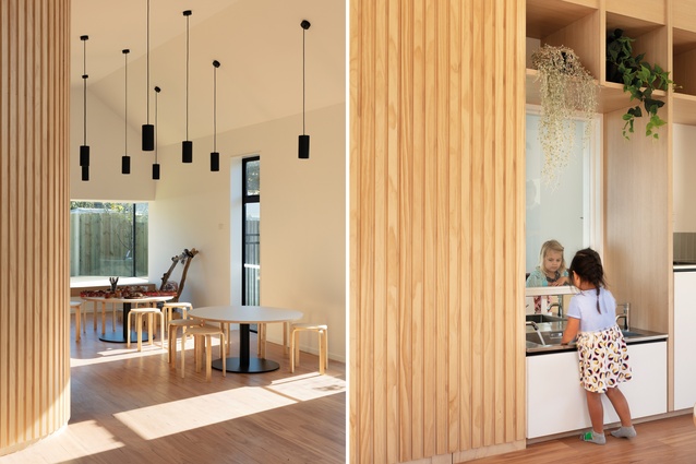
Located in the suburb of Burnside in Christchurch, The Rabbit Patch is a purpose-built preschool that operates on the Reggio Emilia philosophy of learning, which includes seeing the learning environment as an additional teacher. Providing a base that is natural and neutral allows for the child to imprint their own thoughts and expressions on the centre, and that is the brief that was provided to Phil Redmond Architecture & Urbanism (PRau) from which to create the design for the preschool.
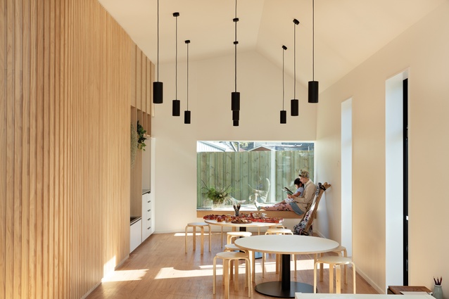
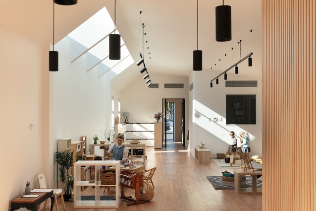
“The idea is that you are creating a space that is not specifically a childcare centre but is homely in terms of scale,” says architect Phil Redmond. “The natural palette provides a blank slate for the kids to engage with and fill with their own ideas. It’s a very arts-based centre. They use a lot of natural materials to create art that adorns the space. So, it fills with the children’s creative ideas rather than being saturated in colour and kid-specific shapes and forms. The children take ownership of the space.”
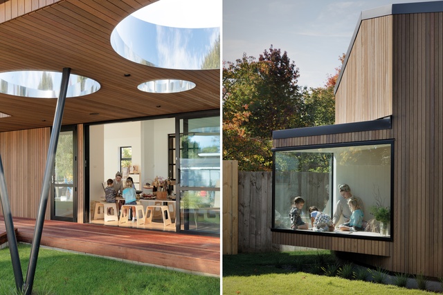
In terms of plan, the building is angular. It interacts with two other buildings on the same site, which house other age groups of children, and its shape creates a courtyard that opens onto the existing playground. A special feature is a ‘bird’s beak’ window seat, which articulates one corner of the building and forms a sunny spot in which to read or create, adjacent to a mixed-use atelier area.
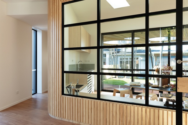
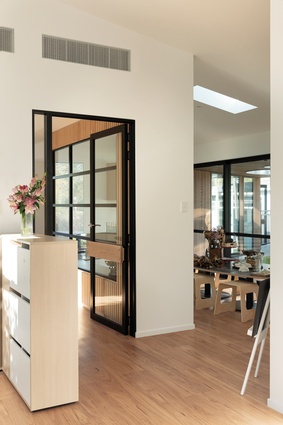
In contrast with the exterior, internal walls are curved. “The curves came from creating a flow within the space so it naturally progresses between different areas without defining them sharply with angles,” says Redmond.
The roof over the deck features circular cut-outs with reflective inner surfaces, which seem to soften the angles of the architecture and also inspire the children to pause and look up. On wet days, this would create some interesting conversations around rain. Those who know of Phil Redmond’s previous work (e.g. the award-winning Rhodes House in Christchurch) will appreciate that there is a PRau signature metal V holding up the roof here and doubling as a whimsical feature for the children to hold onto and spin around.
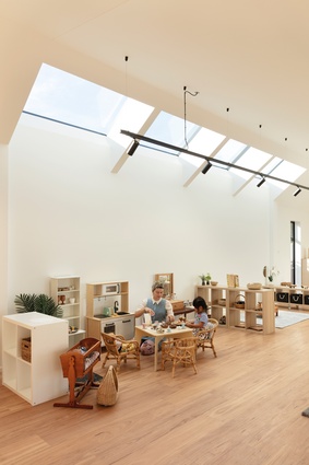
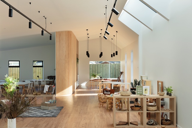
A circular skylight in the entranceway furthers the theme and adds another sense of interest to the interiors. “The interaction for the children through light, shadow and reflection is really interesting and ties nicely with their [inquisitiveness] and experimentation,” says Redmond.
Furniture is a mix of PRau custom designs, such as the work tables, and off-the-shelf childcare furniture, such as the Aalto-esque chairs in the dining area. Designing for a smaller-scale human being was an involved process, says Redmond. “Functional items for the children – tap heights, sink depths and the like – were the trickiest. You want the children to be independent so there was a lot of time working out what appropriate responses were.”
Walls are lined in whitewashed plywood overlaid with pine battens. The vertical battens carry to the exterior cladding, creating a sense of continuity and neutrality. “Vertical battens were chosen to disrupt the perception of the length of the hallway and the main space. We also feel the vertical battens articulate and add a nice tactile element to the curves in the spine wall,” says Redmond.
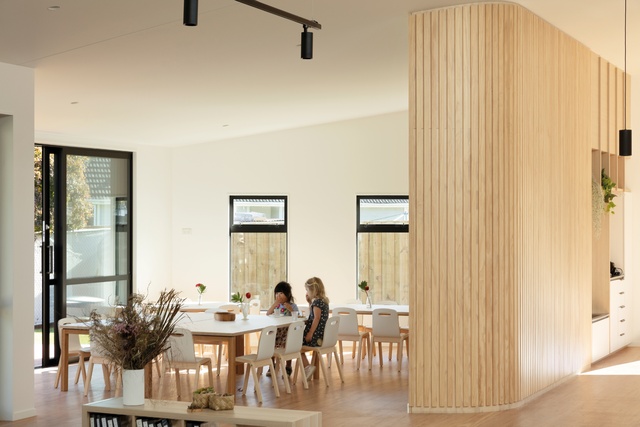
Lighting is chosen from the Unios range. LED fittings are used throughout and varied in some spaces to define zones. A cluster of pendants gives the small atelier area a cosy scale for the children, who often work at ground level. Track lighting with positionable spots allows for artwork on the walls to be illuminated.
For PRau’s architectural graduate Madeleine Clarke, the design of The Rabbit Patch held special meaning as this was the preschool she attended as a child. “It was a privilege to have been able to design the new building, having gone there myself and then be closely associated with it through the years. The scale and feel to the street are subtle and of a residential scale – not showing off. The focus is on the experience for the children.”
This article first appeared in Interior magazine.


