Game of stealth: Macmasters Beach House
Replacing a 1940s weatherboard cottage, this pragmatic new beach house by Polly Harbison Design responds sensitively to its environment while resisting the temptation to hide.
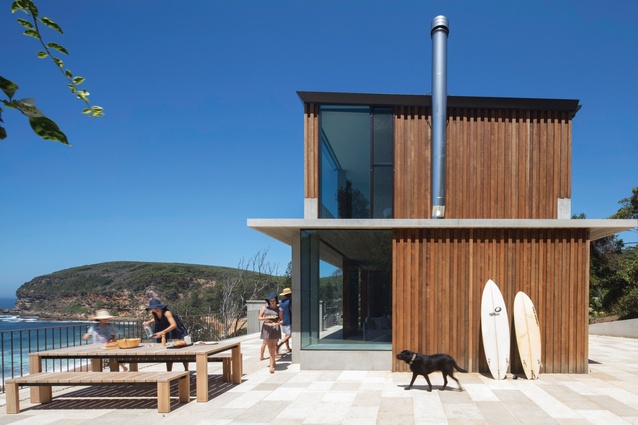
Macmasters Beach House by Polly Harbison Design plays a game of stealth. In a secluded pocket of the New South Wales Central Coast, it hides in plain sight above a sand dune – a concrete bunker sheathed in silvering hardwood and screened from the street by a grove of banksias.
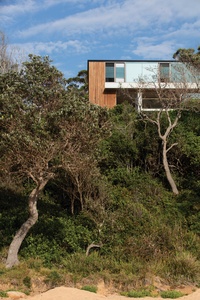
The house replaces a 1940s weatherboard cottage on a steep beachfront site, bordered by two neighbours, a bushfire flame zone and a sand dune along its eastern boundary. Its owners had occupied the old cottage for two years before it partially collapsed in a storm. Implicit in their brief to architect Polly Harbison was the idea that its replacement should be of monumental strength, with modest detailing. “A robust and pragmatic beach house: comfortable but not fussy,” explains Polly.
“Our challenge was designing a holiday house large enough for a big family, without dramatically increasing the original footprint (we jumped from fifty square metres to nearly three hundred). We also wanted to retain as much landscape as possible and actually increase it. So our strategy was to make the house a distinct object within the bush and use circular retaining walls to ‘scoop’ into the site.”
This resulted in a slim rectangular tower on the old building line, circumscribed by two elliptical landscape walls – one along the western terrace, the other around a parking bay. The tower is distinct but not obtrusive. Much of its floor area is excavated into the hillside, allowing the architect three storeys instead of two, so the increased program occupies a far smaller footprint than is permissible. It also results in a tightly resolved floor plan: top floor for adults, middle level for communal gathering and the kids’ domain on the lower ground level – “the land of wet towels and kids, friends and surfboards,” as Polly calls it.

This downstairs zone of two bedrooms, a bathroom, rumpus, laundry and storage space opens out to a small lawn, where the old driveway once terminated. In re-sculpting the site, the garage was dispensed with and cars cordoned off near street level, encircled by a low retaining wall, allowing garden and bush to reinhabit the space between the house and beach.

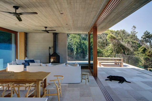
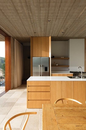
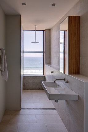
From the beach, only the top storey is visible. Behind tinted glass, its private sanctuary is occupied by a main bedroom and guest suite facing squarely out to sea. The communal centre below combines the kitchen, dining and living room, adjoining two outdoor terraces, one in front of and one behind the living room. Three-metre-high sliding glass doors open the interior up to these terraces. It’s designed for high winds so that even with the doors closed, it’s possible to sit outside on the western terrace and see the ocean through the prism of the living room.
“It’s not a huge room, but the view is epic and the building is hard, so we wanted to dial that down with some comfort,” says Polly, explaining the hierarchy of finishes through the house, which privileges the communal space. Sheer white curtains, sandstone flooring (as warm as limestone underfoot), a cast-iron fireplace and thick hardwood frames around the sliding doors set this level apart.
For economy’s sake, aluminium window frames were used on both the top and lower ground levels, but skilfully rebated into the thick concrete walls. The top level is carpeted with sisal, while “kids’ world” is low-maintenance and raw, with concrete floors and the barest joinery essentials. Its open-air entry, just a few steps in from the outdoor shower, is permanently draped in drying swimmers and wetsuits, and towels and toys and thongs.

Michael Cooke’s landscaping holds the bush and beach together, mixing natives and exotic plantings. Rough and smooth concrete steps, and elements of aggregate and hardwood, make subtle distinctions between the private domain immediately surrounding the house and the more public domain toward the site edges. In time these will fade and be overrun with creepers and grasses, dissolving back into the dune.
This is a pragmatic house. It is as beautiful as it is blunt, in a way that perfectly matches the setting. While the old cottage was very much of the local vernacular, this is clearly not. Polly’s archi-crush is for the “fat walls and rough textures” of Swiss practice Wespi de Meuron Romeo Architects and its fetishised alpine chalets. This influence is evident in the way Polly has carved the concrete shell to crop and control views, rather than revealing the views all at once, and in the texture of the living space’s off-form concrete ceiling.
“I love the timber texture of this ceiling. The builders hadn’t done it before, but were really excited by the challenge. When the forming boards came down, they re-used them to line the downstairs ceiling,” says Polly. “They were quite resourceful like that. They built quite a lot of the joinery and hardware details – like handles and hooks and benches for the wardrobes – using salvaged timbers from the old cottage. So in a way it lives on.”
This article was first published in ArchitectureAU.com.

