Garage land
The collaborative force behind a number of new Britomart, Auckland hospitality ventures talks us through the monochromatic semi-industrial interior of the Tyler Street Garage.
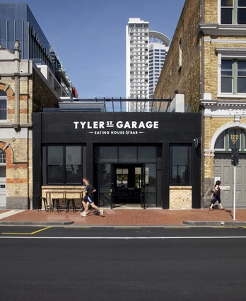
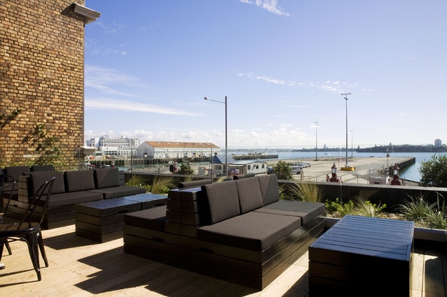
Twelve months ago the only thing you’d be parking at Tyler Street Garage would have been your jalopy. Times change. You can now park your car down the road, and park your posterior in a semi-industrial drinking establishment. Oh, and for a shot of fresh air, you can retire to a rooftop terrace and watch the gantries rolling across the road at the wharf. If you want to see what really goes on behind the big red fence, now’s your chance. It’s a good time to be a design-conscious imbiber in this city. Aucklanders may at times be oversaturated, but it’s fair to say they’ve never been oversaturated with choice when it comes to finding a small spot outside to while away some time.

Tyler Street Garage was once an old single-storey carpark building on Quay Street. Designer Kirsty Mitchell and architect Tim Dorrington worked on this project and the neighbouring restaurant Ebisu with Lucien Law. The idea, says Law, was to create a bar with great food drawing on the raw industrial form of the building for inspiration. That said, achieving the right sort of refined rawness suitable for food and drink presentation required a fair amount of finesse. The quest for simplicity is, most designers say, a fairly complicated path.
It starts with a definition, says Law. “How do you reference the garage — but make it good enough to eat in. What do you keep? It was important not to get all tricky or try and theme it. There was no way we wanted it to descend into spanner door handles and hubcap dinner plates.”
And why Britomart? Law says the decision was fairly obvious, with Britomart Station a hundred metres away, a few thousand additional workers about to occupy the new East Building, Vector Arena down the road and “five other great bars down here”. The heritage character of the buildings was also a motivation.
“There aren’t many buildings left like this in Auckland. You can’t invent them. This area is an area to bet on, just because of the mixed use nature of it.”
Architect Tim Dorrington, who shares a Herne Bay workspace with Mitchell, also collaborated on the project. Tyler Street Garage, he says, actually ‘borrows’ its heritage-controlled brick walls from the neighbouring Union Fish and Northern Steamship buildings.

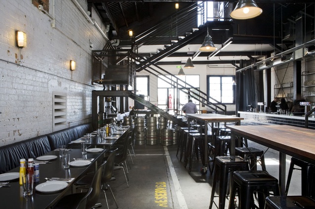
“The Garage is basically a negative space between two existing buildings. Those sidewalls aren’t technically this building’s walls, but because they are heritage walls we made an intentional decision to mount the services and fittings on the walls. We could have, if we’d wanted to, chased in wiring to grout lines and hidden it up, but these are heritage walls and so all the services are surface mounted. We’ve basically exposed everything.
It is easy to think that exposing services might make for an easier job, but as Mitchell points out, great care was needed to ensure authenticity, to make the design appear “simple and honest — as though it had always been there”.
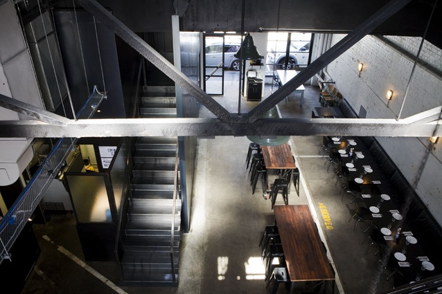
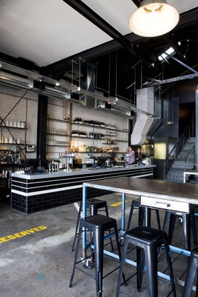
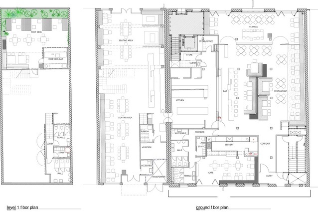
Tyler Street’s main ground floor hall has been designed to maximise the existing industrial bones of the building and reference its recent history as a garage. The existing concrete floors were cleaned and sealed and special effort went towards retaining the parking lines and ‘reserved’ markings of the previous occupier. The brick walls, Mitchell says, remained relatively untouched, and the existing structural steelwork was stripped and painted black to make it more prominent.
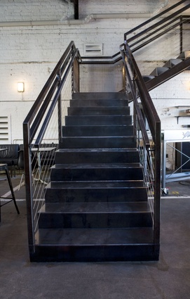
Tyler Street Garage is north facing with a flat section of roof above Quay Street. To access this space required what was perhaps the most significant architectural intervention: an industrial-style ‘blue’ steel stairway.
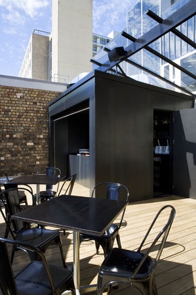
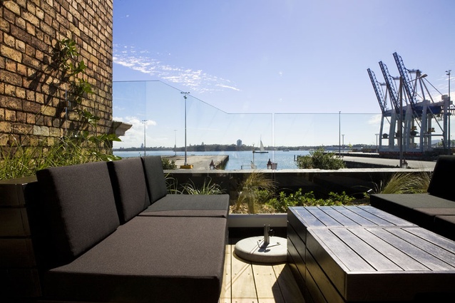
The roof deck was tidied up with new timber decking, a planted garden and fully working bar added. It’s a space sheltered on either side by those brick heritage walls we mentioned earlier, and these frame expansive views. Here patrons can sit on built-in lounge seating sheltered below a floating acrylic roof and warmed by an open fire.
The paradox with semi-industrial venues is the care required to work them into usable shape. Here, a monochromatic palette extends right through to branded elements. Colours are limited to black and white; materials throughout are raw industrial concrete, glass and steel. There is a nice contrast in materiality, raw rubs against soft, new steel meets rough brick and the leather-covered booths soften everything. And then there is the bar, low and open with a riveted steel top on a tiled base and a back bar of steel tube and glass.
In the end, says Mitchell, the question is, how far do you go? “For instance, we had a lot of conversations about the walls. You want to get them clean but how much do you take off? You want the feeling that it’s still a raw environment, but you can’t re-create that. So you don’t want to take it back so far that you’ll lose anything, because you can’t get it back again.”

