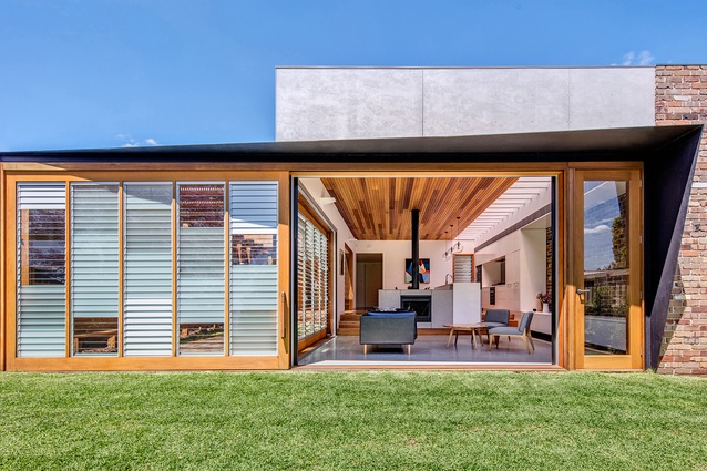
Garden pavilion: Canada Bay House
This clever alteration and addition by CplusC Architectural Workshop effectively uses one space and retractable walls to create a diversity of spatial moods and experiences, without enlarging the home’s footprint or sacrificing the backyard.
Canada Bay is one of those relatively unspectacular, family oriented, inner-western-Sydney suburbs resting quietly along the shoreline. Located halfway between the CBD and Parramatta, it sits pleasantly at the southern dogleg end of a larger sweep of water, Hen and Chicken Bay, off the Parramatta River. It is a place where land and water meet gently, on the flat or slope, forfeiting breathtaking drama for softer, calmer reflection. Canada Bay is pressed up behind the better-known suburbs of Five Dock, Burwood and Concord, which boast some of Sydney’s most impressive Federation and inter-war homes.
Architecturally, this is a suburb that wears an unselfconscious, unpretentious, solid ordinariness. Populated originally with modestly sized Federation and inter-war homes, it now holds a somewhat chaotically diverse muddle of old and flashier new dwellings, speaking a range of less than harmonious languages.
It’s a delight, then, to find unexpected moments of architectural inventiveness, such as this recent alteration and addition by Sydney architect and builder Clinton Cole, founder of CplusC Architectural Workshop. Clinton’s clients were a young couple with a new baby and potentially more on the way (they now have two active boys under five), who’d quickly realized their three-bedroom, one-bathroom home no longer accommodated them comfortably.
They wanted additional space in which to entertain and live – an open-plan kitchen/dining and living space, an extra bedroom and bathroom, a new laundry – but without sacrificing too much of the backyard. And, they wanted more daylight throughout their home. The simple brief was made slightly more complicated by a request from one of the owner’s parents – in line with feng shui principles, they asked that the back door not be visible from the front and that the addition speak of permanence.
The more complex challenge was the site, a gently sloping south–north block in a quiet cul-de-sac, uncomfortably sandwiched between a solid-brick duplex to the west and an even larger, more imposing two-storey brick house to the north. Both buildings sit heavily over the site, impacting solar penetration, overlooking the rear garden and presenting major privacy issues.
Clinton’s response is, he says, an exercise in material, time and cost-efficiency. To work with the client’s budget, the original single-storey, double-fronted brick home was largely retained, with rooms refreshed and reconfigured: four bedrooms and two bathrooms to the front; and a new laundry and kids’ rumpus/family/guest room centrally placed, the latter facing and opening to the rear garden and new courtyard. Old rear lean-tos were demolished and a new open-plan “attached pavilion” stretched garden-wards along the western elevation to house the kitchen, dining and living spaces.
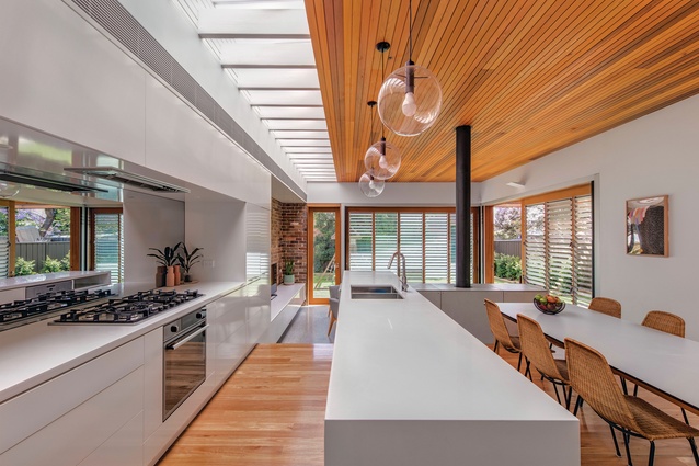
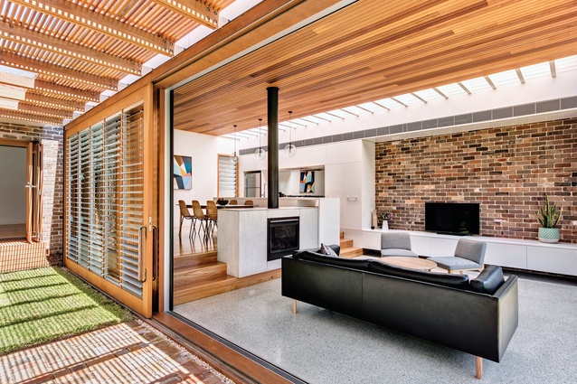
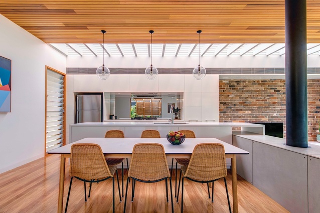
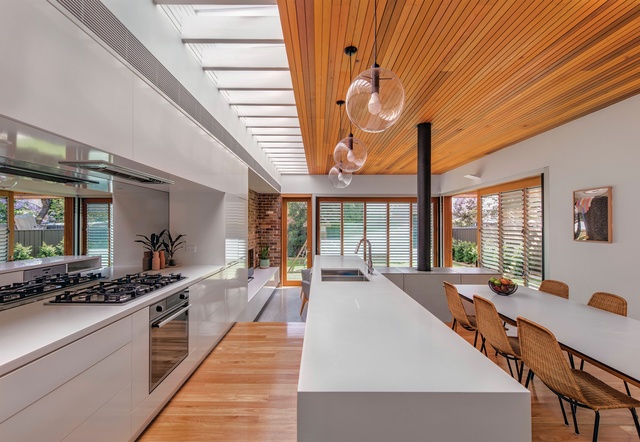
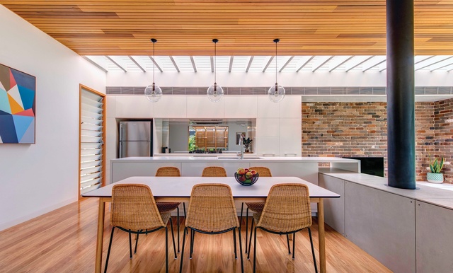
Cooking and eating areas have been kept level with the existing house, with the living space stepped down to connect directly with the garden. A long polycarbonate skylight and single ceiling covering the space increase its sense of volume and height, with floor-to-ceiling glazing wrapping the northern elevation and most of the eastern for light and ventilation.
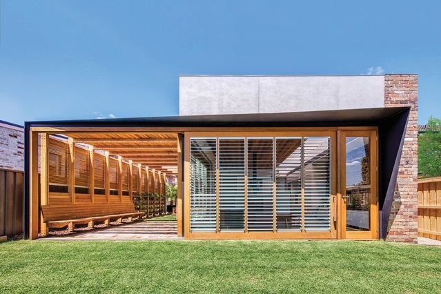
Stretched alongside and thoughtfully balancing this calm indoor space is a delightfully active outdoor one – a joyous, timber-framed pergola, accessible through both the rumpus and living spaces (perfect for young children playing chaseys or doing laps). Horizontal timber battens have been used to minimize overlooking, with a motif of recycled brick running through the new addition and referencing the old.
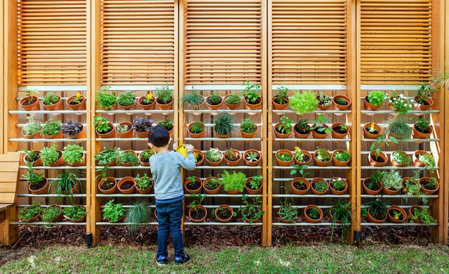
Responding to the client’s enthusiasm for cooking, a vertical herb garden has been seamlessly integrated into the pergola design. Positioned directly opposite the kitchen/dining space, this lush greenness of plant-filled terracotta pots inserted between galvanized pipes is charmingly reflected in the kitchen’s mirror splashback.
Without question, the most striking feature of this house is the visual, emotional and physical connection created between all rear spaces (both internal and external) and the garden. Clinton has successfully blurred lines between indoor and out (a claim often made and almost equally often overstated), and, most importantly, he has ensured privacy is not only maintained but also enhanced.
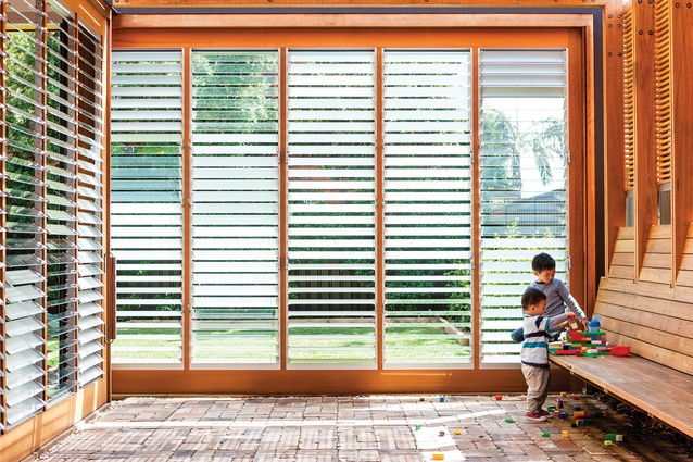
Key to this is the positioning of two floor-to-ceiling, timber-framed and louvre-filled sliding doors, positioned at right angles on the pavilion’s northern and eastern elevations to create a variety of outdoor/indoor space options. Inserted with a combination of aluminium, opaque and transparent louvre blades, strategically placed to provide privacy to the living space from surrounding neighbours, they also allow an abundance of light and ventilation into the house.
And, they afford the owners the opportunity to open or shut spaces to the garden as required. By sliding the north-facing door east, the living space is opened fully to the garden while enclosing and folding the pergola into the house. Similarly, sliding the east-facing door south fully opens the living and pergola spaces.
Transition through these spaces comes with a pleasing, playful shift in materiality, textures and patterns. The smooth warmth of timber flooring in the kitchen and dining space (chosen to match the existing house) gives way to cooler, smooth concrete floors in the living area, and then to rough textured brickwork and verdant grass in the pergola.
These two modest spaces offer multiple options to close off or open up as desired, allowing for a diversity of spatial moods and experiences. So simple, so clever.

