Garden revolution: House Au Yeung
With a wink to the brick cottage’s Arts and Crafts heritage, this addition by Tribe Studio relaxes the home’s original formality, brings focus to the garden and offers thoughtful elements of surprise.
The owner of House Au Yeung is digging in the front garden when I arrive at her home on a clear Sydney morning. Although only recently planted, the borders of rosemary, lemon thyme, Vietnamese mint and lavender are already bursting onto the pink gravel drive. Yes, they’re in full northern sunlight, but this client is clearly a devoted plantsperson. “Actually, I only have one only rule in gardening,” she says cheerily. “Survival of the fittest.” Then it’s up to the porch and off with our shoes for a tour of the house.
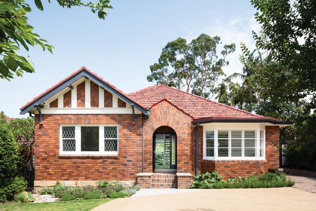
The brick cottage is in a conservation pocket behind Roseville Park, on Sydney’s Upper North Shore. Built in the 1930s by a neighbour for his daughter, it is modest in size, with Tudor detailing, leadlight windows and an intricate, almost Gothic brick arch over the porch. It’s clearly a house that’s been loved, and the front facade shows neither signs of ageing nor the recent work by Tribe Studio.
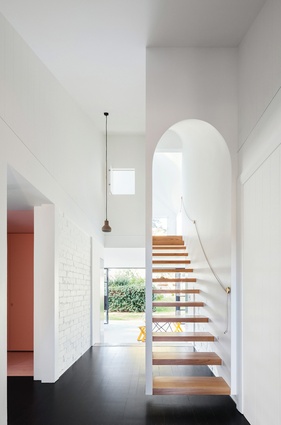
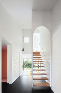
Inside is a revelation. The light-dappled entry hall has walls of exposed brick or timber panelling painted white, and a staircase with no balustrades, just large steel knobs wound with rope. An upstairs window frames a vignette of sky and treetops, while glimpses of the back garden beckon from beyond the stairs.
“We treated the main axis as a ‘garden-to-garden’ experience, roughing up the space like exterior walls,” says Tribe Studio principal Hannah Tribe, who also describes the balustrade detail as “something fun that the modernists did.” The knobs are from her Bit Part series of architectural hardware, created in partnership with metal craftsman Adam Corry. Used throughout the house, the knobs and backplates are mixed and matched in metal alloys, stainless steel and marble, with rich enamel lacquers.
Tribe Studio has a way of reworking mid-century houses to rekindle their spirit while bringing them forward in time. The family of four had lived here for a year before deciding what changes they wanted. Their brief to Hannah and her team called for a more functional space, with bedrooms and study areas for two boys and more light throughout the house, but nothing too big.
The three-part response included slicing off the rear kitchen and service rooms, and replacing them with a new two-storey pavilion; loosening up the front “formal rooms” for improved comfort, privacy and flow; and reinterpreting original elements in the new building fabric – from ornate brickwork to old interior colours unearthed under decades of old paint and linings. “It was such a sweet, confected folly, with all its detailing and intricate brick arch. But great care had been taken with its construction, so we wanted to play up those elements, rather than tone them down,” says Hannah.
On the western side of the central hall, a once cloistered lounge and its sunken sunroom (originally a verandah, enclosed with leadlights) were united with the dark timber flooring that defines the old part of the house. A window seat cut between the lounge and new kitchen brings a view of the rear garden into this more casual space, still with its original fireplace. It’s a favourite room for both the boys, who practice piano in the sunroom.

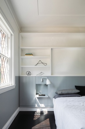
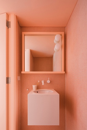
To the east of the hall is the main bedroom looking out to the front garden. Built-in robes line a wall with timber panelling in a warm blue-grey. A small second bedroom has been split to make a modest ensuite tiled in blue-green ceramic mosaics, and a dusty pink laundry, powder room and shoe room.
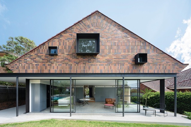
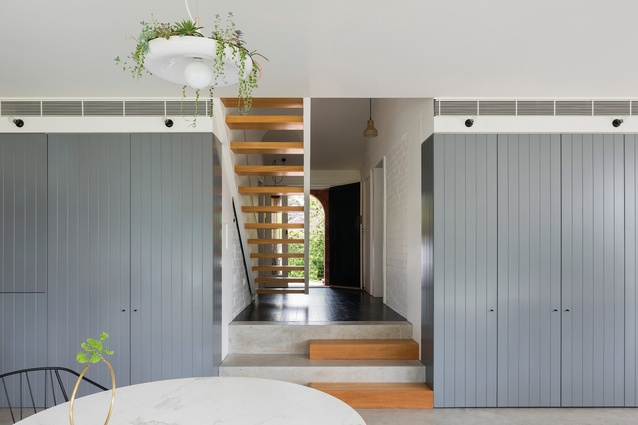
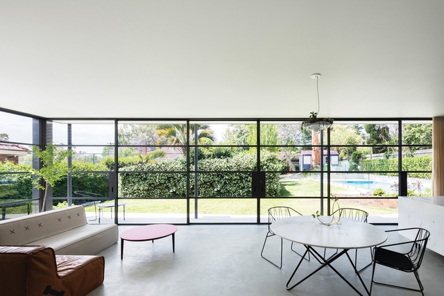
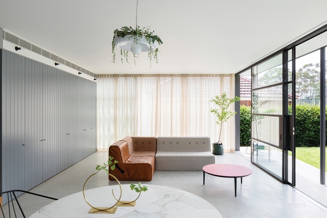
From the hall we step down to a concrete floor and the airy new pavilion. Here, kitchen, dining and living room are open to the garden through glass walls and sliding doors framed in fine steel – a nod to the leadlight windows. Walls of wood-panelled joinery painted dark grey “continue the garden’s paling fence line” and the concrete floor extends as an outdoor terrace, with sheer curtains softening this threshold. “The clients love gardening and cooking, so we wanted to bring those things together in a single space that feels like it’s part of the garden,” says Hannah.
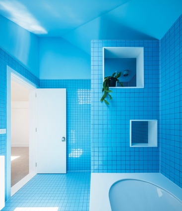
Upstairs the pavilion is more inward-looking. Under its high gable is a rumpus for the boys, a bathroom and their bedrooms, each with a private study. Despite the pavilion stopping short of the old building envelope, the local council’s concern for preserving the original roof line and language produced an interesting response by the architects. The dormer windows to the boys’ bedrooms are clad in terracotta tiles to blend with the old hipped roofline, but the new rear gable is outstanding – a suspended brick tapestry with a sunburst pattern to echo the entry’s, finished with “comical upturned corbels.”

Set into the bricks are three timber windows with deep steel reveals, the largest from the rumpus, the smaller two from the boys’ study nooks. The youngest wanted his little portal positioned low so he could see the swimming pool, while his older brother asked for a high window, looking up to the stars. In between, the large rumpus window frames a view of an unlikely couple in the backyard – a jacaranda tree and an old angophora.
The beauty of the pavilion, which adds only forty-three square metres, is that it reorients the house to its garden, setting up unexpected sight lines from front to back and top to bottom. It relaxes the formality of the original house, with a wink to its Arts and Crafts heritage. “Between the coloured bathrooms, the open kitchen and the beautiful brickwork arch, the architects gave us things we love living with, but would never have thought of ourselves,” says the owner.
In turn, the garden under this owner’s care is loosened and less predictable, with more exotics and edible plants in among its established ornamentals. Her prized new specimen is a truffle tree, potted to avoid damp feet. “Out of its element?” I ask. “We’ll see,” she says.

