Gem in the dunes
Tara Iti’s clubhouse blends American and New Zealand ideals of comfort with a respect and fascination with the land that surrounds it.
There is a stunning entry sequence at the clubhouse of the Tara Iti Golf Course in Mangawhai. It is a simple space yet highly considered and, in a way, synthesises some of the key design drivers that make the place so welcoming: the juxtaposition of raw and highly polished materials, the many connections between the interior and the land that surrounds it, and the need to make a high visual impact on a small site.
The entry hall in question consists of a wall (plastered with local sand) on the left, traversed by the downward trajectory of exposed wooden beams from the pitched roof. Its apex is elsewhere, beyond the wall, somehow enticing one to step towards the second entrance to discover how the compactness of this space might unravel there.
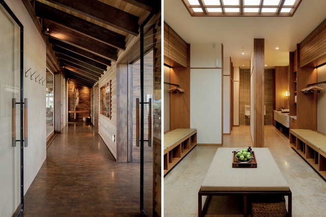
The right side of this hallway is made of timber weatherboards – with metal joints in seemingly uneven patterns – driving one’s eye onto an almost painterly composition at the far end. A cantilevered swamp Kauri shelf with a smooth, carved, oval bowl, a powerful turned bronze vase that pierces the Kauri volume, and a pill-shaped swamp Kauri pedestal resting beneath.
On its own, the composition is simple, tactile and deliciously balanced; once the light beams have been threaded upon its wooden backdrop and three languid toi toi inserted in the vase, the thing takes an almost poetic presence.
“This composition provides a strong focal point upon entry, and also allows the club to feature a living fragment from nature that can be changed to reflect the current season,” says Philip Howlett, principal of Herringbone Design, the California-based firm tasked with crafting the club’s interior.

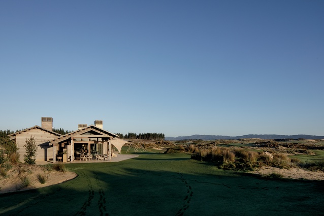
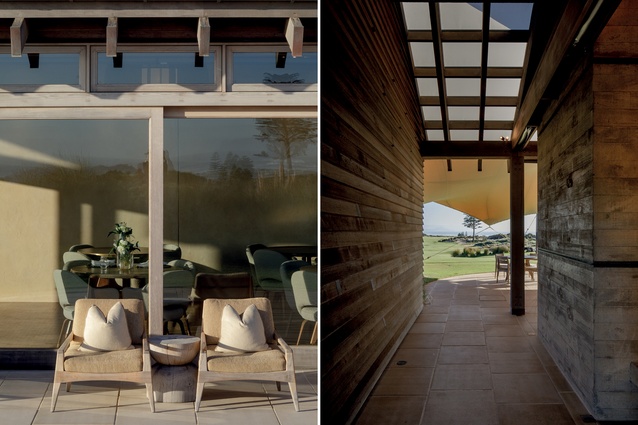
Most of the design choices here were made in an effort to work in concert with the surroundings. Timbers, sand, the ever-changing floral display and immaculate sightlines to the Tom Doak-designed course are some of the ways in which this space creates a synchronicity with the world outside.
“The landscape and surrounding nature is obviously the most powerful feature of Tara Iti,” says Howlett; “nature as art, if you will. In that sense we have always operated with the understanding that the golf course and expansive views are the real stars.”
And that, they are. American golf course design deity Doak travels with one or several ‘shapers’, guys on bulldozers who manipulate the course to Doak’s walkie–talkied whims. Cheshire witnessed the process closely and arranged sightlines from the clubhouse to take in Doak’s handiwork.
Even during the early designs, nature was a regular preoccupation for those involved. Cheshire considered making the building mainly with materials found on the site and went as far as studying the possibility of making glass with the local sand and trying to make something elegant from the Radiata pines there. However, “we were colliding with escalating expectations of standards,” Cheshire says.
Howlett also confesses that one of his main goals was “to reflect as many of the colours and textures that exist in the surrounding nature, to try and embody the essence of Kiwi culture, while also giving voice to a multinational selection of goods and materials that speak to the international make-up of the club’s membership.”
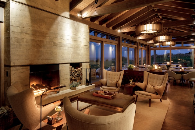
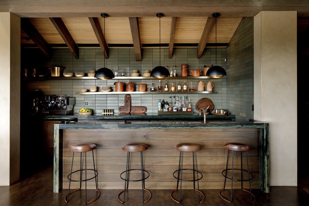
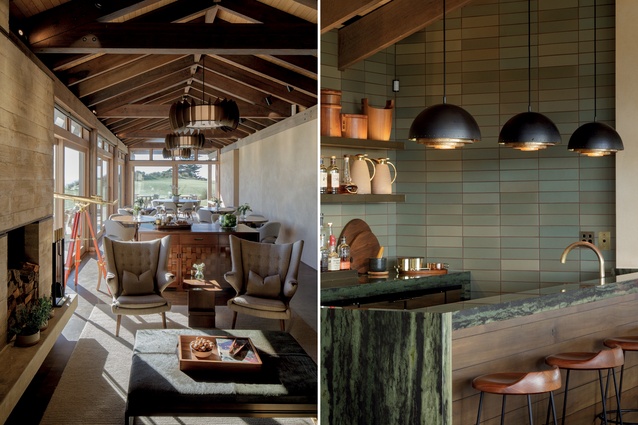
Native woods – such as ancient swamp Kauri, reclaimed Kauri, Rimu (on cabinetry and millwork), Tawa (on ceilings) – have been coupled with Walnut, a living un–lacquered brass, handmade ceramic tiles and an end-grain Oak, blockwood floor. Howlett: “The rich, muted colour palette is drawn from the surrounding nature, and given further depth and dimension by a series of textural fabrics and materials including linen, cowhide, wool bouclé, and cashmere.”
The layout of the inner sanctum of the clubhouse is fluid and, as Cheshire admits, smaller than most United States’ counterparts. This was to be a mix between American and New Zealand, he says: “American in the sense of gentility, grace of wealth, everything in its place and a place for everything,” while at the same time Kiwi in its “informality of scale”.
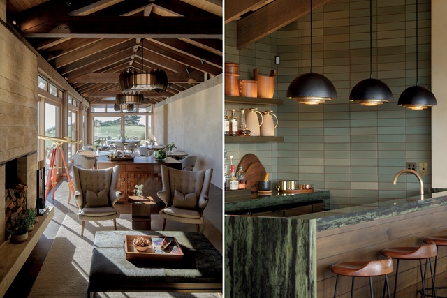
The architect, who talks about having been a regular surfer in the area before coming to this project, explains how he regularly tried to institute a sense of Kiwi comfort. However, he admits the small site also helped put ideas of grandeur on a backburner. “But from this tension, of high-end versus relaxed, of American standards of luxury and size and a modestly-sized site, there came interesting solutions,” he explains.
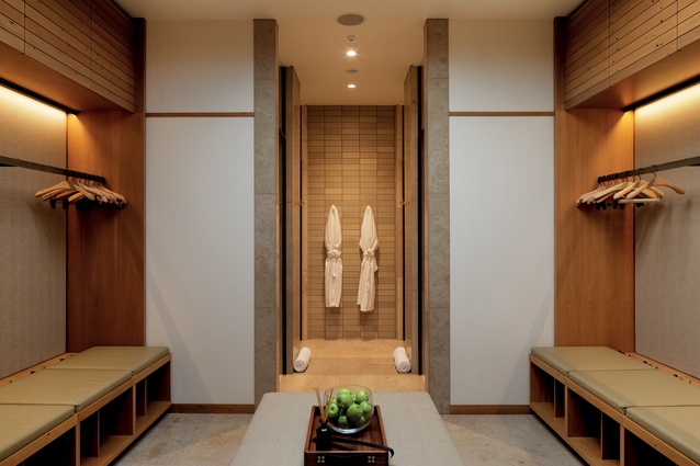
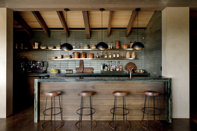
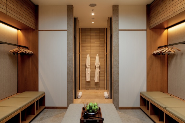
The bar area and the changing rooms are crisp gems – one green and brown like a native forest, the other almost ivy-league in its khaki pants and starched collar civility. The changing room uses “barley-coloured ceramic wall tiles, jura gold limestone, unlacquered industrial brass fittings, slatted wood cabinetry of reclaimed Kauri, fabric-upholstered walls edged in brass, and, finally, a fresh, honed white-granite vanity,” says Howlett.
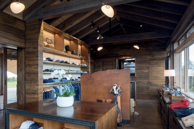
He then describes the pro shop as a handsome “jewel box” with articulated millwork of swamp Kauri, Rimu and antique brass-influenced, Howlett says, by renowned New York retail designer Peter Marino, with whom Howlett’s design partner Jeffrey Botwin has often collaborated.
“It’s a space both luxurious and efficient in design, and years spent working with Marino on multiple retail projects gave Jeffrey a unique understanding of the storage needs and all the elements required to create a successful, luxurious retail experience.”
The views from the main dining area include glimpses of Taranga Island and the Whangarei Heads. The sand and sea spray twirl right outside the generous glass doors and thus, this modest clubhouse, unobtrusively sunk within the dunes, shelters and blends in with a unique sense of elegance.

