Geyser
Drama and a sense of community prevail within this Auckland building’s medieval-like laneways of the future, by Patterson Associates.
As an architect, it never pays to be too impatient. The process of making architecture is typically a waiting game, punctured by periods of extremely intensive activity. One of the lengthiest projects I have ever observed was Heathrow Airport’s Terminal 5 project, which took at least 12 years to complete, possibly more, due to the ‘transparent’ nature of the British system: i.e. consultation after consultation – you can imagine. But here in New Zealand, eight years was still a very long time for Patterson Associates to twiddle its thumbs before realising its latest creation, Geyser: a suite of boutique office buildings in Auckland’s Parnell. The story is probably familiar to many in the field: the architect completes his design for the scheme in 2004, but the tenant on the site wants to stay put and run out its lease, so the design is essentially mothballed for five years. But at least this is one project that was eventually built and not relegated to the plan drawer.
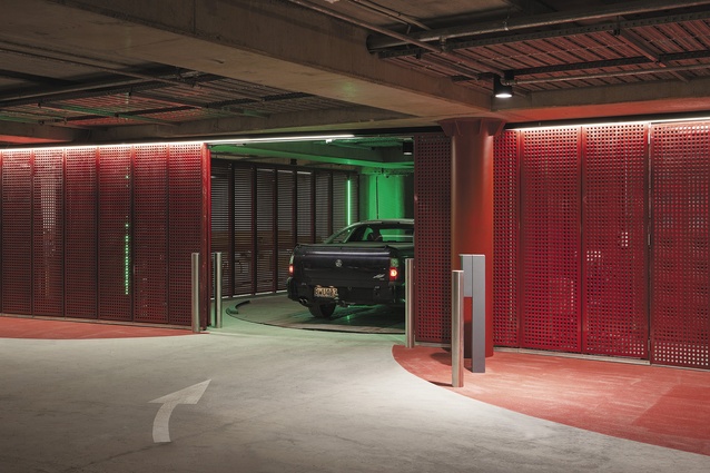
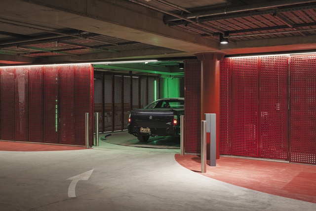
So, Geyser is given the get-go and we all hear about it: the 6 Green Star certification for innovative, world-class, environmentally sustainable design and the largest automated car-stacking system in New Zealand, with a robotic device that transports 165 cars into the structure’s compact basement – the celebrations are lengthy and our expectations are high. But, now that Geyser is built, naturally the question arises, does its eight-year-old design still stand up, so to speak, do the bells and whistles live up to the hype and, more to the point, does it work and do we like it?
Wandering around the 5,040m2 buildings – virtually on my own, apart from a bevy of builders in snagging mode – I happen to strike up a conversation with one of these men (brown hair, average height, no name – I say no more). He’d worked on the project for only a few months but I still ask the dreaded question: do you like the building? “No, not really,” he replies. Okay, well, this is not a great start, I think to myself. The builder then adds, “I can understand why other people might like it but it’s not really my cup of tea.” Aha, now here comes that wonderful moment where you know that you’re onto something, because the shock of the new is a curious beast and Geyser is not your typical Kiwi office block. It might take time for some people to appreciate its merits, although I’m already there.
With Cumulus and Anvil already under the practice’s belt in terms of office buildings, it’s quite clear that Patterson Associates isn’t shy of throwing a dramatic form or an unusual patterned façade at us. In this fair land where corrugated iron rules, I think we need to be shocked a little. We need to be made to question, to try to work out what it is we’re looking at, where we are going, where we’ve come from and what might be possible. Geyser offers us much of this.
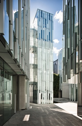
While it is certainly a bonus that the building announces many ‘firsts’ into New Zealand, the reality is that the sustainable bells and whistles and the reduction of a car-parking footprint should together be a given, a no-brainer, for all new buildings in New Zealand. What really elevates the design of Geyser above the ‘comme ci comme ça’ is, firstly, when you walk into the structure you are enveloped by a series of medieval-like laneways of the future. The architect, Andrew Patterson, explains that he “sliced through” the original rectangular mass, which was then “slightly blown by the wind”. Pulled apart, what could have been one building becomes five buildings, drawing light and shade into and around the forms, with the consequence being a fantastic labyrinthian warren of paths which link the inner courtyard out into three neighbouring streets through five entrances. Why are we not arranging more of our buildings like this? This plan makes complete sense here in Auckland (or New Zealand, even) with our vivid light and need for dappled shade and, crucially, for our many small businesses (the planned tenants of Geyser) to maintain their privacy and, yet, still share a sense of community.
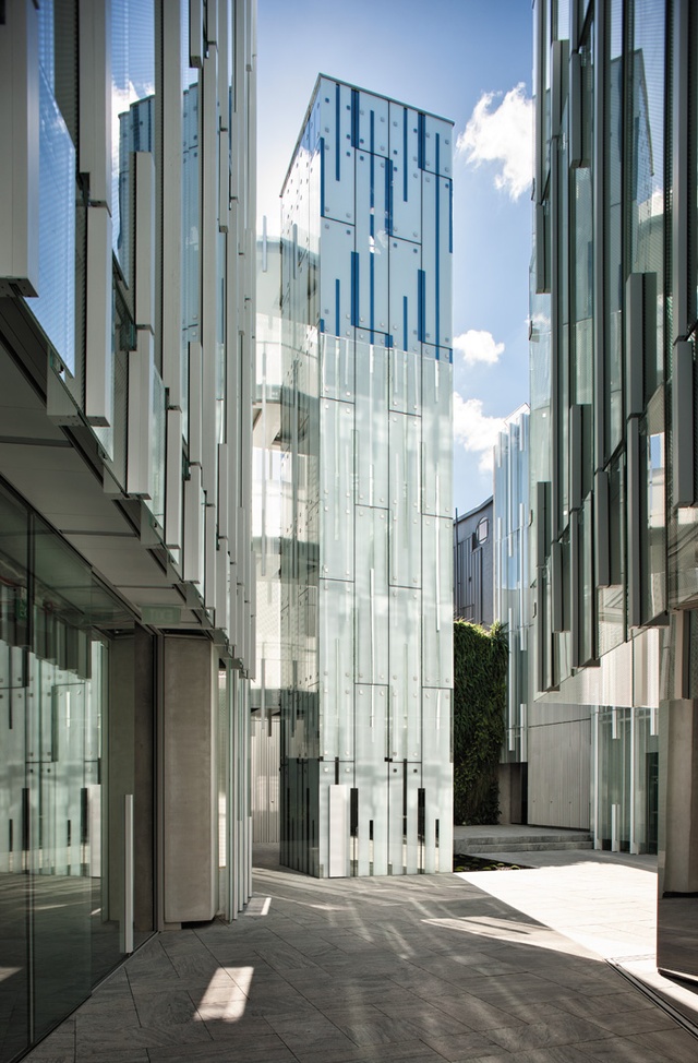
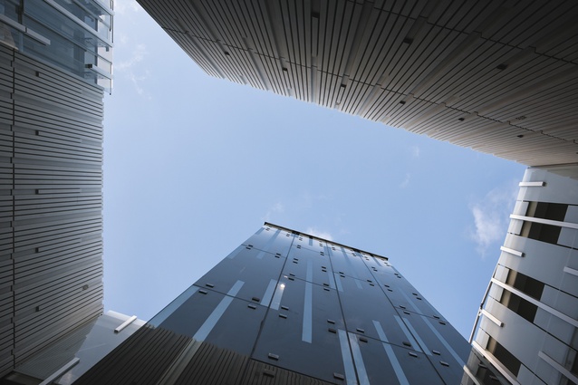
Even better is the series of journeys through the laneways, which emphasise movement and pedestrianisation, particularly shocking given that the building is located within the sprawling, car-obsessed, ironically monikered City of Sails. These strong vertical forms are striking, almost a little vertiginous, but this addition of movement and what should become, once tenanted, an industrious pocket at the end of Parnell Rise offers hope for Auckland. Hope is offered up by the awesomeness of the inner cathedral-like space which provides a sense of wonder as we look up into that framed hint of sky. Meanwhile, the semi-transparent nooks and crannies (the narrow lanes, the balconies and mini-courtyards) force us to make chance encounters between spaces, to converse with one another, to feel sociable.
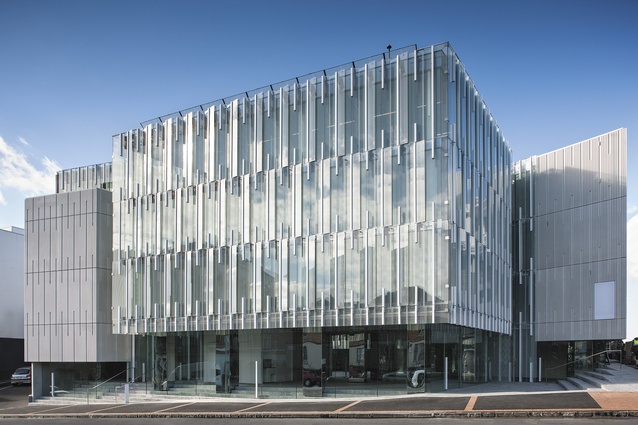
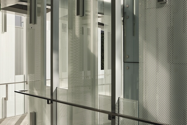
From the street front, the sheer bulk of the form could be imposing except that it responds to the scale of the neighbouring buildings and it is broken up and given a series of contrasts, through the adoption of different materials, and Patterson’s signature patterned façade which, on Geyser, is derived from the tassles of the korowai or traditional Mori cloak. I’m told that the pattern took a considerable period of time to perfect and it shows; it’s mesmerising. More pattern is applied to the fritted glass façade, which acts like a sunshade and creates privacy within the individual spaces.
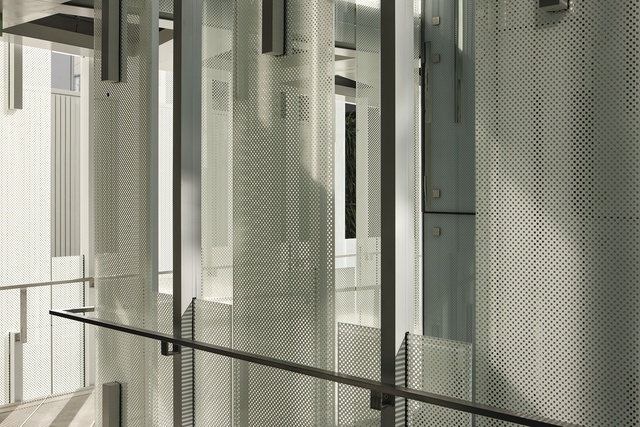
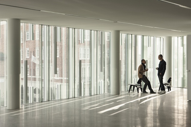
Patterson suggests that he drew inspiration from the unique New Zealand experience of steam fields, with the frits making the people in the opposite buildings look as if they are ethereal “children of the mist”. This veil-like feature is the modern equivalent of the lace curtain and, in this instance, rather than twitching the curtains, you can slide the glass windows back at intervals to let in more of the 100 per cent fresh air that this eco-building delivers. (This is in stark contrast to the lung-fulls of air-conditioned, brain-fuzzing breath that most office workers across the country currently draw. We can all but dream). This innovative dual-glass façade traps warm air between its walls in the winter while, in summer, the outer skin opens electronically for full ventilation. Patterson claims that he’s pretty certain that the technology will live up to the hype; it’s been vigorously tested but only time will tell.
The only aspects I don’t truly understand are the myriad of mirrored columns in some of the lower workspaces. I can understand the mirrorisation, to some degree, as it seems in keeping with the iciness of the colour palette, the ‘glitteriness’ of the glass façades and the nightclub feel in the basement but, if I were a tenant, I wouldn’t be too keen on glimpsing myself in the mirror every time I jump up for a coffee. However, it’s a superficial gripe.
Geyser is about transformation; it’s a surprisingly light piece of architecture for such an intensive plan and, along with other exciting recent buildings in Auckland, such as the Art Gallery, Ironbank and the Maritime Museum, it paves the way for a new identity for Auckland and, with a bit of luck, a more sustainable way of life. Patterson describes Geyser as a “Transformer Building”. Here’s hoping that Auckland receives a few more Transformers, particularly ones which are clearly visible along its waterfront and on its skyline, sometime soon. For now, Parnell’s Geyser will make the city proud.

