Interior Spaces: All about that curve
Katie Scott of Auckland-based interior design studio Sticks+Stones loves a curve and, here, in this Telford kitchen renovation, she uses them to beautiful effect. Amanda Harkness takes a closer look.
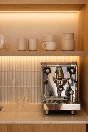
Frustrated with a lack of flow between their original bungalow and its 1970s’ addition, Katie Scott’s clients were looking for a multitasking kitchen: one that offered a space for morning coffees, relaxed meals and cocktails with friends, not to mention homes for their much-loved Rocket coffee machine and biltong drying box.

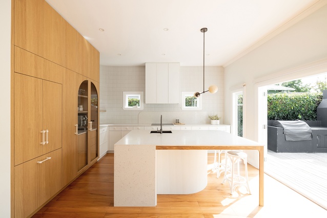
The existing kitchen was tucked in beside a rarely used second living area. It had low ceilings and little sunlight and required significant remedial work. Scott saw the sense in flipping the two spaces and positioning the kitchen beside the bifold doors opening to the garden. “With high windows and a higher ceiling, it was the perfect position for the hub of the home,” she says.
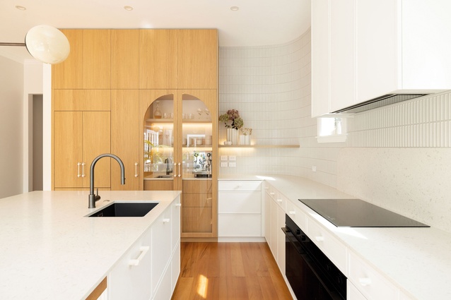
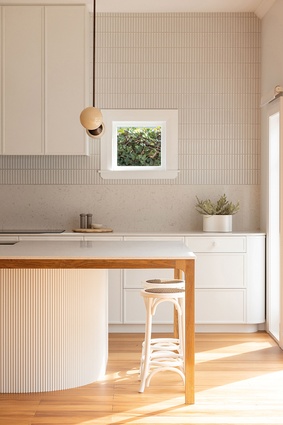
To celebrate the newly found light, Scott used whites and neutrals in textural finishes, to add interest. Light-oak cabinets stretch from timber floor to ceiling, maximising the sense of height in the room. A soft curve at the base of the dining island reflects the curves built into the corner wall and cabinetry, “to create a sense of intention and timelessness, softening the hard edges of a kitchen’s functional surfaces,” says Scott.
There was also a degree of practicality in this design move — the curved joinery provides a clever workaround to the existing window joinery. The finger mosaic tiles surrounding the splashback reflect the vertical fluting on the island but, once again, are pragmatic in their detailing, seamlessly hugging the curve in the corner of the kitchen, cleverly created by builder Ben Holwerda from splicing and bending GIB plasterboard to shape.
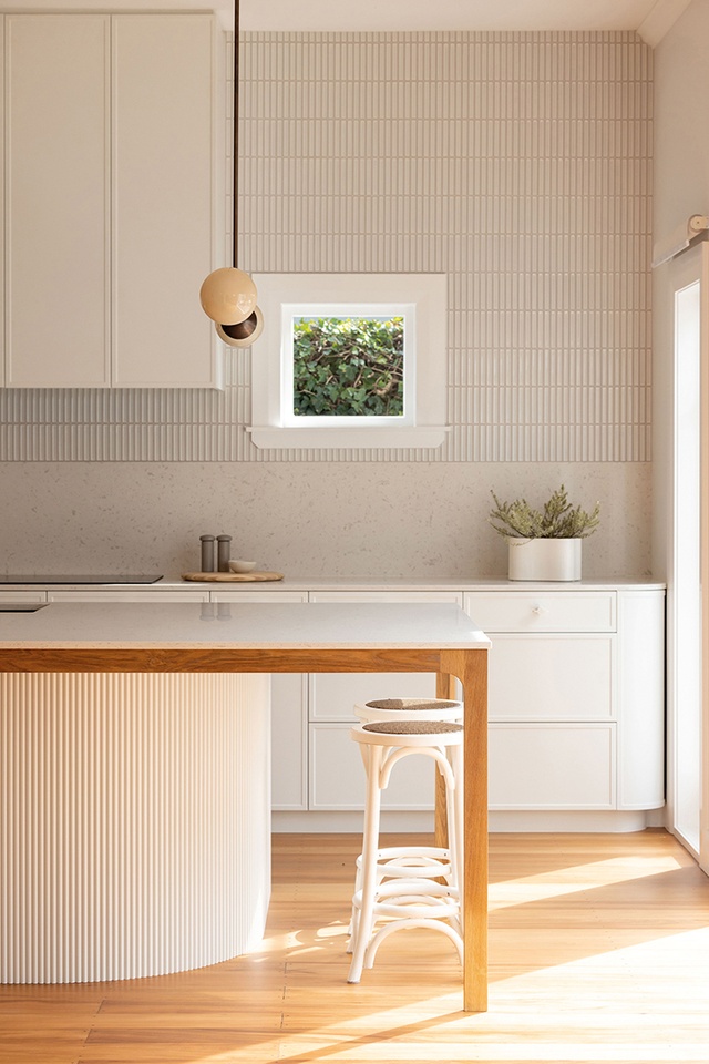
Distinctive cabinet hardware from Lo & Co’s Intersect Pull range and a Snelling ‘Line’ pendant provide moments of fun while, behind glass doors, the prized and plumbed-in espresso machine takes centre stage as it awaits the much-revered daily coffee ritual.
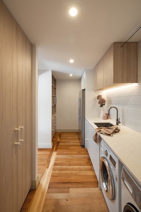
Beside the kitchen, a separate scullery space cleverly uses more cost-effective materials and existing floorboards and, here, the biltong drying box has been built into the cabinetry.
Scott’s clients are very happy with the result; there is an improved connection not only between the old and new parts of the home but, also, to the outside.
The Interior Spaces series is brought to you by GIB® in partnership with ArchitectureNow.
Learn about GIB® Wet Area Systems in the video below:
ArchitectureNow works with a range of partners in the A&D supply sector to source appropriate content for the site. This article has been supported by GIB.


