Interior Spaces: Let there be laughter
Auckland-based interior design studio Material Creative stepped up to the plate in delivering this fun, new waterfront eatery within a tight time frame. Amanda Harkness takes a closer look.
When the Queen of Auckland hospitality approaches you to design her next venture, there’s a certain amount of expectation that comes with the gig but add a turnaround deadline of just four months from engagement to opening, with Christmas in between, and things really begin to heat up.
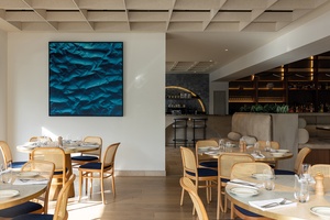
Serial restaurateur Judith Tabron knows a thing or two about dining and the Kiwi psyche, and, with our nation’s love of the ocean, she knew a relaxed, contemporary waterfront venue overlooking a sea of sails would provide a year-round hot spot for locals and tourists alike.
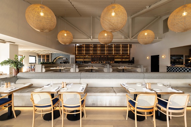
Material Creative and main contractor Conpro were up for the challenge. “The interior needed to be comfortable and laid-back, but with an ‘international’ LA beach club feel,” explains creative director Toni Brandso. “And with such a limited time frame to complete within, we designed a space with New Zealand ‘in-stock’ in mind. Furniture, fixtures, materials – everything had to be delivered in six weeks or less.”

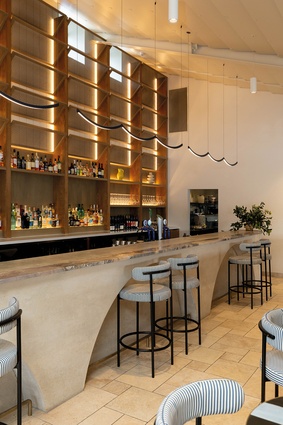
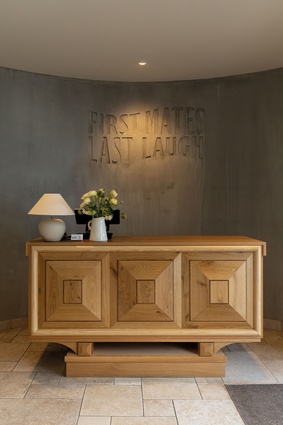
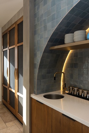
Working with natural-feeling materials like French pavers, marble and oak, and hues drawn from the surrounding harbour, the designers gave the Westhaven Marina-based First Mates, Last Laugh bistro a “tactile, fun feeling with a residential vibe”.

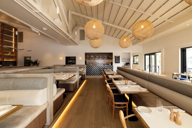
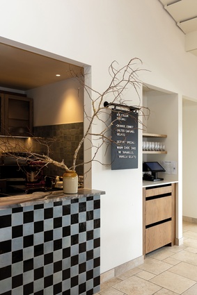
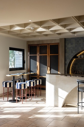
Natural light was maximised by integrating louvred windows over the existing windows behind the bar area, and comfortable seating of varying heights, types and configurations created different zones for drinking and casual and group dining. A checkered tile servery draws the eye to the kitchen, encouraging guest engagement with the culinary artistry on show.
“Our design prioritises not only aesthetics and sustainability but also efficiency,” Brandso points out. “By leveraging a systematic spatial plan into defined sections, with wide service path workflows, the restaurant works hard without sacrificing style or comfort for the customer.”
Acoustics were also carefully addressed in the 335m2 space, utilising angled, raked ceilings in vaulted areas and acoustic ceiling grids in the entry, bar and group-dining sections. “This ensures a vibrant, lively atmosphere while maintaining excellent acoustic performance,” says Brandso. And plenty of opportunity for last laughs to be had amongst first mates.
The Interior Spaces series is brought to you by GIB® in partnership with ArchitectureNow. Find out more about GIB® Fire Rated Systems and GIB Fyreline® in the video below.
ArchitectureNow works with a range of partners in the A&D supply sector to source appropriate content for the site. This article has been supported by GIB®.


