Golden glow: Rhodes House
Drawing from a collection of beautifully combined influences, this award-winning Christchurch house is both a gallery for the owners’ art collection and a work of art in itself.
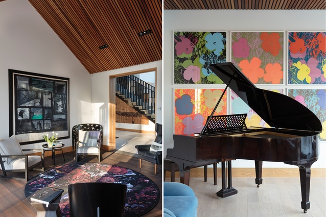
Art is the driver behind this highly detailed and shining new home in the Christchurch suburb of Merivale. Built to replace an historic double-storeyed villa demolished after the Canterbury earthquakes, the new house was seen as an opportunity to create a building that reflected the owners’ love of art and provided plenty of space for the display of some highly significant artworks.
It was also a once-in-a-lifetime opportunity for up-and-coming Christchurch architect Phil Redmond to design a building that illustrates his penchant for fine detail and expresses his admiration for the work of some key artists and architects.
The house is formed out of a central, double-height gallery, sandwiched between two pavilions clad in rough, local aggregate: a material that, along with the gable forms, harks back to Christchurch’s colonial past. Wide skirting boards along the base of the building add to this reference (these also continue indoors where – as further testament to the intricate detailing in this home – they feature a thread of brass that runs along their upper edges).
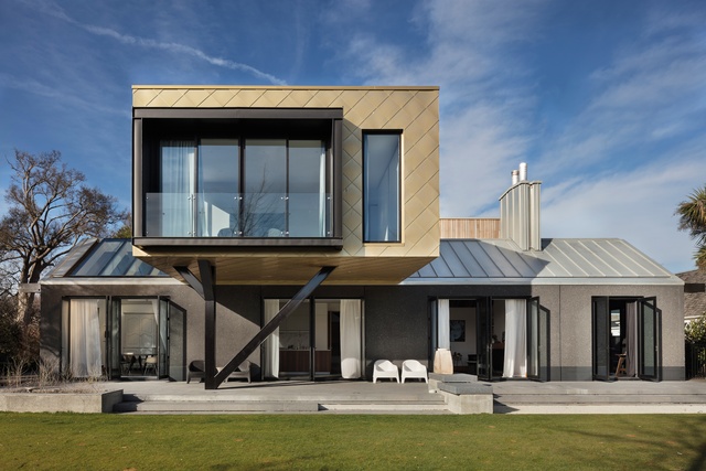
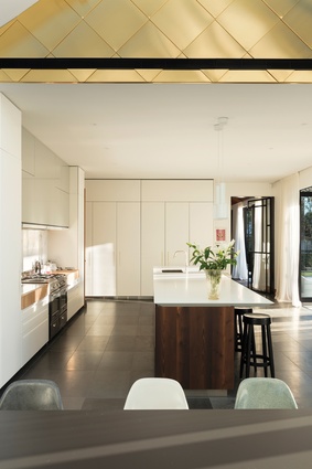
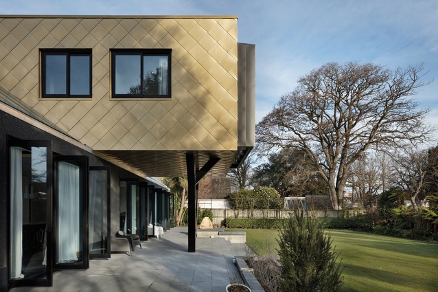
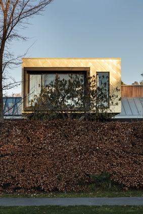
In strong contrast with the grey aggregate, a gold box of Aurubis Nordic Royal – a copper alloy product from Finland – balances overhead, containing the home’s private zones. The inspiration for the gold cladding and the form of the upper floor came from German architect Hans Scharoun’s Berlin Philharmonic building. This box is supported by a tree-like stand that references the ephemeral work of Japanese architect Kazuo Shinohara.
However, Redmond’s main influence in the design came from a different creative source altogether: the highly detailed work of modernist Italian architect Carlo Scarpa (1906–1978). “When we began the house, I suggested we look closely at Scarpa’s detailing and how much attention he put into the smallest little things,” said Redmond. “The owner went overseas and did the Scarpa tour in Venice and she was immediately on board.”

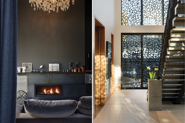
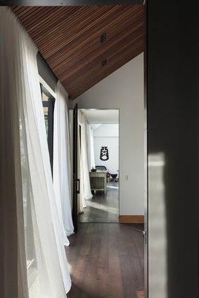
His influence is strongly felt. The Scarpa touch begins at the front door, where the particulars of the Italian architect’s work can be seen reflected in the bespoke brass detailing and door handles, and in the perforated metal screens that prevent direct light from affecting the artworks in the gallery space beyond the entrance.
These screens generate some amazing play on shadow and light in the gallery and are also a work of art in their own right. They were created in Redmond’s studio by hand-painting shapes on foamboard, cutting them out and rearranging them on eight panels, so that each has a different combination of forms.
“The shapes reference elements of Matisse, Le Corbusier’s birds and Basquiat’s crowns. There are also some floor plans of buildings completed by our studio – and some dinosaurs and sharks are thrown in there, too, because who doesn’t like dinosaurs and sharks?” jokes Redmond.
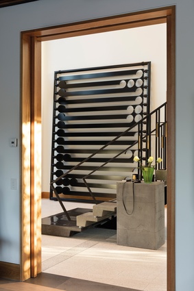
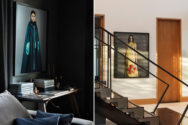
Through the front door and the staircase in the gallery is “heavily Scarpa”, says Redmond. “It is modelled from the stair in the Olivetti showroom in Venice, with pre-cast concrete treads welded to a substantial steel base that runs through the centre.”
A bluestone plinth at the base of the stairs attaches to the lower treads that spill past the angular lines of the handrailing.
The gallery is populated with artworks, most significantly Michael Parekōwhai’s Prayer black-steel sculpture. “The house was built around it,” says Redmond. “It didn’t fit in the old house and had been kept in storage. It took six men to lift it into the room.” Other works in this space include a bright and eccentric painting by Andrew McLeod and Yvonne Todd’s bold photograph Ernestina.

A ‘homage room’ is contained in the street-facing pavilion that opens from the gallery. “Here, we picked up elements from the old house, such as the chandelier, old doorknobs and letterbox numbers. It is like a small archive: dark and reflective in nature, with a steel ceiling and a sense of peace and stillness,” says Redmond.

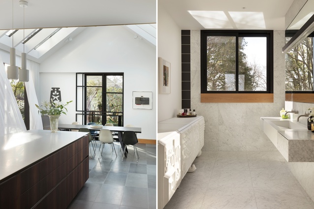
The design of the kitchen refers to a similar space in the old house. Over the dining table, large skylights give the sense that you are dining al fresco. The gold box upstairs moves through this space, and the difference in patina between the cladding that is exposed to the elements and this protected section is obvious. “The gold reflects a lot of light and makes it brighter in here. It is also really effective when it’s raining,” says Redmond.
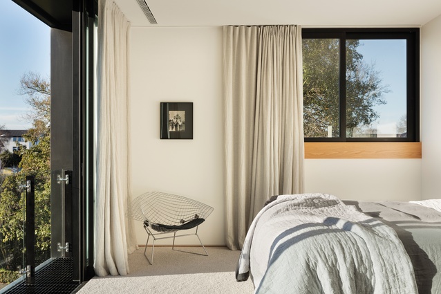
Heading upstairs, the wide skirting boards that framed the downstairs walls have vanished, and the windows are given significant sills that reference those in the old house. The bedrooms and bathrooms up here are more reserved in their use of colour but art still dominates, as does designer furniture. The master bathroom contains a white, three-dimensionally patterned cabinet by Jaime Hayon for BD Barcelona. This echoes a three-dimensional tile used in another of the upstairs bathrooms, while harking back to the patterning in the tall screens in the entrance gallery.
This is a home with such depth of reference that it is almost impossible to fully exhaust its many features and stories. While the rooms are vast in number, each has its own character. For the architect, this has been a chance to pay homage to his influences in a project that is brave and bold and sure to stand the test of time.

