Good things in small boxes: The Cube
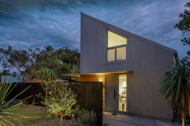
Though First Light Studio’s Petone House – affectionately called The Cube – is small, it is packed full of thoughtful details and planning: a private courtyard, a soaring roofline, clever skylights and even a sauna are just the beginning. Clients who were passionate about housing densification and public transport combined with First Light’s signature style of creating small spaces that are still extremely liveable have resulted in a unique secondary dwelling on a suburban site.
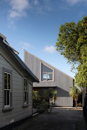
The firm was approached by a couple, one of whom is a teacher, that split their time between New Zealand and overseas to create a one-bedroom house in what was previously a classic 6m by 6m garage behind their Petone villa. They wanted to help their adult children get into the property market by letting them have the main house while still having a very liveable home in the back to stay in when they were in New Zealand.
The clients wanted to pack a lot into a small space including a sauna and a space to do at-home teaching sessions in person and online. “In the end, we decided to keep the existing footprint of the garage and build something new,” Explains architect Ben Jagersma. “We split it into a three by three grid.”

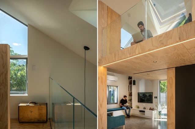
Bathroom and kitchen services are along one wall with a living area in a third corner. The fourth corner houses the stairs up to the mezzanine level. Though use of the word mezzanine may conjure images of a cramped bedroom with just enough room to lie on a mattress under the ceiling, this is anything but. The added height of the roofline, strategic skylights and a glass balustrade all add to a sense of breathing room in the bedroom. “One of the clients is quite tall, so we did a lot of studies in the office around the skylight height and how everything would fit,” adds architectural graduate Mitch Holden.
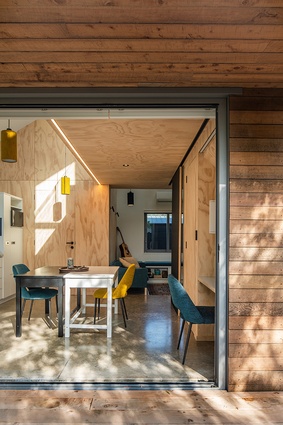
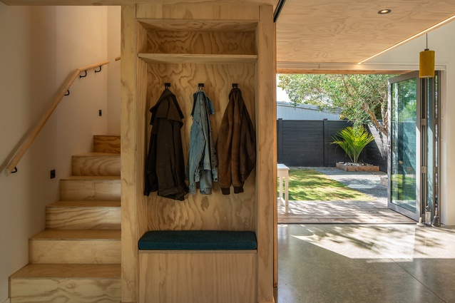
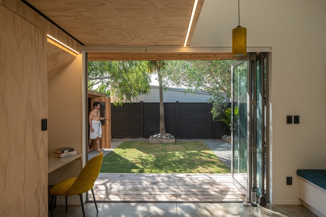
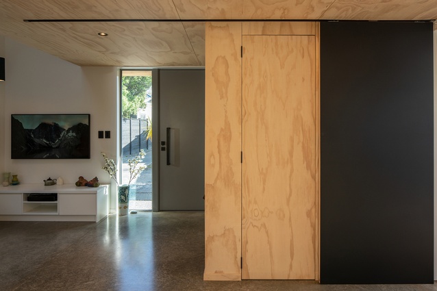
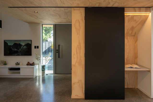
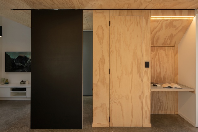
This feeling of largeness flows to the living spaces below in part due to the excess of natural light let in and in part due to the flexible nature of the area. The centre of the cube downstairs houses most of the circulation space within the home and can be used as a dining area or teaching space, with sliding partitions hiding a desk area under the stairs. It also opens up to a private courtyard, which helps the home feel bigger, despite the modest footprint.

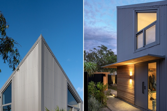
The overall build cost was relatively low. To achieve this, the team called on budget-conscious yet robust materials such as the powder-coated steel exterior cladding and the light-hued ply used in the interior, which are balanced with considered fittings like bespoke furniture and custom joinery. Clean finishes, recessed lighting and hidden accessories help keep the openness of the interiors and enforces the usability of the space.
“We’ve introduced the cedar in the parts of the building that you touch and feel. It is actually recycled Deodar [timber],” Jagersma notes. Holden adds, “The builders say when they were cutting up the timber all they could smell was lanolin, as it came from the family’s sheep farm.”
The clients gave the designers lots of freedom, but they were particularly passionate about the minimalist cantilevered awning. “It’s made out of 8mm folded steel,” says Jagersma, “so, in the end, it’s only 40mm thick, but there are no structural posts. It was built in two pieces that weighed 600kg each. It was a huge logistical challenge to get it installed down the narrow driveway. But, in the end, it turned out really great.”
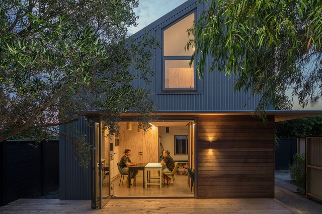
The Cube provides something of a model for infill housing that might begin to address the lack of housing stock in Wellington and, indeed, across New Zealand’s urban centres. “There are a lot of sections in Petone that are identical with a villa at the front and garage at the back,” Holden says. “This could become really common, especially if it’s done well. This is really considerate; it doesn’t affect the neighbours; it fits within the building envelope and daylight plans, and it still is kind to the original villa.”
Just after the resource consent was complete for The Cube, Hutt City Council updated its district plan to allow secondary dwellings. And, as barriers to housing densification are increasingly being removed – a step that is surely in the right direction – this certainly proves that they can be not only sympathetic but include everything one might want in a home and more. And, with homes like this, First Light Studio continues to demonstrate that well-designed and enjoyable spaces can come in all shapes and sizes.

