Goodfolk
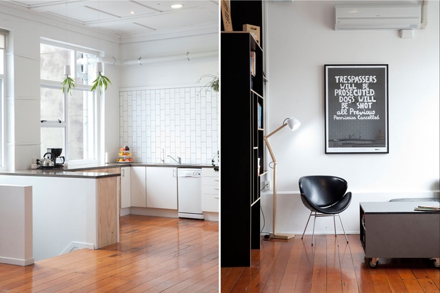
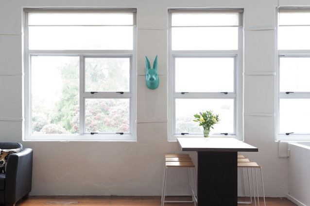
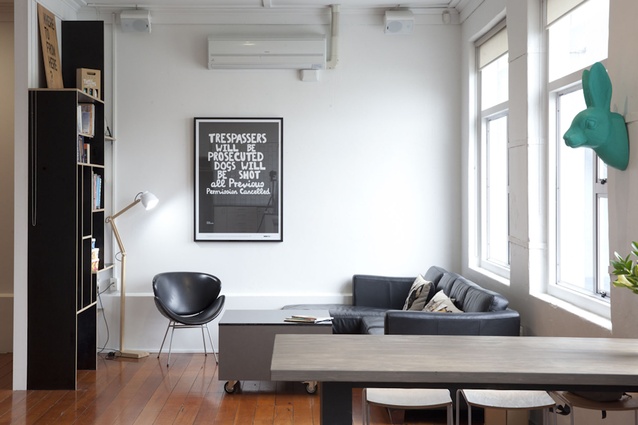
“Why is that post green? Why is there a large scary rabbit on the wall [or a poster that says] ‘dogs will be shot’… is that a bit aggressive?” is how Michael Easton, Managing Director of creative agency Goodfolk (and former on-camera interior designer for TV One’s Home Front show) imagines his clients’ reactions to the company’s newly renovated studio.
Located in the heart of Auckland’s not-quite-gentrified red-light district (K Road), Goodfolk is sandwiched between a Red Cross op shop and a novelty store. Its entry is all aluminium and glass with only a green dot bearing the street address as an identifier.
“The outside belies the inside,” confers Easton. “A lot of agencies in Melbourne or New York have absolutely no street presence… no wow factor at the door; it is when you walk up the stairs that you have the ‘ta-da!’ moment.”
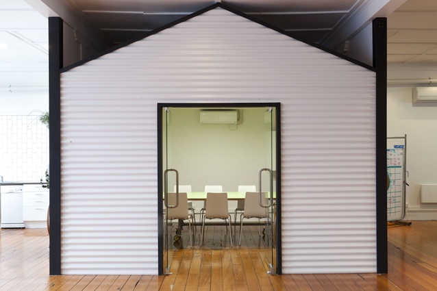
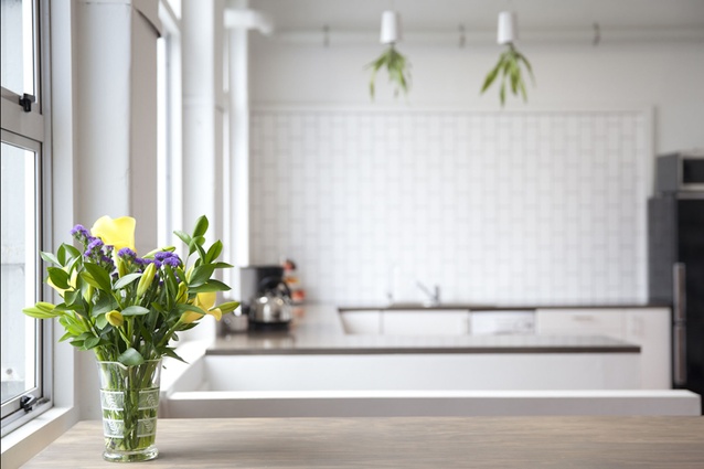
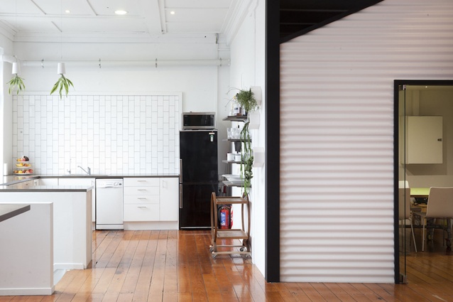
Here, a narrow staircase covered in deep crimson carpet leads to a medium-sized social area composed of a small library-cum-waiting room and a white-tiled kitchen beside a shed-like meeting room. The latter incorporates many design elements from the corporate culture vocabulary (muted tones, the rectangular board table, the projector, the erasable whiteboard) that Goodfolk is increasingly being asked to master. Yet it has incorporated touches that are reminders that we are, indeed, in the midst of the alternative, gritty community of K Road: tiny LED spotlights hint at a nighttime starry sky, there is an exposed fuse box.
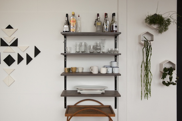
Easton: “Our previous studio [at this same locale] was a cross between a modern-art-oriented studio and a really cool student flat.” While the bohemian-chic aesthetic fitted the agency’s previous clients (predominantly in the arts industry), Goodfolk has gained an increasing number of large, corporate customers. These good folks have retained that ‘un-fussiness’ via coffee mugs emulating the old French enamel variety, circular tea trolleys, upside-down planters. The timber floors, although polished, retain the constellation of well-trodden past lives.
“There are some moments in here that provide that sense of challenge that we want to present as an agency,” says Easton; “we are determined not to forget our heritage.”

