Grand Papua hotel
Papua New Guinea is famed for its biodiversity, its 800 languages and rich culture. But it’s a land of paradox, with security issues best summed up by travel warnings for visitors offering a strong caution to visitors about ‘wandering off’ alone.
Space Studio’s Vee Kessner has a good grasp on the pros and cons of working in PNG – she has spent the past four years intermittently visiting the country as part of her work on the Hotel Grand Papua, a five-star hotel that opened in late 2011. Working conditions in Port Moresby are obviously different to those in New Zealand, with high humidity and temperatures in the mid-30s normal. Space Studio was introduced to the project by Fletcher Construction, says Kessner, and Jon Cullen of Australian architecture firm Cullen Feng designed the hotel, which was built by the South Pacific arm of Fletcher Construction.
Space Studio had worked some years before with Fletchers on the Radisson, in Denerau, Fiji. In Port Moresby, the client, Steamships Property, had originally specified an apartment building, but as market conditions changed so too did the design – to that of a 160-room hotel.
Eventually, the full gamut of the job would encompass design of interior spaces and procurement of everything from flooring to forks and anything in between. Kessner’s statement that there were a “lot of logistics” sounds much like an understatement; there were, she says, thousands of suppliers from almost every continent, and Space employed a full-time staff member to deal solely with the logistics of shipping and customs.
“Linen, knives, forks, spoons, salt and pepper shakers – this is the first project where we’ve done a lot of work with regard to signage and graphics. We coordinated this, did the wayfinding, the main signage, and then that led to things like the room cards, room service menus, everything like that. We even ordered in the Christmas tree for the lobby.”
Kessner says that the interiors process on big projects such as this can be a bit disjointed.
“You come in quite early and you work in the planning and conceptual phases and then you have to wait before you can complete all your detailing and there’s lots of coordination back in with the architecture and the services. And then you’ve done all your drawings and you’re waiting for the base building to be completed. We were going up once a month for the last six months and it was only in the last three months that the interiors actually became visible. When the high-volume spaces are filled with scaffolding you can’t actually appreciate the space – and then it comes down and you can see the mouldings and the scale becomes evident.
Such timelines can also throw a few spanners into the works with regard to consistency of supply. For instance, says Kessner, in the two-year gap between design and implementation a number of fabrics were discontinued. “You have to rework it,” she says. “With interiors in particular, where you have fabrics and wallpapers that get reinvented or changed, you can’t always have them. With other harder materials it’s easier.”
Is that a way for design firms to diversify, I ask Kessner, thinking that in these straitened times the one-stop shop for spatial and graphics packages might be a good selling point for design firms?
“Yes and no – I think you have to recognise where your limits are. We’re not graphic designers but we know what the graphics need to be able to do. And so we developed a brief, worked with the graphic designer and then with the signage manufacturer to make sure the detail was right.
But we get ahead of ourselves. An early conundrum, says the designer, was that the building’s form was set in a contemporary aesthetic, but the client wanted an interior with a colonial feel.
“We struggled a little with that, because you have to work with the architecture, you can’t disregard it completely, and that’s why we started to work on the idea of a contemporary application of a colonial theme.”
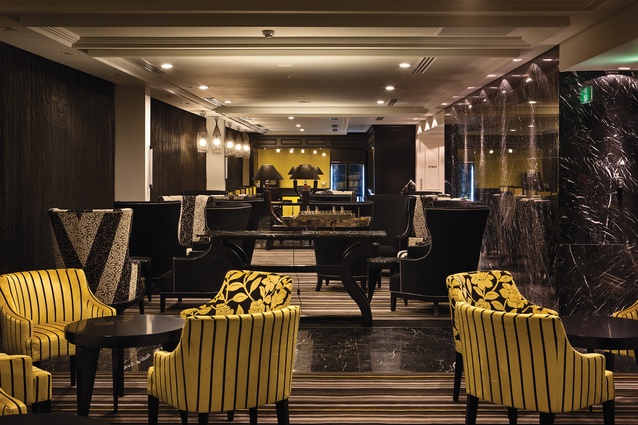
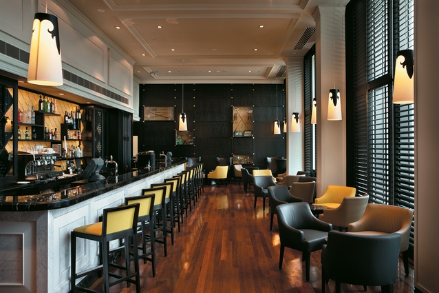
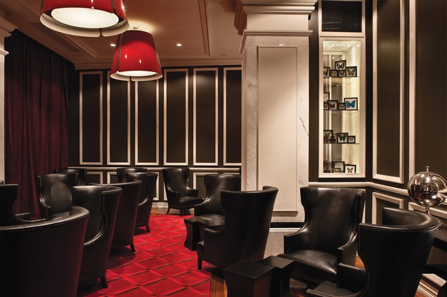
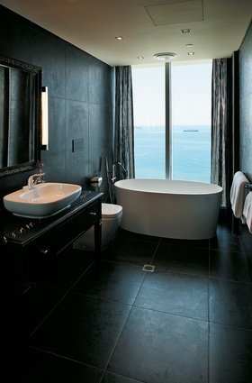
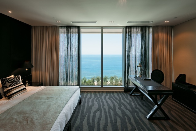
So, what is an expression of ‘contemporary colonial’? Kessler says the spaces are very clean inside, with moulding detail that is over-scaled in places; there’s also a vibrant colour palette – “certainly more vibrant than what you’d have in a colonial setting” – and the colours draw on a PNG palette, ochres, earthy reds, yellow, blacks and whites. “That gives a connection to the country, which is important.”
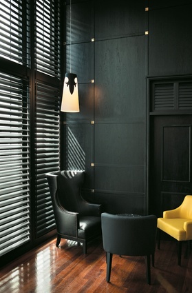
Furniture expresses the theme also. A contemporary interpretation of the wingbacked chair is deployed throughout the building, with the designer’s skill applied in the play of texture, colour and upholstery. Patterning was important too.
“The idea of a unifying device is something that developed as the project went on. If you started with it in mind you’d pigeonhole yourself and probably overdo it; although, in saying that, we had a fabric that was selected early on and that made it all the way through. It had a ‘cross’ design. We started with that and then developed it into another pattern and motif that worked through the space.”
Kessner says that the client had a long history in the country, and there was also a request to reflect this in aspects of the design. Archives were trawled for historical photography, which was distributed into spaces such as lift lobbies and other places where guests would have time to absorb it.
“In the bar, we’ve referenced all the sports that were introduced to the country. In the standard suites, the artwork is contemporary and more about PNG. We sourced some art from local sources, but the photographic work we used was from a French photographer called Eric Lafforgue, who has done amazing photography of the region and the people. The executive suites and some of the public spaces have got regional paintings in them. Because the building is owned and developed by Steamships, who have always been traders, we had quite contemporary abstract art that references shipping. And that was Anita Levering’s work that we sourced from New Zealand.”
Kessner is complimentary about the level of service New Zealand suppliers went to on the project. “The signage contractor went up and did the installation, and trained someone in PNG to work with him. The wallpaper installer went up and worked alongside Fletchers. The heat and the way the site happens are not like New Zealand and at the end of the day you can’t go home.” Says Kessner, anecdotally, “I remember one day going to the site and all the offices are in containers and they’re like a fridge. Anyway, we were about to get into this cage lift on the outside of the 20-storeyed building and the site foreman looks at his phone and says ‘oh… my wife says there’s just been an earthquake in PNG’ and I looked at Devi and we got in this cage and we rattled up this side of the building and I just couldn’t believe I was doing this. The thought of getting in a cage lift is bad enough – although the views from the top are absolutely incredible.”

