Granular reinvention
A historic grain silo becomes the physical symbol of the metaphoric rise of Cape Town’s design scene and the continent’s solid reputation as a cultural tour de force.
ZEITZ MOCAA
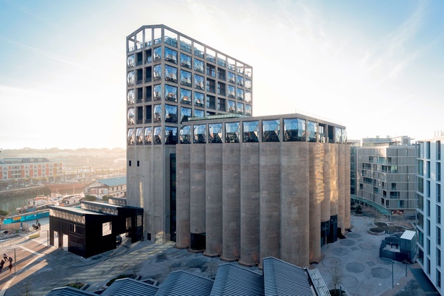
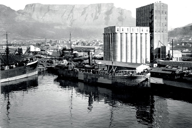
For over 80 years, the grand and historic Grain Silo, located on the edge of Cape Town’s docklands was a force in the city’s agricultural economy. Billions of tons of grain were delivered to the elevator tower, hoisted to the top of the 60 metre silo bins and then processed inside their gargantuan concrete cells before being shipped across the country.
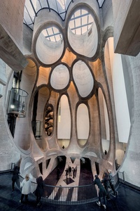
Now, almost 15 years since it fell into disuse in the 1990s, its monumental façade, fallow innards and hulking metal machinery have been transformed into a dramatic receptacle for contemporary African art (the Zeitz MOCAA, so-named after art collector Jochen Zeitz) as well as the adjacent Silo Hotel.
The former is composed of two primary parts – the elevator tower and the storage silos, each of which measure 30 metres tall by 5 metres wide. As such, the design team at Heatherwick Studio were faced with an extreme design challenge: how do you create 9,500m2 of voluminous space where none existed before? “We started with 42 tightly packed concrete bins with no space between them,” says project architect Stepan Martinovsky. “Usually, in industrial buildings of this nature, we have vast space to work with. Here we had none.”
As a result, the team has spent the best part of a decade wrestling with the predicament – and refining the outcome – by successfully hollowing out the silos to create over 80 art galleries, a rooftop sculpture garden, screening rooms, art and conservation areas, a bookshop, a restaurant and bar and reading rooms.
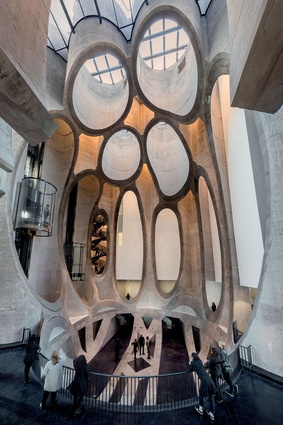
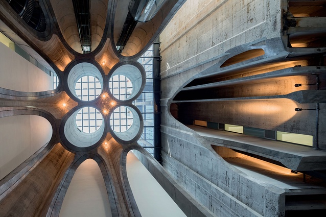
Treating the silos like cardboard tubes – and inspired by the shapes of a piece of grain – the team pushed the capabilities of advanced concrete-cutting techniques and their three dimensional skill set to painstakingly carve out a large central atrium, which functions as both an exhibition space and as an orientation and circulation zone that unifies the two buildings.
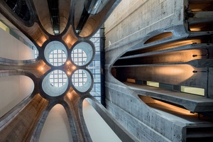
The result is a compelling convergence of geometries and edges that are still cellular in nature, housing circular glass lifts and spiral staircases. The bisected shafts bring light deep into the space through glass caps at roof level. International standard, white-walled galleries have been surgically inserted into the tower floors, forging a stark contrast against the bulk of the building, which has been left raw and untreated.
“We wanted to celebrate the heritage of the building, and so we left the majority of the building’s monumental façades and industrial machinery intact,” continues Martinovsky.
“We simply removed thick layers of render and paint in certain areas, which reveal the crude beauty of the original concrete.” This deft touch extends to the basement level, where a 2-metre-thick wall has been sliced open, its historical anatomy seemingly draped over the floor.
THE SILO HOTEL
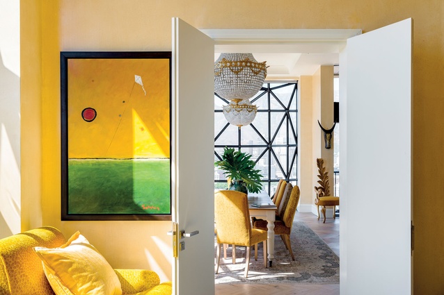
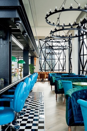
The Silo Hotel brings two distinct and disparate worlds into arresting counterbalance. Heatherwick Studio’s sculpted treatment of the silos and the museum’s raw, untreated surfaces and almost scale-less form work, are brought into sharp focus as The Silos’ lush, layered interiors unfold over six levels of the elevator (grain) tower.
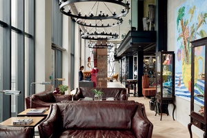
“I think that the contrast between the stark, industrial exterior, and the colourful, comfortable and eclectic interiors is something unique,” explains Liz Biden, the CEO and founder of The Royal Portfolio (who own the hotel) and the powerhouse behind the hotel’s interiors. Entry into Biden’s inner sanctuary is via the hotel lobby at ground level.
Guests casually enter under the saw-toothed roof and steel latticework of the silo’s existing track shed into a tight, double-volume space. A Haldane Martin contemporary chandelier and graphic artworks by Frances Goodman and Jody Paulsen are juxtaposed against an original grain hopper, left in situ a formal introduction to the remainder of the hotel’s contrast-heavy interiors.
Throughout the hotel, Biden has leveraged her repertoire of knowledge of art and textiles to create a plush and eclectic series of private and public spaces.
Mirroring the mandate of the museum, the suites, café, bar, restaurant and reception area feature pieces by the continent’s emerging and eminent contemporary artists.
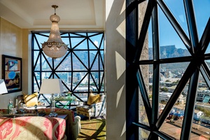
The interior architecture of the hotel, by Rick Brown & Associates, takes advantage of every possible opportunity for light and space, in a floor plan severely restricted by a strong structural grid. The team have deftly slotted the hotel bedrooms between structural columns and the two elevator shafts, resulting in spaces that are narrow in width but soaring in height, taking advantage of the existing floor-to-ceiling ratio and the billowing glass lanterns that punctuate each of the window openings.
Waking up to sweeping views of the Cape’s famous mountainscape, historic waterfront and criss-cross of highways leading in and out of the city is perfectly paired with Heatherwick Studio’s engineering-heave intervention and Biden’s soft, fabricated world.

