Green Goddess
When Shaun Carter of architectural practice Carter Williamson Architects was charged with designing this new residence in Sydney’s inner-west suburb of Rozelle, he recognised that his client’s plot harboured enormous potential.
Carter is responsible for the acclaimed Upside-Down, Back-to-Front house, located on the same street. With it, he had succeeded in transforming an existing worker’s cottage and a steep site into a practical, light-filled and dramatic family home. So, when he started work on this dwelling, Carter knew that he could, as he says, “leverage the site’s dramatic level change to create a highly functional and inviting multi-levelled home.”
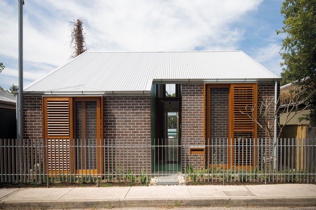
In a street predominantly characterised by low-rise workers’ cottages, this modestly scaled, 225m² home, designed for a young couple and their newborn baby, makes its presence felt but neither challenges nor distracts from the street’s historical gravitas. A single roofscape, rising up from the upper, street level, picks up the ridge lines of the original workers’ cottages on the road before flattening out and dropping down over the ground floor.
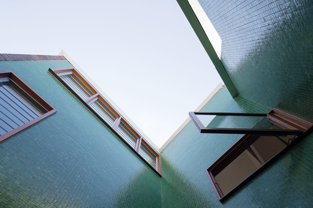
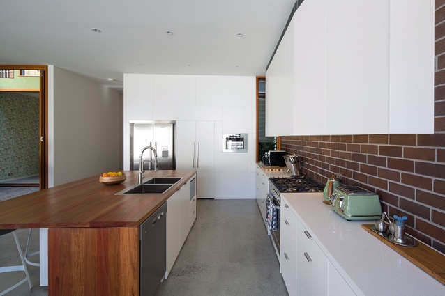
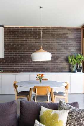
Despite a tight budget, the building materials used also reference the Federation style of architecture found in the neighbourhood too. “We used a material palette of brick, galvanised metal sheeting, timber and tiling,” Carter explains. “In Federation homes, the tiling was typically laid horizontally but we’ve pulled the tiles into the walls of the house in a contemporary gesture.”
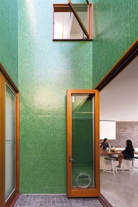
The grass-green, glass tiles used at the front and back and in the courtyard constitute a bold move, but they succeed in creating a striking contrast to the home’s rich and meaningful archival overlay.
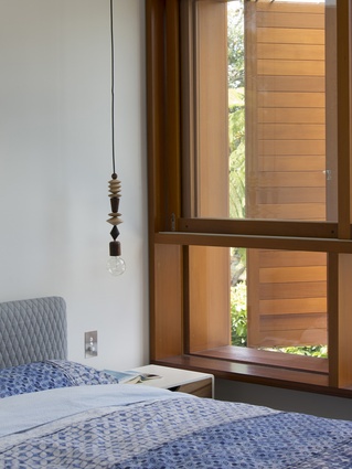
Seen as one storey from the street, the upper floor includes a guest room and baby’s room (both with mezzanine levels), the master bedroom and an open-plan playroom and library. A vertical, glazed skylight draws light into the open stairwell and through a void to the ground floor below.
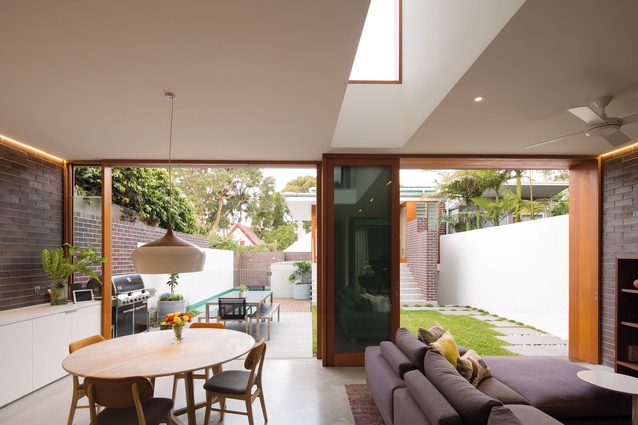
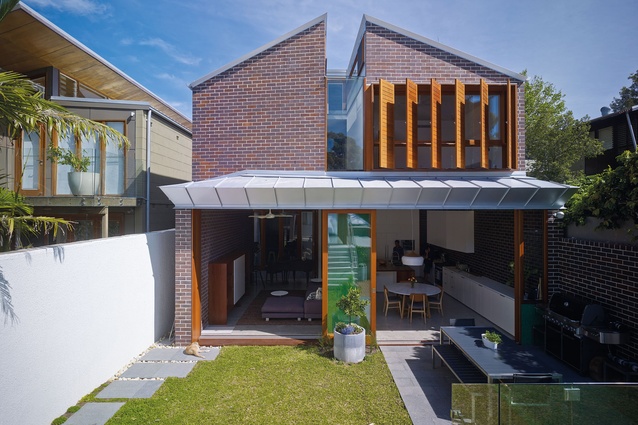
In typical fashion, Carter has also woven his signature spatial manipulation magic by creating a level connection between the lower floor, which features an open-plan dining, living and kitchen area and an intimate, walled garden framed by a free-standing studio at the end of the site. This level also houses a workshop and a small internal courtyard; the courtyard draws in light through the centre of the house and provides additional natural ventilation to the floor above.
The studio, primarily utilised as a home office, is an elegant pavilion-like form which presides over the rear lane, the garden and the swimming pool. It also features a shower room, accessed from inside the studio and from the swimming pool area adjacent.
Without skipping a beat, Carter has converted the level change between the studio and the garden into “town hall steps”, which provide generous outdoor seating for the fenced oasis. Also, he has housed pool pumps and additional storage cleverly within the garage below, taking up the varying heights and pockets of space to the underside of the pool and garden.
Carter has managed to fill the main house with light, despite its facing south. “Our challenge was to try and pull the ‘wrong’ quality of light into the house; our solution was to deconstruct the roof,” says Carter, referring to the predominantly pitched roof, which has been truncated in the centre (the void forming a glazed, rectangular cut-out). The resulting slot draws sunlight deep into the ground floor living area as well as the open playroom and library on the first floor. The open-plan living area is the clients’ favourite part of the house.
“It’s from here,” says Carter, “that you’re able to appreciate the fulcrum of the house, the extent of the garden and the view beyond which includes a glimpse of the White Bay Power Station.”

