Guy Tarrant
Have you always lived in Auckland?

No, I’m from Wellington originally. I came to Auckland in 1981 to study fine arts at Auckland University, with the intention of being a painter. However, once I’d graduated and spent a year working in a studio on my own I came to the conclusion that being a painter wasn’t really going to suit my personality. Being alone all day was challenging. As a kid I had always been interested in architecture but was discouraged by my poor maths and science results, a prerequisite for an architecture degree back then. Once I began questioning my motivation as a painter, I began considering architecture again and as a fine arts graduate the prerequisite subjects were no longer a condition of entry.
Do you continue to paint, in your down time? Assuming you have some down time.
People keep telling me I should be painting more (laughs). But no, I don’t do any painting anymore. Perhaps I will take it up again at some point in my life. Certainly looking back at the paintings I did do I can see how my paintings may have developed and I have become increasingly interested in the relationship between my paintings and the architectural work I do. It would be nice to think that my handling of materials and light was almost painterly. I’m thinking more and more about how my training as an artist informs the way I work as an architect.
And do you think having grown up in Wellington influences your work?
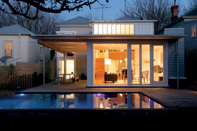
I moved to Auckland to attend Elam in 1981 – the beginning of a crazy decade. I loved Auckland instantly; there was no mourning for Wellington. It was an awakening for me really, so no, I don’t feel like my past in Wellington informs or influences my architectural work. The houses I create are foremost a response to a specific site and brief; and the influences of my ongoing architectural education.
How would you describe your process for designing a house?
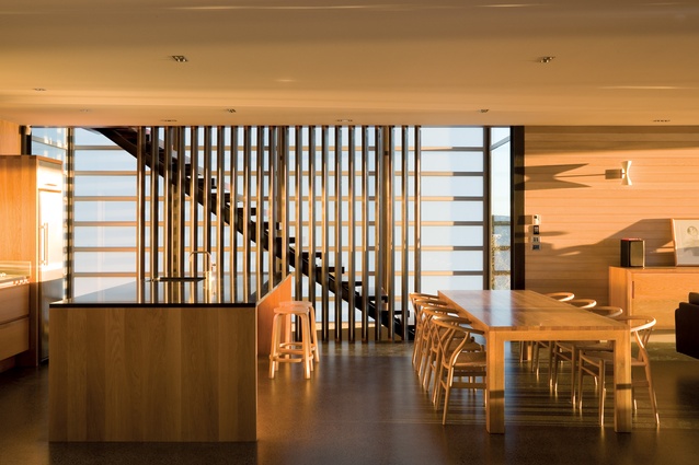
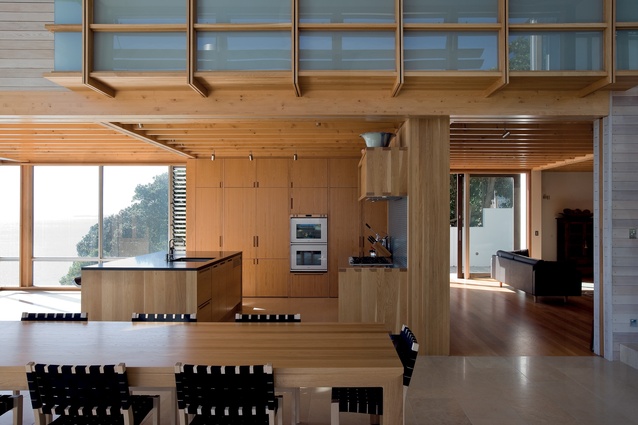
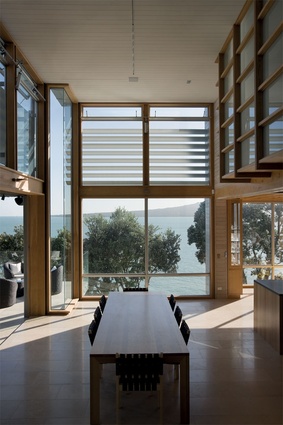
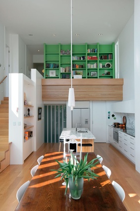
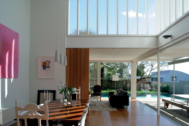
I’d like to think my houses are driven by the plan, so I’m trying to resolve the plan as elegantly and as completely as possible before I start thinking too much about what the house is going to look like. I’m interested in what a house feels like to be inside. I’d like to think that I design from the inside out always, so principally, I’m concerned about what it feels like for the occupants to be in the house.
There’s talk that through shows like Grand Designs the general public has become more au fait with architectural design. Have you found this to be true?
Certainly people are more aware of what a modern building might be like or perceived to be like but I don’t know that there’s a greater understanding of architecture. I think these shows have made people more aware of architectural images, so the idea of a house as an object is certainly something that more people are aware of. But, in truth I think it’s the obvious ‘bells and whistles’ things that people are responding to, if you like. And possibly things like beautiful planning, subtlety, restraint – the craft of architecture – those kinds of things are still not something many people are truly aware of. I feel that for most people still, the notion of engaging an architect is seen as elitist and extravagant. It would be great for people to really believe that even if they were considering a revamp of their kitchen that they should consider talking to an architect. Architects add value on many levels, and it would be nice for people to appreciate that.
As an architect, are there any buildings that are particularly standout for you, either here or overseas?
The most influential house for me would have to be Villa Mairea by Alvar Aalto. Aalto’s work generally is a standout. I say this having never actually visited one of his buildings. I have always admired Le Corbusier and a particularly memorable moment for me was to visit Villa Savoye. It was extraordinary to actually experience the building after years of seeing it in photographs only – much more intense than I could have imagined. I visited several other Le Corbusier buildings (Pavillon Suisse for example) during that same trip but Villa Savoye was a standout moment definitely. On a more immediate level there are two local houses that I’ve been to many times that I particularly enjoy. The first is Marshall Cook’s own house, which I visited recently after more than a year and again I was really struck by what a great series of spaces it is. Also, good friends live in a Stevens Lawson-designed house that I have been to many times over the years and it’s a house I enjoy every time I visit. On a public level, the work Pip and Nat Cheshire have done in Britomart is a real model, I think, for how good commercial architecture can be. There is something inspirational about the way those buildings have been considered and what they are like to experience. It’s a very good collection of spaces indoors and particularly out, beautifully scaled and textured. So, yes, there are some lovely moments and it’s particularly impressive for a developer-driven project. It’s been very positive for central Auckland.

