Gymnastics of the cross
Chris Barton explores the religious expression embodied in the design of The Chapel of St Peter by Stevens Lawson Architects.
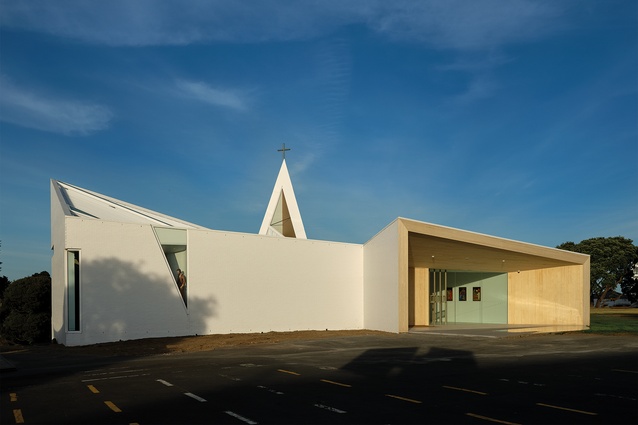
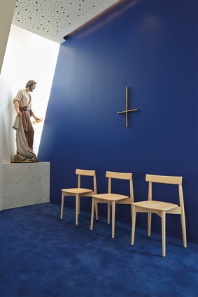
There’s a new presence during ‘morning yard assembly’ at Auckland Catholic secondary school, St Peter’s College, Te Kura Teitei o Hāto Petera, when some 1350 boys gather in front of a doorway, its lintel adorned with a figure of Mary, mother of Jesus Christ, looking over them. Now, at the rear of the outside assembly yard, another onlooker peers somewhat surreptitiously from an inverted triangular window on the western façade of the school’s new chapel. The life-sized statue of St Peter, brandishing his pair of keys to the kingdom of heaven and trailing his fishing net, is no doubt benignly watching out for the boys. To an outsider, he’s a little unnerving.
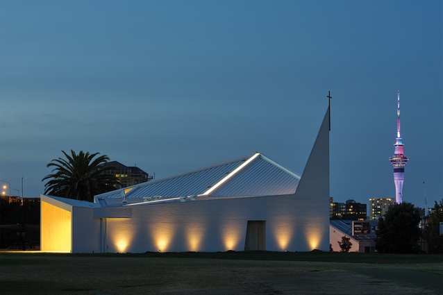
Until he was pointed out, I hadn’t noticed the saint who gives the school his name. I was more captivated by the arresting geometry in white of the $3-million, 220-seat Chapel of St Peter itself. Designed by Stevens Lawson Architects and completed in February, it was opened a week before COVID lockdown. You don’t get very far in appreciating what this building is about without taking in the many signs and signifiers that abound in this Catholic college, established in the central suburb of Grafton in 1939 and integrated into the state system in 1982.

They begin with the 11.5-metre, 7.5-tonne inverted cross, also designed by Stevens Lawson and placed, in 2017, at the Mountain Road entrance to the school. St Peter the Apostle was crucified upside down, a sign of his self-proclaimed unworthiness to share the fate of Jesus. Most see the inverted cross as representation of the humility and martyrdom of St Peter, which artists, such as Caravaggio in the early 17th century, have depicted over hundreds of years. More recently, the symbol has found its way into popular culture as an anti-Christian emblem, often associated with satanic themes.
The college was well aware of the negative connotations of the Petrine Cross and, in the midst of a sometimes-hostile culture, saw a need to reclaim the Christian heritage. NZ Catholic: “It is true that the college could have chosen the keys to the kingdom as a symbol of their patron saint. But, it was reasoned, it was not so much the Petrine ministry that needed emphasis today among our young, as it was the role model of strong, yet humble, Christian, Catholic leadership – even unto death.”
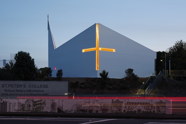
The sentiment is very much alive in the new chapel. Looking up from Khyber Pass Road by the Grafton Railway Station, there’s a large, traditional-looking cross cut out of the white brick of the northern face of the building in glass. The effect is not unlike that of the glazed cross formed in the walls of the college’s Technology Building, designed by Architectus in 2001 and highly visible from the Southern motorway near Gillies Avenue.
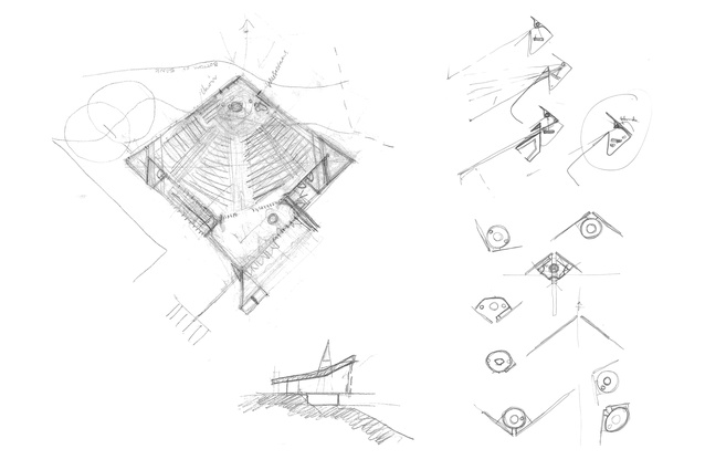
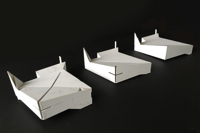
Here, the vertical cut or staff of the cross is made at the apex of walls formed by a diamond-shaped plan. The result is the glass slits for the cross bars or arms of the cross bend backwards from the staff in a difficult gymnastic gesture along the building’s north-east and north-west walls. Illuminated at night with LED strip lighting, the cross from this view is a powerful Christian billboard, 24/7.
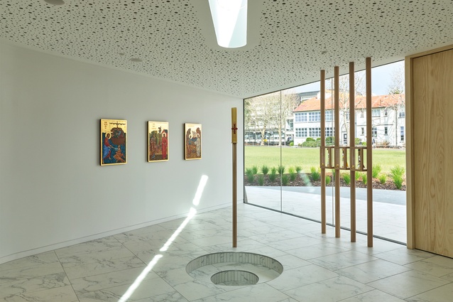
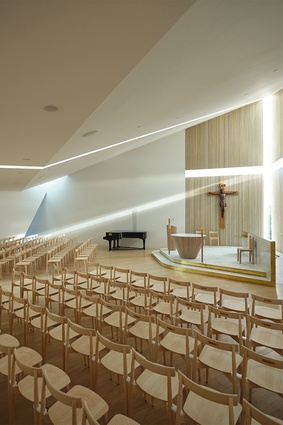
Inside, the cross gymnastics are even more complicated. The chapel is entered from the side via a generous protruding porch – its sides and ceiling lined in Accoya – beginning at the southern apex of the diamond-shaped plan. A right turn through the timber doorway, flanked by a wall of floor-to-ceiling glass, puts you in the narthex, a low-ceilinged, triangular entrance lobby with a ceramic-marble-tiled floor and sunken, circular baptismal font. It also puts you in the central aisle, the long north-south axis directly facing the glass cross, this time with its arms reaching towards you.
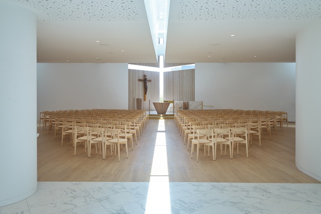
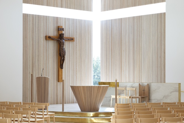
Above, the ceiling slopes up, gently at first, then rises more steeply – perhaps to heaven. The sacramental journey from font to altar is reinforced by a long strip of skylight glass running the length of the central aisle to the top of the vertical glass staff of the cross. In the procession, the cross makes its ultimate move – a somersault, so it’s now upside down, thanks to the extended staff, the glass strip folded into the ceiling. A play of the light that is not unlike the inverted cross at the entrance, which casts a shadow that is right-side-up during the day.
The theatrical spatial climax along the central axis takes multiple readings: a Petrine Cross, “I am the way, the truth and the life”, or, more literally, a sundial providing shafts of sunlight that penetrate the chapel throughout the day, casting a wonderment of shadow and light. The design recently won both an NZIA Local Award and a German Design Council Iconic Award for Innovative Architecture. [Editor’s note: Since the time of publication, the project has also received a New Zealand Architecture Award.]
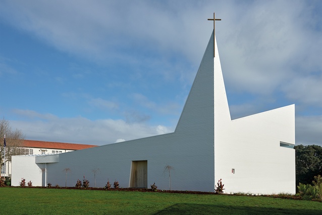
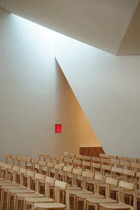
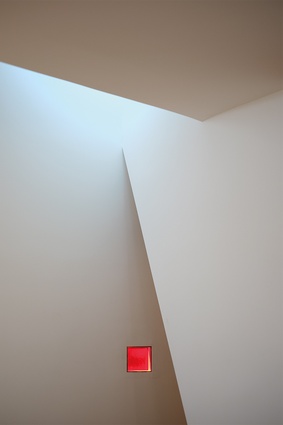
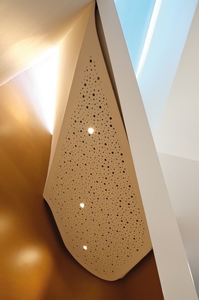
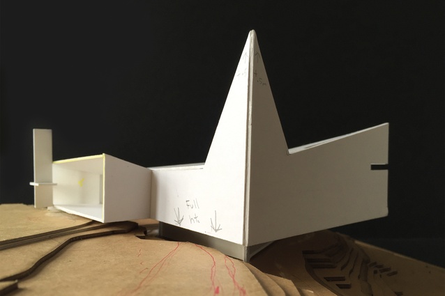
Triangles feature often in this meticulously crafted, minimalist sculpture. They might evoke an abstracted reference to the holy trinity but, here, they seem mostly about the forms and the light that result from triangular shapes. The narrow, inverted triangular window from which St Peter peers provides a counterpoint to the building’s sharp triangular spire, with two solid planes and the third with a triangular skylight. If you’re Catholic, you might see an allusion to the peaks of the mitre – the liturgical headgear worn by bishops and popes.
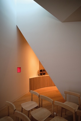
Regardless, the fusing of the two sides of the triangular spire to the south-east corner of the building makes for a striking vertical gesture. And the light falling from the skylight face of the spire into the side sacrament chapel below – housing the tabernacle (where the bread for communion is stored) – makes for a sacred atmosphere of quiet contemplation. The two side chapels, situated symmetrically on either side of the east-west axis of the diamond floor plan, are signalled from above with small triangular skylights and accessed via open triangular doorways.
Unlike the rest of the chapel, which is seamless white gib board walls and ceiling and an oak timber floor, the reconciliation chapel, where the carved wooden statue of St Peter resides, is a splash of electric blue carpet and blue-painted walls. It represents a change in the space of Catholic confession – no booths, no doors, and windows providing a connection to the outside for safety. Private but not too private, this is an architecture to counter the history of sexual abuse in the church worldwide, for which two popes have officially apologised. It offers a setting that allows for personal discussion and counsel between an individual or a small group and a priest, sheltered from the chapel, yet still connected and visible.
Stevens Lawson has taken considerable care to stay true to ‘noble simplicity’ – the key principle in contemporary Catholic places of worship, in sharp contrast to the ornate and highly decorated tradition of Catholic churches. The idea, says Gary Lawson, is a design that’s very simple and austere to make the focus on “the journey of the self and your connection to God without being too embellished”.
The unavoidable embellishment central to various traditions of Catholic faith has made Stevens Lawson work hard to locate various religious artefacts within the chapel’s clean, white austerity. Hence, the firm’s restrained palette of marble, brass and oak in the design of the altar space with its disability ramp and its furniture: the candlesticks, the circular altar, the presider’s chair, the credence table and the careful placement of the crucifix, an Oberammergau corpus hand-carved in Germany on an oak cross.
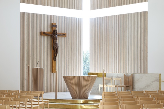
In a wall niche, there’s also a hand-carved statue of Mary made by Michael Pervin from the Studio of John the Baptist. On the wall by the baptismal font, three icons, hand-painted in the traditional manner by the same company, depict significant moments from the life of St Peter. The pale ash Lara congregational chairs are from renowned British furniture-maker, Ercol.
What impresses most about this chapel is its extraordinary attention to detail, to stay true to its noble simplicity brief – from the subtle curves in the walls that transition from the font area, to the main body of the chapel, to the precise acoustic tuning with Marshall Day to design the building, as Nicholas Stevens puts it, “like an instrument to amplify singing”.
Stevens and Lawson acknowledge Tadao Ando’s Church of the Light as an influence. They mention also Álvaro Siza, Alvar Aalto, John Scott and a bunch of contemporary Spanish architects. A fine lineage for a design that encapsulates the transcendental power of well-articulated religious architecture.

