Happy kisses
Hospitality with social-media-ready interiors? Rebecca Zephyr Thomas steps into Happy Boy and Kiss Kiss, two Auckland restaurants designed to be Instagrammable.
HAPPY BOY
Happy Boy is the fourth and most recent venture from a young, Auckland-based trio Celeste Thornley and Jasper and Ludo Maignot creating social-media-ready, inexpensive and impactful interiors made from an excellent usage of colour and graphic design.
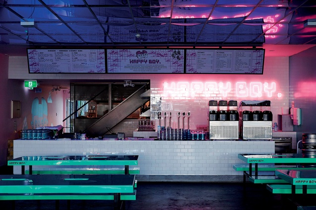
Happy Boy, which opened in July 2017, stands out from its Royal Oak neighbours by being a clean, simple, but glowing, blue box. According to Jasper ,the area is “old money but with young suburbs around it. Epsom’s old money, but Onehunga has all the young parents. There was a huge gap in the market here.”

As such, the interior of Happy Boy is based on pop culture references that many children of the 80s and 90s would hold dear. There are hints at classic hip hop music videos, arcade games like Sonic the Hedgehog and sci-fi movies such as Tron. It’s a nostalgic look back at what was a pre-internet view of the future.
Jasper says the design was always meant to be powerful: “Space Invaders, StreetFighter. The whole idea behind Happy Boy was to create a simple menu and an atmosphere that was just a whack on people’s faces.”
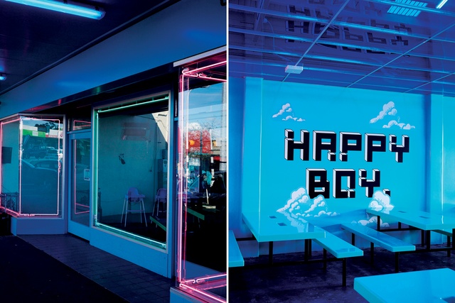
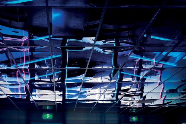
Ludo’s academic background is in spatial design and his influence is evident in the layout and finishing touches here with the electric blue perspex ceiling being a standout feature in the locale. Yet, these pop references are not merely decoration but also a cleverly-thought-out marketing strategy that seeks to enhance the digital potential of the wildly-decorated interior.
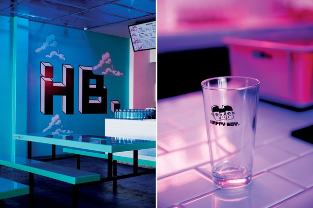
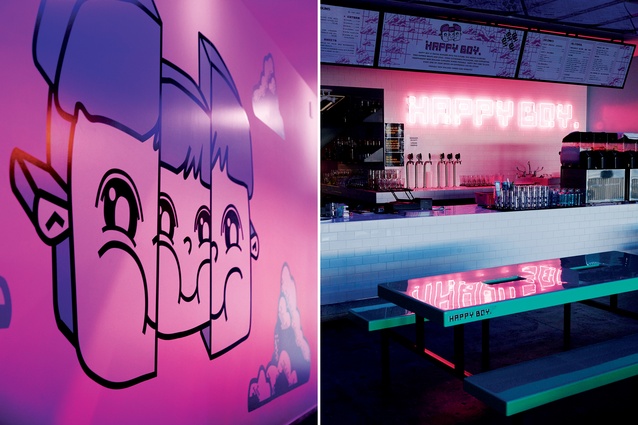
The cartoon characters that adorn the glassware, the packaging and even the walls of Happy Boy have been created by Studio Miede and its director Sarah Hui says: “We can imagine that people Instagram the packaging, also the venue, as there are so many places to take photos and it is a worldwide trend; people want to be able to develop their own content. It’s less about the marketing side of it and more about people having fun. It’s about having an experience and getting something out of the visit.”
KISS KISS
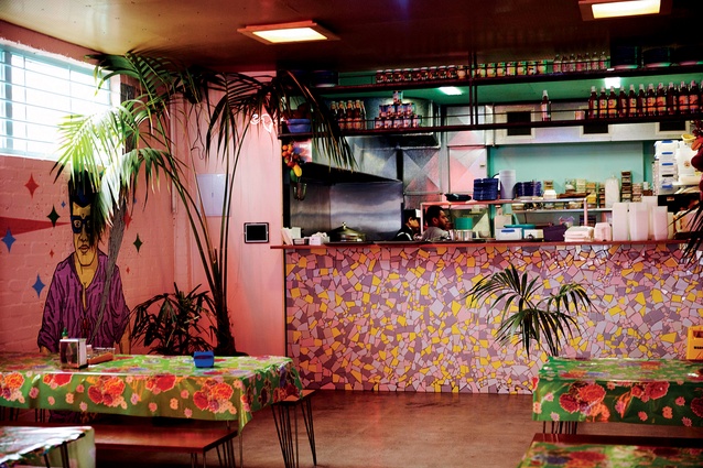
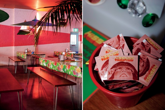
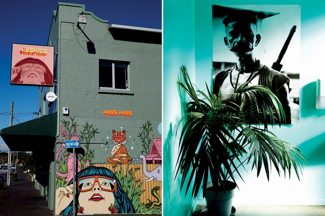
Kiss Kiss is all soft pink walls, subtle neon, palm trees and umbrellas. It is Asian and tropical while at the same time being a colourful homage to a retro era. For the Instagram generation, this space ticks several boxes: that of the holiday pic and the food pic all wrapped into one and giving the visitor a unique photographable experience.
Celeste, Jasper and Ludo’s sense of style is bold, colourful, surreal and completely scatter-gun, with influences from a wide selection of pop culture references. The design of this Balmoral eatery was partly inspired by Ludo’s love of 1970s’ Thai jazz and documentaries including Sound of Siam, but also of current New York-based recording artist Hot Sugar, whose aesthetic is laid-back, neon-drenched, 80s’ kitsch.

The references might be slightly obscure but Celeste, Jasper and Ludo make the look friendly and accessible to anyone who enjoys colour and craves an upbeat dining experience with plenty of point-and-click potential.
The clientele includes pensioners, young families and groups of friends in their 20s – all enjoying the bench seating, soft pink walls and meticulous attention to detail. There are small mementoes that make the interior multi-layered (such as the mini branded Kiss Kiss hand wipes, immaculately packaged and pretty as a picture).
Celeste explains how the design process here was one of constant collaboration: “I’d say Ludo’s the most extreme in terms of craziness, Jasper’s in the middle and I’m at the bottom. I will always be: ‘No let’s tone it down a bit’. Ludo is: ‘No, let’s go crazy!’ – but we manage to make it work!”
Colour is a key feature here, as Celeste says: “We start with deciding on a colour and we like to go bold with it. That’s probably a noticeable thing in what we do; we go the whole way and over-saturate it.”
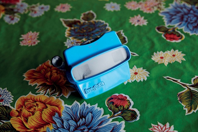
Another highlight includes the View-Master cocktail menus. Celeste was initially hesitant about the toy: “I was like: ‘Oh, I don’t know’, and Jasper and Ludo were like: ‘No, imagine! Everyone will want to take a photo with them’,” she says, “and… it was true!”
THE MASTERMINDS
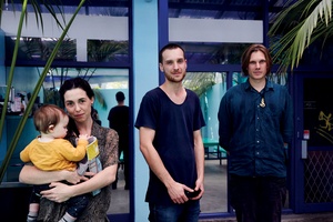
Celeste Thornley, and Jasper and Ludo Maignot
The team behind Kiss Kiss and Happy Boy are partners Celeste Thornley and Jasper Maignot along with Jasper’s brother Ludo. Their aspiration is to bring a type of dining experience to Auckland that is high on style, value for money and visual candy.
“It’s entertainment; it’s visual entertainment,” says the part-French Jasper. “Design helps to create the experience; it creates the atmosphere. Music, interiors, food.”
Celeste also notes the undeniable influence social media has on modern life and the way it partly dictates the decisions as to how people spend their leisure time. “A lot of people don’t want to go to a restaurant unless it’s Instagram worthy,” she says.
Yet, at the same time, it is slightly ironic the amount of love both interiors receive from Instagram given that Celeste confesses to being “useless on social media. For us, it’s been such a struggle. But in terms of gaining a really big audience, we’ve managed to create spaces that people love to Instagram.”
Although the trio has very clear ideas of what they like and all the interior flourishes in both Kiss Kiss and Happy Boy are designed by the talented threesome, they have a wider creative gang that helps make the magic happen.
They have built a circle of similarly-minded young creatives around their growing empire, working with sisters Sarah and Ellyn Hui of Meide Studio on the branding, design and web presence and architect Harriet Mildon King (Patterson Associates) and builder Nick Coldicutt on the physical spaces.
DESIGN & BUILD
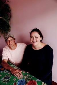
Nick Coldicutt and Harriet Mildon-King
Builder Nick Coldicutt is an old friend of Celeste’s; he’s worked on all four of their restaurants so he has an insider’s view of the design process. “How it usually works is they come up with a look book and a theme for each place, they have an idea of what they want, and then they put together a whole portfolio of the things they are interested in. They come to me and Harriet [Mildon-King] and we talk through ideas and Harriet starts drafting up a basic floor plan, elevations.”
STUDIO MEIDE
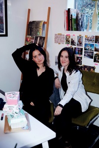
Sarah and Ellyn Hui
Sarah and Ellyn Hui of design studio Meide were heavily involved with the graphics and feel of Happy Boy; they developed the Happy Boy cartoon character for the restaurant. Sarah mentions that the idea behind the modern burger joint was always about more than just sitting down to eat. “It’s like ‘futuristic, arcade, diner’ and also that it’s more of an experience coming to the place than being just a food place. It was Anime, Asian inspired”.

