Domestic joy: Harry House
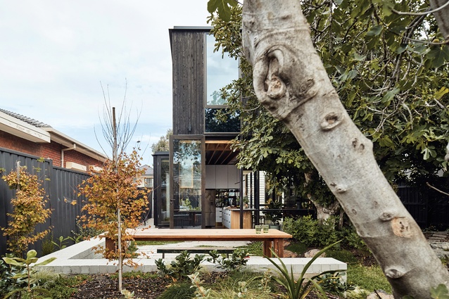
Wrapped in charred timber cladding and hugged tightly by a lush suburban garden, this discreet addition to an existing cottage expertly balances function and folly.
Located in an unassuming street in Melbourne’s north, Harry House is a hidden addition to the rear of an existing cottage. Described by the owner as a house that is “so easy to live in,” Harry House acts as a framework that supports a family of five. What makes the house remarkable is the way that architecture practice Archier has taken a very detailed and pragmatic brief and translated it into a design that is not only highly functional but also playful and neatly resolved.
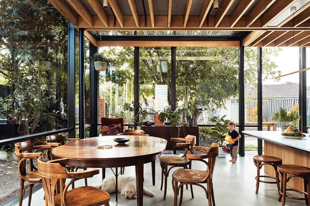
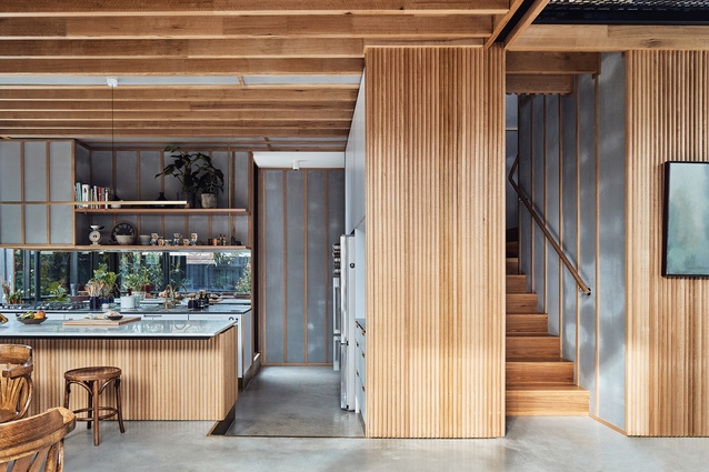
The owners had a forensic understanding of how their family would live in the house and wanted their requirements to be packaged in the smallest building footprint possible. An inspection of the plan reveals that this has been accomplished. The kitchen and dining areas – those used most frequently by the family – are privileged over the living area and allocated the location with the best outlook and access to daylight.
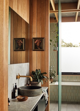
The living area is compact by comparison, with views out to a small courtyard, and has a closer relationship to the children’s bedrooms. To keep the plan compact, the clients’ three sons share one bathroom, which has been planned with the shower and toilet in separate rooms so that multiple users can be accommodated at once. A central laundry is flanked by the children’s bathroom and a butler’s pantry in a series of linked spaces.
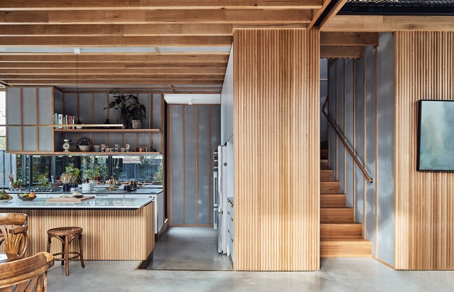
To further streamline day-to-day family life, service spaces are centrally located and easily accessible from all bedrooms and living spaces. They are not hidden from view, as one typically expects. These clustered service spaces function as a production line of cleaning, bathing and feeding, and each has been designed with highly robust, child-friendly finishes. Efficiency in these spaces was crucial to meeting the owners’ expectations for how the home would frame their lives.
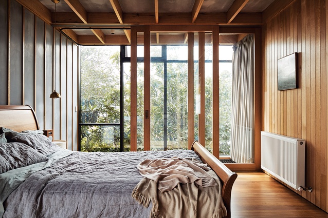
Although the clients knew how they wanted the house to work, Archier challenged their initial brief, unravelling opportunities to create architectural delight. The clients had envisioned the house as a single storey, but Archier encouraged them to raise the main bedroom to a first-floor level in order to engage more with the garden, including two significantly sized fig trees. This move had the added advantage of creating a private sanctuary for the parents.
The finished garden is lush and expansive. Full-height glazing around the kitchen and dining areas takes advantage of this green backdrop. Soft landscaping pulls in snugly around the facade, making the space feel like an outdoor room nestled into a jungle. This gives visual breadth to the kitchen and dining zones, which occupy a much smaller footprint than one would assume. It’s a move that has allowed the clients to build less yet gain more.
The floor of the kitchen is slightly lower than that of adjacent areas, reducing the dominance of the island bench. A mirrored splashback reflects the garden, further diminishing the presence of the joinery and allowing the garden to sing. This sunken kitchen – a move driven by the architect – also encourages a stronger social connection between the kitchen and dining zones, so that even the youngest child can peer over the bench and participate in conversation.

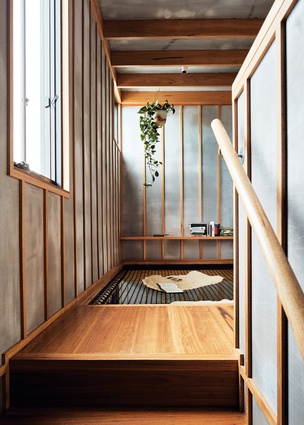
A double-height void adjacent to the glazing takes further advantage of the garden. The first floor stops short at both the north end, facing the garden, and the south end, where the new addition meets the existing cottage, creating double-height spaces at either end. Appealing to their clients’ playful side, Archier proposed the suspension of netted hammocks within these voids. This creates usable spaces above while still allowing light and air to penetrate below. The south hammock, which is located at the stair landing, acts as a rumpus space for the children. As a room with a standard floor, it would have felt poky and compromised, but as a netted hammock, it feels more than generous. It’s a fun and playful space that stokes the imagination and will surely make this house a great place to grow up in.
The less visible but no less noteworthy success of this house is its ability to seamlessly negotiate its suburban setting. The rear extension is a neat double-storey cube wrapped in charred timber cladding. For a practice that has worked largely in rural settings, Archier has been adept in wrestling with planning restrictions to design an extension that bears the same formal clarity as its rural projects. The design team has been strategic with the size and placement of first-floor windows, avoiding highlight windows and privacy screens so that the internal spaces feel uncompromised.
At Harry House it’s clear that Archier has listened carefully to the clients’ needs and thoughtfully given these ideas shape, resulting in a home that is highly functional but also a joy to occupy.
This article first appeared on architectureau.com.

