Havelock North kitchen
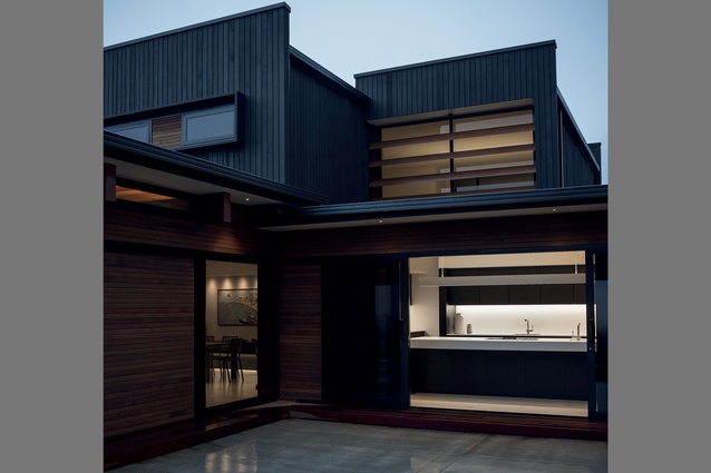
The holy trinity of real estate is, as we all know, location, location, location and this house has it in spades. Nestled in the foothills of Te Mata Peak, the home, bold of form and hue, creates a pleasing juxtaposition with the undulating hillside that enfolds it on three sides.
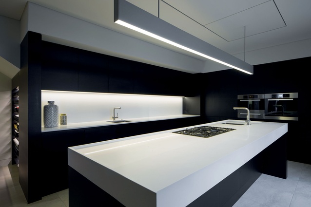
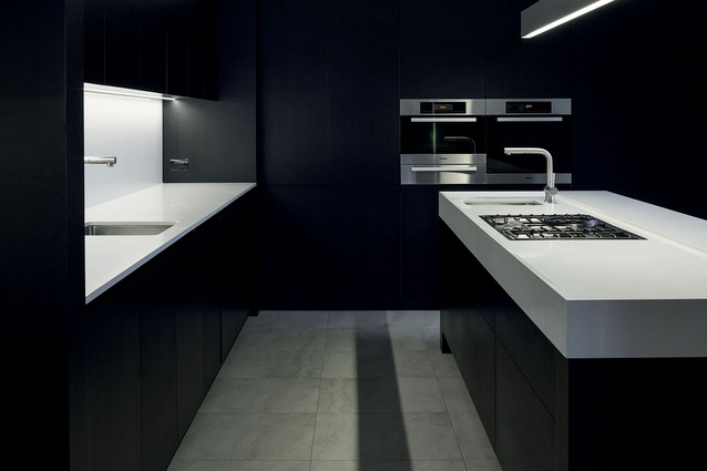
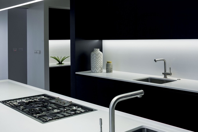
Designer Leanne Larking of Quattro uno was tasked with creating an equally bold kitchen that would not only complement the architecture but would make a statement in its own right.
“The clients wanted a kitchen that was a self-contained space where food preparation could be carried out without overlooking the living areas. They also wanted to utilise a dark/light colour scheme.
“The kitchen ceiling is interspersed with 400mm bulkheads. The decision was made to incorporate these into the overall design aesthetic repeating these forms in the island and rear wall area to create a very linear look. Colour blocking serves as a visual reinforcement of the programme.”
The designer says one of the more challenging aspects of the project arose from the client’s wish for the hob to be positioned on the island.
“As the kitchen faces the view, the client didn’t want the traditional suspended island rangehood, so we had to devise a system that sat flush with the ceiling plane – quite an undertaking at the time.”
As well as the usual fixtures and fittings, Larking also had to make provision for ample wine storage and a bar area.
“The wine cellar area has been inserted into the space created by the stairs positioned behind the rear wall. Keeping as much height as possible in the storage area creates the illusion of the space being bigger than it actually is. Across from this is the bar, which incorporates storage across upper and lower cabinetry.”


