Uncompromising geometry: Hawthorn House
Two monolithic pavilions shrouded in concrete rise from a landscaped platform in a skilful balance of architectural expression, material composition and comfort.
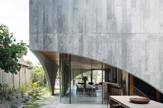
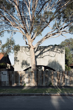
From beyond the property’s weathered, grey Oregon fence, Hawthorn House by Edition Office presents as a beautifully textured concrete box, its interior apparently carved out by a sweeping, almost improbably wide, arch at ground level. At a stretch, one might even be able to catch a glimpse of a second box that sits further back on the site. In the first instance, then, we are prompted to read the home as two cubes sitting in stark contrast to their surroundings. Past the front gate, however, the uncompromising geometry of the home’s street elevation gives way to a set of much more complex architectural ideas.
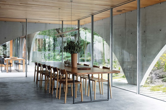
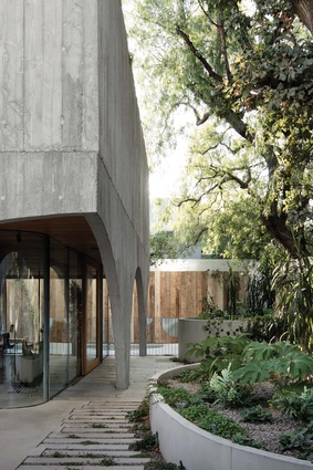
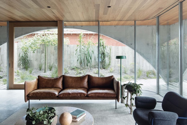
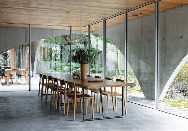
On entry, along the site’s southern edge, the monolithic concrete shroud on each cube can be seen to be one of several layers, which wrap effortlessly around a set of rich interiors. What at first appears as a cave-like undercroft at ground level is revealed to be a warm and incredibly light-filled kitchen, dining and living space. In the rear second pavilion, another entertainment room faces onto the pool area at the very back of the property. Bound by continuous glazed walls and offset from the concrete shell that encases the upper floor, these spaces look out through soaring arches to a shared courtyard with maturing gardens of creeping and climbing plants.
If there are cave-like spaces within Hawthorn House, they exist only in the heavy concrete spine connecting the twin pavilions and their respective levels. This corridor, anchoring the house to the south, operates as a service core for the home’s kitchen and bathroom spaces. It also organizes a series of more intimately scaled rooms and passages, and incorporates bench space, storage, fireplaces and even a small guest bathroom.
Unencumbered by these elements, the main kitchen and living spaces have been opened up completely to their surroundings, making the ground level delightfully porous. The home’s interior takes every opportunity to draw in, and connect with, the landscaped spaces on the site, while simultaneously avoiding views to neighbouring houses. Adding amenity to the material layers of concrete and glass around the perimeter of the structure, the sliding doors to the garden also feature folded, retractable screens, allowing the house to be opened for much of the year.

Recalling the outward appearance of the concrete cubes and their apparent lack of visible first-floor apertures, one might expect to find a collection of relatively dark, inward-facing rooms above the ground floor. Instead, Edition Office has created a sequence of walled balconies that provide both seclusion and outlook to the sleeping, study and play spaces on the upper level.
These balconies have been designed as much to be gardens in and of themselves as to frame stunning canopy views of the trio of mature trees retained on site. Creeping vines and large potted plants are already beginning to climb the concrete walls of the balconies and will no doubt spill over the facades in time, fulfilling the architects’ vision for “private courtyards, full of plants, sky and tree canopy.”
These first-floor balcony gardens provide the key to understanding how Hawthorn House operates as a house – that is, how it uses the logic of what at first seems to be a pair of civic-scaled cubes in order to create a series of intimate residential spaces behind a concrete veil.

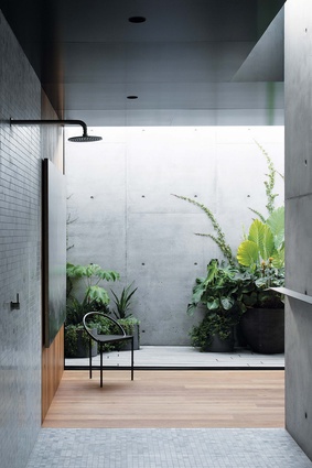
The architects have used a range of strategies to inject multiple layers of complexity and warmth into what could have been much more predictably stark, concrete spaces. The gentle, rounded corners found in the ground-floor glazing are repeated with precision in the upstairs bathrooms and joinery.
These intricate details – for example, the custom corner tiles to the shower and bath in each ensuite – have been carefully balanced by a more effortless, but nonetheless thoughtful, system of brushed and polished brass hardware and accessories. These elegant pulls, hooks and supports will evolve with continued use, developing their patina and complementing the natural variations and textures of the concrete, granite and blackbutt deployed throughout the home.
The strong pavilion forms of Hawthorn House protect a sequence of nested layers and permeable spaces that actively counter the apparent weight of the project. The games being played here, between solid and void, heavy and light, open and closed, are not necessarily new, but Edition Office has pushed these oppositions further than most tend to. The resultant spaces are unexpected and captivating in their capacity to articulate contradictory conditions without sacrificing the sense of comfort required in a family home.
This article first appeared on architectureau.com

