Heart of glass
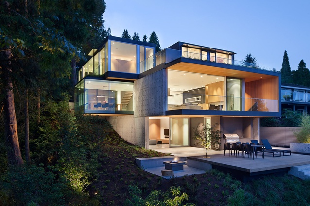
For Nigel Parish, the inspiration for his client’s new family home came directly from its spectacular setting. The steeply sloped West Vancouver, Canada, site looks onto the ocean from the south and abuts a Douglas fir and cedar forest to the west. In many ways, Parish was left with no choice but to respond to the rugged topography and he did so with the utmost respect. “The site really did speak for itself and the clients and I wanted to acknowledge that,” says the principal of Splyce Design. “So we maximised the ocean and forest views because that’s where its real value lies.”
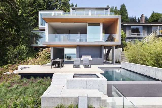
The resulting 427m² plan comprises three levels on its southern elevation and reads as a series of protruding and recessed stacked glazed boxes. Parish strategically configured it to allow for uncompromised views and to also let in as much sunlight as possible. While it was necessary to position the house high on the site in order to achieve these outcomes, it was also important that it be relatively low to enable close proximity to the backyard. The clients, a couple in their early forties, have two young daughters and wanted immediate access to the garden and pool when the children were outside.
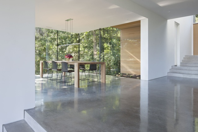
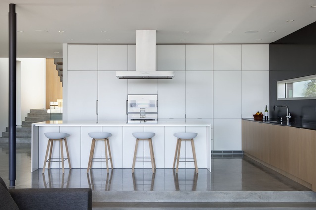
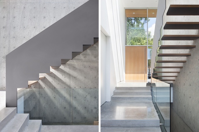
From the street, the house appears modest in scale and the main entry is on the middle floor. But once inside, a dramatic double-height stairwell opens up to reveal a generous skylight offering vast views. Subtle level changes from the entry through to the kitchen, lounge and dining room serve as a reminder of the site’s steep slope and also offer visual interest to the open plan. While Parish located the master bedroom and children’s bedrooms on the upper floor and the two guest bedrooms on the lower ground floor, separating the living areas was never a consideration. He also positioned the external stair to the lower ground floor from the middle floor terrace, which enhances accessibility to the backyard.
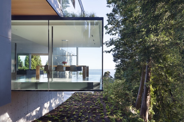
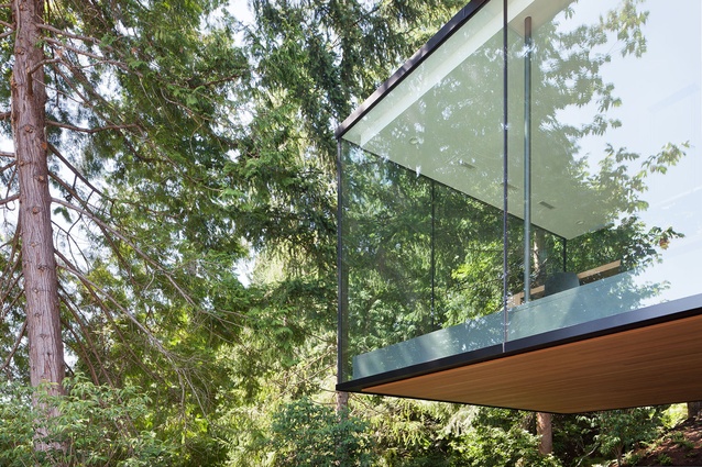
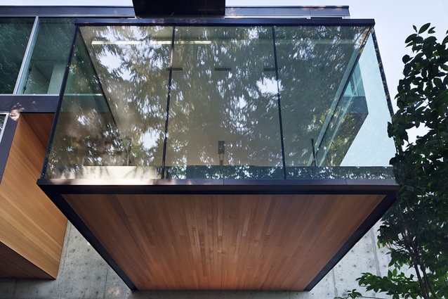
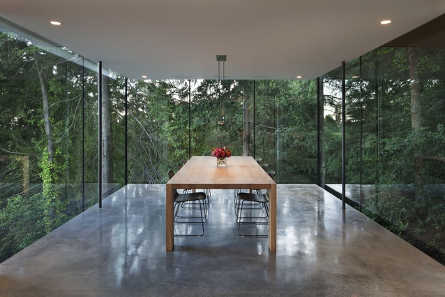
The dining room lends the concept its most innovative design expression with a cantilever that extends almost five metres beyond the concrete foundation wall. Parish introduced this dynamic feature in order to regain living space after some of the previous home’s footprint was lost following its demolition. “We had to be set back from the forest for environmental and geotechnical reasons, so the cantilever was borne out of necessity,” he explains. “But I also really wanted to achieve that feeling of floating amongst the trees and extended the glazing beyond the floor of the ceiling planes, which successfully blurs the line between inside and outside.”
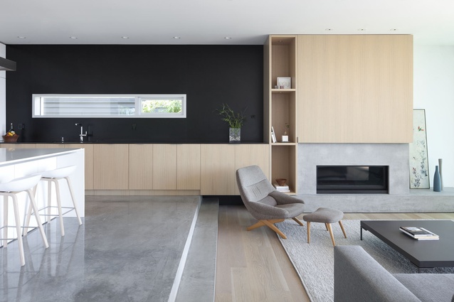
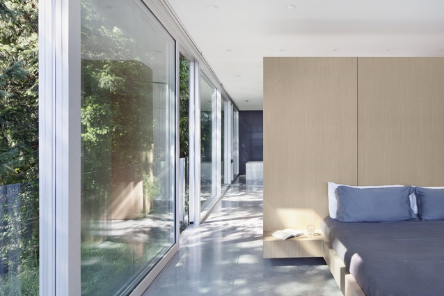
Parish has utilised the traditional modernist glass box particularly well to connect the home to its site. The dining room also lets in an abundance of sunlight, which serves to highlight the interior’s minimalist material palette. Polished concrete is used and contrasted throughout the living areas and five bedrooms with lightly stained white oak floorboards and cabinetry. An exposed concrete wall is also a feature of the double-height stairwell, adding texture and verticality to an otherwise refined, horizontal program.
“I wanted the interior to be quiet on purpose – quite reductive and clean – to respect what was on the outside,” Parish reflects. “So the focus was really on the view and the calming effect that can offer.” This approach also informed the furniture selection. Apart from an heirloom Danish-designed chair the clients brought with them, all of the pieces in this house are new. Parish chose a subdued palette that features pastel, white and pale timber, with charcoal grey as an accent. This is used in the dining chairs and coffee table, all of which pick up on the kitchen’s dark feature wall. The space is cohesive in its elegant simplicity and functions effectively as a neutral backdrop to those views.
Following a 17-month construction period, the clients moved in. Since then, they have introduced a few more personal effects into the interior, but it still remains relatively pared back. “They want to maintain that aesthetic and not have a lot of clutter,” Parish says. “It’s hard for them to put a lot of things in there because once you do, it takes away from the serenity of the space. When the doors are all open and you’re looking out to the forest, you really do get a sense of how tranquil the site actually is.”

