Dichromatic duo: Hello Houses
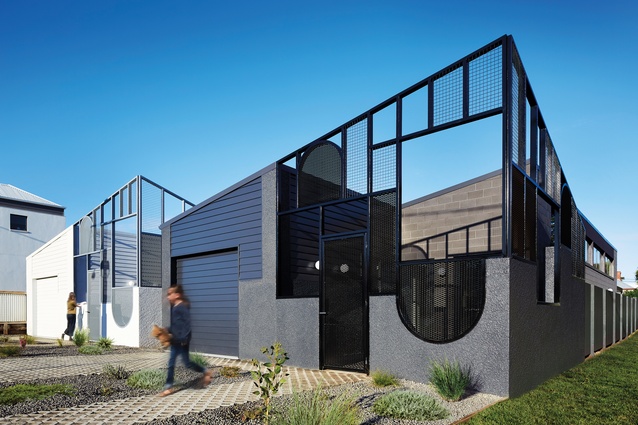
Perpetuating the verandah culture that exists in Port Fairy, a coastal town in south-west Victoria, this pair of houses designed by Sibling director Nicholas Braun for his sister make a friendly addition to the neighbourhood.
The verandah is a cherished place in Australian folklore. Paintings, poetry and literature idolize a life spent semi-outdoors, hobnobbing over beverages. But while the sight of tea sipping and biscuit eating out on the verandah is an increasingly rare affair in contemporary cities, it is still common in many of Australia’s regional towns, including Port Fairy in south-west Victoria, which in 2012 was named the world’s most liveable town with a population under 20,000.
It is precisely this verandah culture that Melbourne practice Sibling Architecture drew on for its design of a pair of houses in the coastal town. Sibling director and Port Fairy expatriate Nicholas Braun led the team to design the twin houses for his sister, Kristan, who had purchased a vacant site of subdivided land just off the main commercial strip.
“Port Fairy [is] very historic and there are lots of verandahs,” says Nick. “We noticed that a lot of people would spend time on their verandahs and really engage with their neighbours. So we wanted to create a space that did [the same] but in a really contemporary way.”
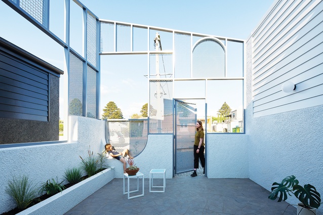
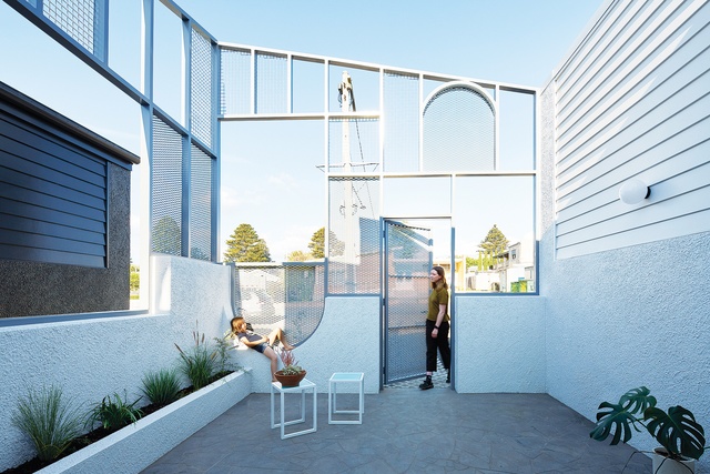
Sibling Architecture created a front courtyard to each of the houses that, in a social sense, acts as a verandah, and in a spatial sense, serves as an interstitial zone between the public street and the private home. “I remember growing up here and there’s a tendency that people will just knock and then come into the house,” says Nick. “[The courtyard] is a way to mitigate that a little bit. It just allows a nice neighbourly interaction. It’s not defensive, but it also offers privacy.”
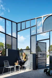
The houses are essentially identical but are made distinct from each other by their different exterior colour schemes – a dichromatic duo bearing the same DNA. The colours of the two houses – one in black and pewter, the other in white and grey – reference the contrasting shades in the architecture of the town.
“A lot of the architecture through town is a very dark bluestone, coupled with lots of white buildings,” Nick explains. “Because we knew we were doing two houses, we wanted to have efficiency in making them pretty much the same, but we also wanted them to have distinct identities so that they would be recognizable, or you’d be able to tell your friends you’re in the lighter one or the darker one.”
Both houses have a raking profile that points to a historic bluestone church at the end of the street. From inside the courtyard of the darker house, the steeple of the church can be seen through a strategically placed window in the fence, like a carefully framed Howard Arkley painting.
The boundaries of the courtyards are defined by latticed fences with square openings and curious, arched shapes like the Play School windows. “The materiality has been chosen deliberately so that when you’re sitting down, you can still be a bit concealed, but you can choose how much openness or privacy you want,” says Nick.
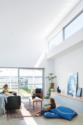
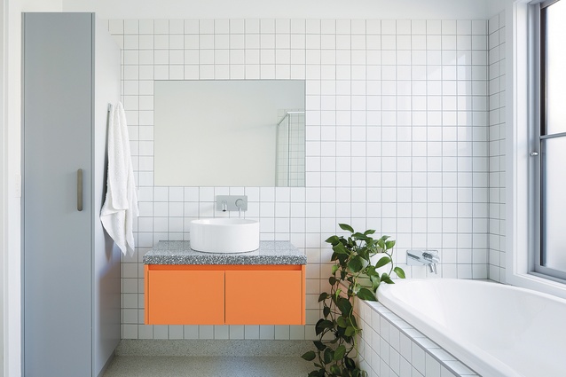
The arched shapes reference the historic motifs seen on Port Fairy’s Victorian buildings. As well, the internal colours of the house – peach, pink and light grey – are taken from the town’s historic colour palette. In fact, the defining characteristics of the houses collectively form a collage of reference to Port Fairy, but each has its own contemporary twist and Sibling Architecture flavour.
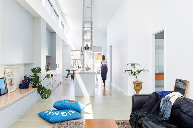
The arrangement of the spaces inside each home establishes a linear progression from the street to the backyard, with the kitchen placed at the centre, flanked on the southern side by private bedrooms. More importantly, the arrangement also establishes a sight line from the backyard through to the courtyard. “Even from back here, you’ve got a connection all the way through to the front,” says Nick. “If you’re out here, you can still interact with the neighbours. They would be able to wave at you and then [you can] greet them and bring them in.”
Each kitchen is framed by a large, hanging shelving unit made from latticed metal, which echoes the design of the front fence. The hanging unit is also a signature Sibling Architecture move that is used in a number of its projects, both residential and commercial. The architects say that placing the unit in the centre of the linear kitchen arrangement signifies the space as the social heart of the home.
Pertinently, these two houses present outstretched arms to the neighbourhood. Architecturally, it’s a design that economically distributes effort to where it might be felt most – the street interface. These two simple dwellings make a palpable impact in an already lively and friendly town.
This article first appeared on architectureau.com.

