A playground for design boffins
Andrew Cox designs Heyday, a bespoke playground of the mind, for a group of Wellington-based digital design boffins.
It’s a word often used retrospectively to speak of better days, so it’s curious that an agency that breaks digital frontiers would take ‘Heyday’ as a name. Then again, the word also means ‘the period of greatest vigour, strength or success’ and digital outfit Heyday is vigorous indeed. After outgrowing its old home it’s moved into a larger office space and its website enthuses that it’s hiring.
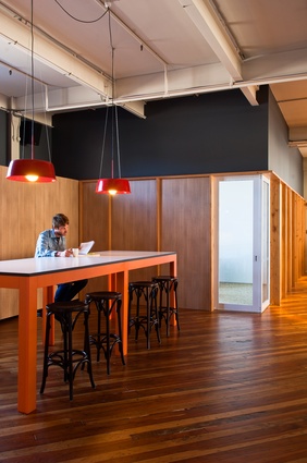
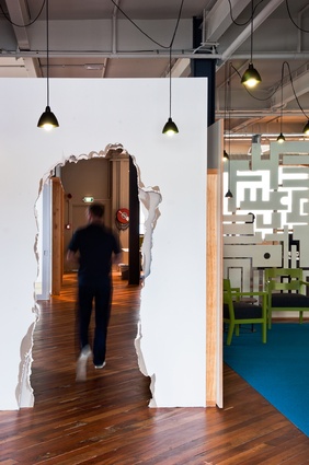
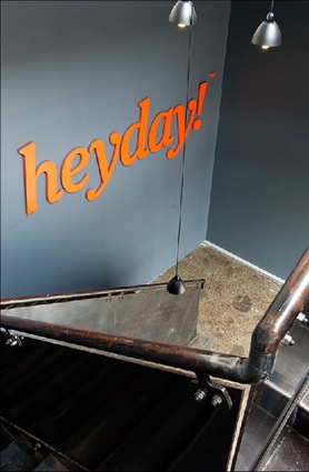
Upon my visit to the firm, I was greeted at the top of the stairs by designer Andrew Cox. Tall, British and considered, his appearance soon proved to be at odds with his progressive views on design — this clearly evidenced by the door behind him, which looks like someone built a wall and then ran through it. Cox’s favourite word is ‘bespoke’; a British way of saying ‘custom’, and the philosophy extends to everything he does. Cox and Luke Pierson, Heyday’s founder, have known each other for years, and as far as the designer-client relationship went, the brief for Heyday was left quite open.
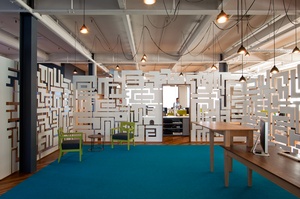
Cox is so interested in bespoke that it’s difficult to convey his ideas. He is an aesthete; “visually interesting” is a typical response when I ask him why he did something. Generally, my inner-cynic cringes at design metaphors, but I find with Cox that I’m crying out for one. To me, Heyday feels like a playground of the mind; Cox’s mind poured out into the space, and that is perhaps the best compliment you can pay a designer. These spaces don’t feel contrived — they’re completely organic.
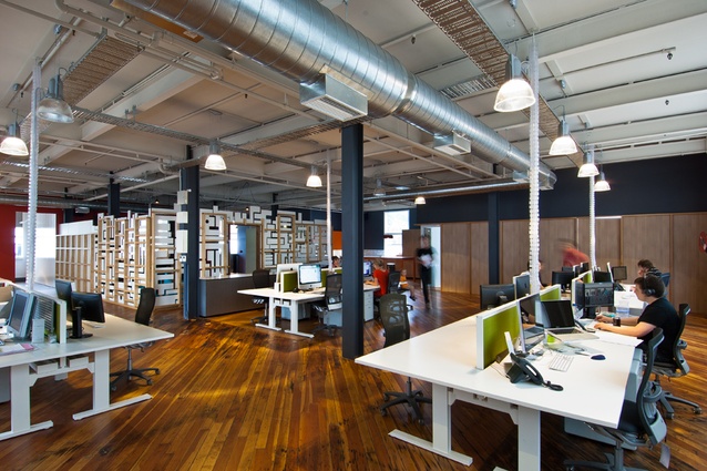
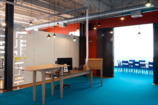
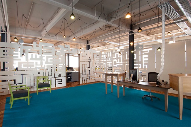
The first thing you notice at Heyday, besides the exploded doorway, is the boldly coloured reception and conference room. The reception seems at first to be unnecessarily large, but Cox points out that the area is flexible, capable of holding meetings and functions in conjunction with the adjacent kitchen and common area. The reception desk, which Cox designed and had built out of walnut and ash, looks like something from Tim Burton’s imagination. It’s vaguely sinister — like it might get up and walk away —but its restlessness works nicely with the hanging cord lighting, which looks like it was draped by a mad rock climber belaying over the rafters.
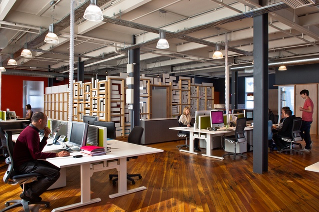
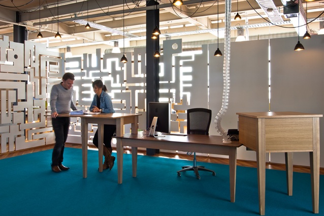
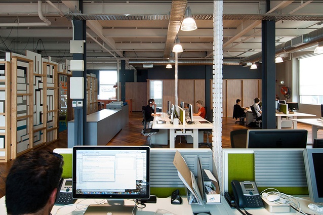
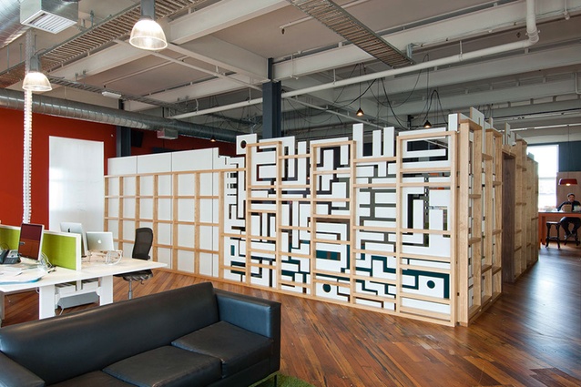
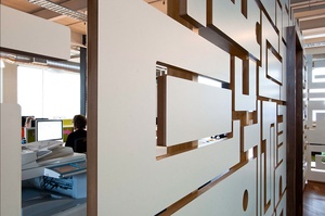
Delineating the reception from the open-plan area is a feature wall. The design looks haphazard, but each section was hand-designed. It’s functional and aesthetic; Heyday didn’t want visitors to feel they could bowl up to people’s desks unannounced, but still wanted them to feel connected. Pierson compares the wall to a lace veil — then thinks better of it. I can see what he means though: it’s translucent, textural, teasing.
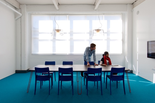
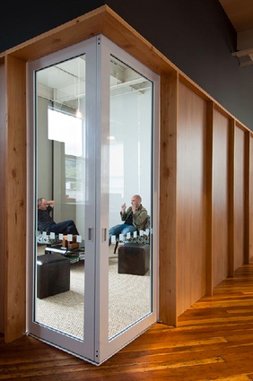
Heyday is mostly open plan, the only place behind closed doors is the ‘thinking room’, a sparse but functional space with whiteboard-painted walls and a toybox in the corner. Between the thinking room and the kitchen is a meeting room with tactile carpet that looks like horsehair. The doors to the room meet on a corner, achieving the same effect as the Lloyd Wright corner window, linking the exterior to the interior. Camel-coloured carpet offers an earthen note, ensuring the kind of transparency that comes from physical separation, not visual.
The interaction between public and private characterises the whole building. Heyday is on a semi-industrial street near Wellington’s Basin Reserve and the exterior is adorned not with a name but with a street number, 38. Pierson implies they’re not so fussed with self-promotion; it’s the work going on inside the building they’re proud of. Anyone who steps inside is bound to agree.

