Houses revisited: Mt Maunganui house
This discreet holiday home sits lightly on its beachside site. First published in 2015.
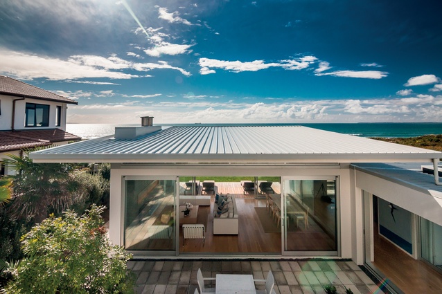
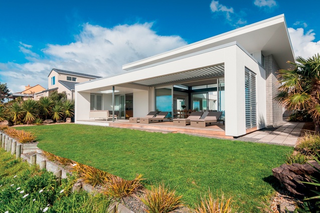
If you were standing on the beach below this house, you wouldn’t have much of a clue it was there — that is unless you happened to climb the protected sand dunes that lie in front of it. Eva Nash of Rogan Nash Architects designed the house for her mother, and part of the brief was for the house to be respectful of its surroundings.
“We wanted the house to be discreet rather than imposing, and to maintain privacy despite the large amount of glazing. The front pavilion is single storeyed and the back pavilion is double. I feel that having a large double-storeyed building right on the front of the site wouldn’t have been very respectful to the neighbours or the landscape. It’s about trying to balance these things.”
The double-storeyed pavilion contains four bedrooms on the lower level and a master suite on the top, and is connected to the other pavilion by a glazed walkway — the three elements, in turn, frame a central courtyard. The master suite upstairs is designed to be closed off from the lower level when Nash’s mother is home alone, as a kind of upstairs retreat, while the rest of the house allows for the accommodation of visiting family.
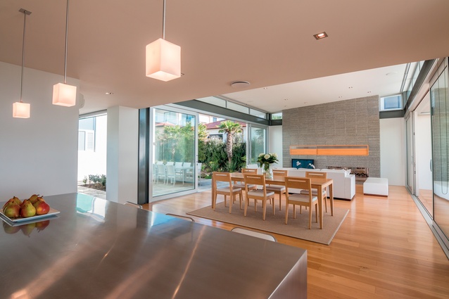
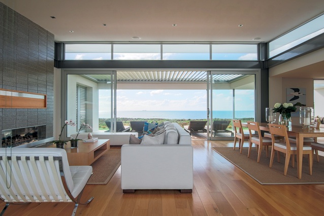
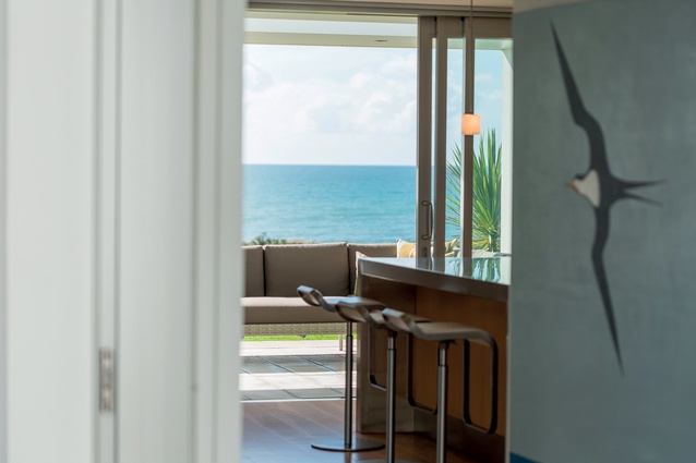
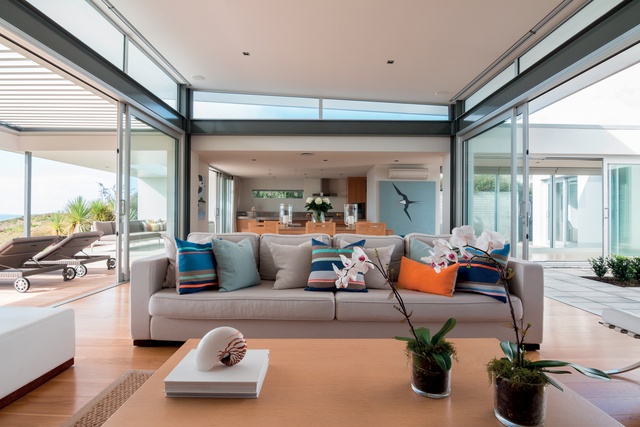
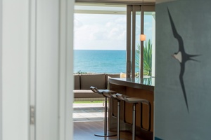
Hidden from the entranceway, the front pavilion has a stud height of 3.6 metres on the seaward side and contains the living, dining and kitchen areas, and flows seamlessly to an outdoor room. This configuration allows for a more impactful experience of the expansive sea view, says Nash.
“The position of the house means the view is right there; so it was about finding a way for it to unravel through the house rather than just being presented straight away. We used the idea of compression and release in the layout of the home. You come into a smaller area, then you walk through a transition place — the glazed walkway — and then you arrive at this larger, higher-stud room at the other end of it. This is an idea Frank Lloyd Wright used a lot.”
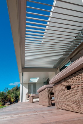
The outdoor room at the front of the house is covered by a louvred roof, allowing the space to be used in all weather conditions. Clerestory windows admit light over the outdoor room’s louvred roof into the front pavilion, providing a connection with the journey of the sun at all times of the day, even when spending time indoors.
“It’s like a floating roof, lifted up with the glazing, and it draws the eye up and gives a lightness and volume to the space rather than closing it in,” says Nash.
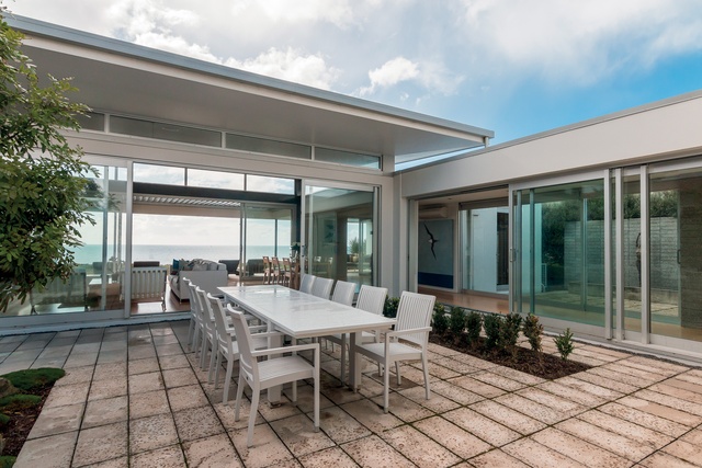
Allowing opportunities for entertaining large groups was a priority in the design of this house, as the family often congregates here for Christmas. The courtyard was designed with these occasions in mind. The view can still be seen through the glazed pavilion in front, but when there is an offshore wind, this space is very sheltered. It is also fenced in to prevent wandering children from accessing either the driveway or the beach.
“You have to make all the spaces work hard for themselves; each space has to function in a way that gives you opportunities to use it differently from the others. The outdoor courtyard is not only for entertaining but is also a great place to shelter if the wind is coming in from the sea, whereas if the wind is coming from the south, the outdoor room is ideal because it’s sheltered and has flexibility due to the louvred roof,” says Nash.

How did you make the choice to use these particular louvres?

We used the Louvretec Super Roof as the client had seen it elsewhere and was keen on it. As the house faces the sea and north, the elements can be really harsh, and having recently completed my Masters in Sustainable Design, I had a really good understanding of how the environment can affect a house.
The Louvretec roof is great because it’s adjustable to the weather; you can open it up to let the sun in, which is favourable in the morning, then close it down when it’s overhead in the middle of the day. One of the walls uses them too, to allow flexibility and cross ventilation.
How do they complement the architecture?
They set up a strong horizontal line, which is what we wanted to achieve in the architecture. And it’s not only the horizontality it brings but also the colour of the material, which relates back to the other elements in the house, such as the aluminium joinery used throughout.
The louvres are anodised aluminium. They were a natural choice that offers flexibility. They talk the same language as the rest of the house in terms of materiality and also in terms of scale. They’re not overbearing. Louvres are a great addition to any outdoor space and perfect for a beach or seaside environment.
Click here to see more Houses Revisited. And sign up to our email newsletters to receive Houses Revisited straight to your inbox.
Note: These are stories from our archives and, since the time of writing, some details may have changed including names, personnel of specific firms, registration status, etc.

