Higher ground: Richards Partners
This renowned branding think-tank takes on the role of a lifetime: to redefine itself and how its workplace personifies and facilitates that shift. The result is an oasis of sorts in Auckland’s city centre.
Completed in 1913 and designed by Scottish émigré and Public Works Department draughtsman Claude Paton, the former Magistrates’ Court on Auckland’s Kitchener Street has been commended as a fine, if slightly playful, example of Edwardian baroque. Striation and rustication adorn its façade and there are expressive voussoirs with enlarged keystones above the windows. It isn’t shy of ornament, yet its colour palette and symmetry keep it firmly within the realm of restrained and sober classicism.

Although Paton adhered to many of those stylistic standards, he experimented by skewing some proportions and using local materials like Ōamaru limestone and Coromandel tonalite.
For Brian Richards, founder of branding and strategy firm Richards Partners, this style of building represented “a classic backdrop and contemporary foreground” for what was to become his company’s new headquarters. “We wanted our space to reflect the refinement of our business over 30 years: a place people would gravitate to and a place with quiet confidence in itself yet not intimidating in a corporate sense.”
Although originally a court of law, the building boasted many welcoming traits. Built in the shape of an H, it had a number of rooms placed within two sun-trapping end pavilions. Throughout their years, these spaces have served a variety of purposes: offices, holding cells, waiting areas and, before this iteration, a bar. The central atrium has now become a fairly lustrous walkway and reception space for the buildings directly behind it (such as the Metropolis), making this an impressive arrival zone.
Given Richards Partners’ line of business, both the building’s architecture and its history as Auckland’s Magistrates’ Courthouse seem serendipitous. “Ambiguity would have been debated every day by clever lawyers. It’s fitting that… over 100 years later, we are doing something similar with our clients every day in what was the former courtroom: discussing the ambiguity of brands as intellectual property of great value.”
The firm’s previous headquarters was based behind a bustling shopping precinct in Newmarket. Besides streamlining the core of Richards’ business (“We have recently developed a completely new manifesto and raison d’être, reducing our staffing numbers and focusing on best-of-breed”), part of the brief for Young + Richards designer Harriet Pilkington (Richards’ daughter) was to relocate the firm, she explains, to a “calm environment… something quite different from a hurried branding or advertising office, which can be a noisy hive of activity”.
Richards agrees: “Over time, many things have changed in the industry. The advent of digital has produced a great deal of speed – but not necessarily quality – in thought and/or execution. We wish to retreat to higher ground and still feel there is room for a firm like ourselves with the legacy of experience.”
To this end, the space where the office eventually ended up had to be subdivided. A complex series of permits and boundary adjustments had to be negotiated, both with the consents office at Auckland City Council and with a body corporate that included close to 100 people. “It was a very complex process for something that feels very simple,” Pilkington explains.
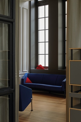
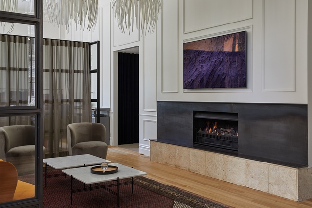
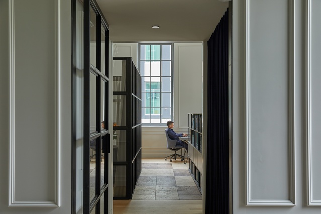
Yet, from the entrance, one understands that the sort of simplicity to which she is referring to is neither the minimalist nor the monochromatic type. “The clients are sophisticated, exacting and well travelled,” she continues. “They want to feel as though they are in a luxury boat or going into a Porsche showroom.” Meticulousness is evident at every turn. Transitions from skirting to architraves have been followed through with precision. Hidden doors within the panelling reveal perfectly spiral-bound notebooks. Even the functional tech rooms have been carefully presented.
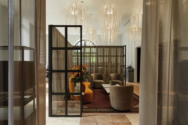
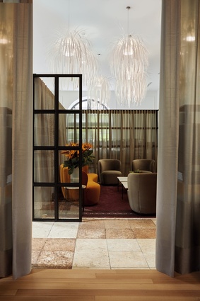
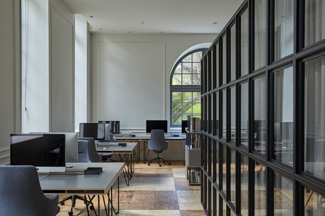
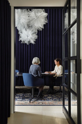
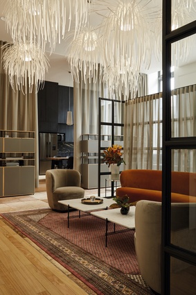
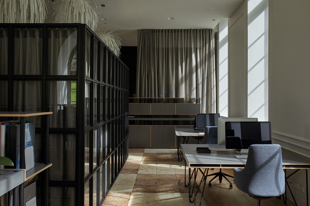
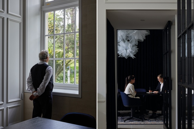
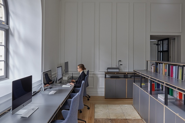
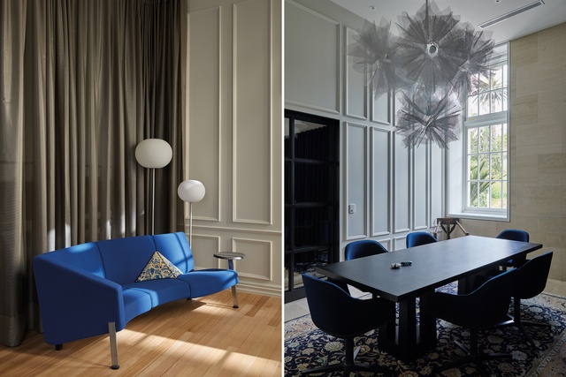
In terms of layout, the main space is essentially a rectangle with desks on half of the perimeter to make the most of the natural light streaming in through the arched windows. The core is a client meeting space defined by a glass-and-steel room divider in emulation of Crittall windows. It is a room within a room: a well-appointed and delightfully furnished lounge that can morph from being open to being a private enclave, thanks to curtains that wrap around it.

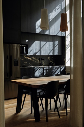
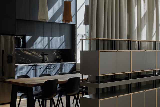
This curtain treatment is also used to divide the kitchen and dining area from the larger workspace. This time, a slightly see-through acoustic textile has been used. “It is part of the drama of the space,” says Nigel Rye, a design and workplace furniture specialist who worked closely with the client and the designer. “You can open [the curtains] up and see all the way through or you can close it depending on events or functions and how intimate or open you want the space to be.”
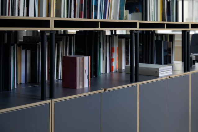
The European furnishings selected by the client and Rye go further afield to explore a sort of contemporary eclecticism. According to Richards, the interior used “hand-carved chairs from the Pitcairn Islands, Persian rugs (which tell stories of ancient kingdoms) and New Zealand craft objects by some of our leading designers” alongside Danish cabinetry and theatrical chandeliers from Spain’s Arturo Álvarez.
“These objects help us understand the world around us,” says Richards. “They describe who we are and the timeless things we value. There is so much ‘graphic anarchy’ around us these days. It’s peaceful to have something timeless to enjoy.”
This is a workspace that conjures legacy and a certain sense of traditional values through a fairly contemporary and impressively erudite design lens. Many work and retail spaces try to emulate a similar mood through a paint-by-numbers textbook version of luxury interior design but very few accomplish it to this level and with this intrinsic sense of confidence and ease.
This article first appeared in Interior magazine.


