Home theatre: Waterloo Terrace
With a commitment to salvaging and reinterpreting materials, this terrace house has been reworked by David Mitchell Architects to create a light-filled home and studio that offers a “site-specific theatre performance.”
Michael Pollan’s book A Place of My Own: The Architecture of Daydreams is a favourite of mine. It’s a book about making a place for yourself – where the making is just as important, maybe even more important, than the end result. The author describes how he (and his various cohorts) navigate through the design and construction process, wallowing languidly in the details while looking forward to that day when he can walk over the threshold to enjoy his particularized space for evermore.
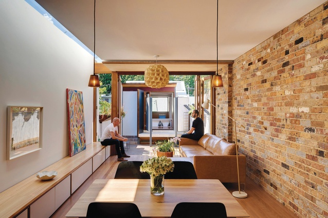
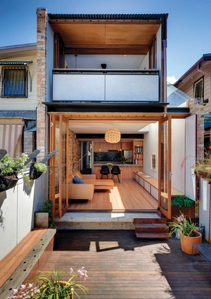
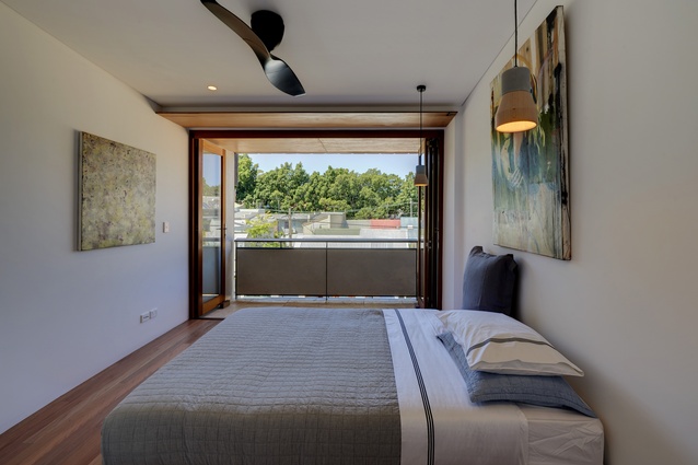
When architect David Mitchell bought a small single-storey semidetached home in Sydney’s inner-city suburb of Waterloo, he moved straight in. And then, over a period of six years, David and his partner Kat Wilson carefully planned out what they wanted to do with their home. One of the keys to unlocking their design solution for the terrace concerned light. In picking apart the program, David describes the project as “an experiment in how to bring more light into the middle of the building.”
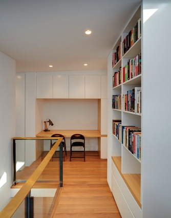
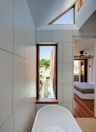
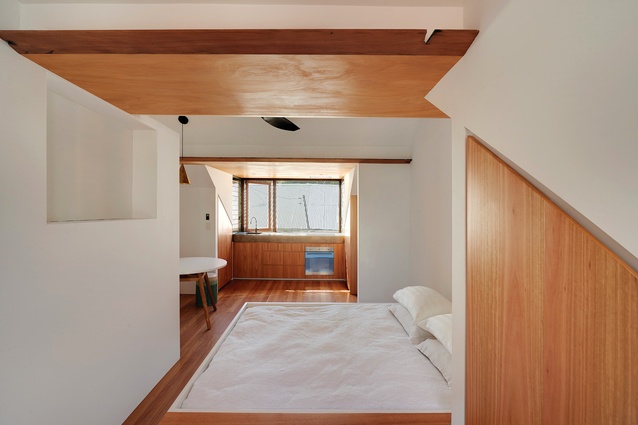
Shifting the traditional terrace house plan around to give living spaces direct access to the outside is a critical part of an effective terrace renewal, but how it’s done is crucial to making those spaces in the middle – the bathrooms, the stairs, the in-between spaces – work as key components of the home. Experimenting with northern skylights allowed David and Kat to let direct sunlight into living spaces where and when they wanted. Where natural light is required to illuminate those spaces in the middle, south-facing skylights allow a gentler light in. These different light sources create varied spatial qualities and allow the house to feel bigger than it actually is.

The luxury (if that is the right word) of being able to take time to work out a response, not just to the existing house and its site, but also to their own brief, enabled David and Kat to really explore a self-described “commitment to salvaging and reinterpreting the existing materials and using them throughout in unconventional ways.” Bricks, sandstone blocks, timber found on site and off, and even metal roof sheets and pipes were salvaged and reinterpreted as wall cladding, sculptural landscape elements and window and door finials. This works to transform what was a simple worker’s terrace into an immersive theatre of beautifully crafted spaces and elements.
It’s a bit like a site-specific theatre performance, where the audience is led around a building to happen upon a performance in each room, except here, the materials and the detail responses are the actors. Lovingly crafted doorhandles and joinery, exquisitely detailed doors (the front door has an ingenious series of hinged panels that can be cracked open slightly to allow a breeze through, without the need for installing the usual security door), split sandstone footings reinterpreted as fence posts and a front door chevron fin detail all offer up their own well-crafted argument for considering, retaining and reinterpreting the things we find around us.
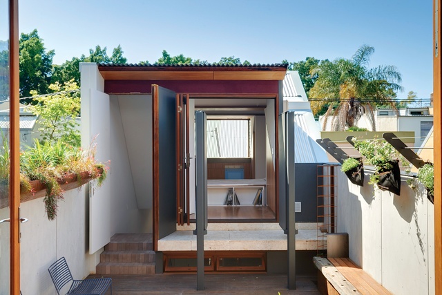
The original house has been transformed into a light, vibrant, three-bedroom home with a separate studio building that could be used as a residence, working studio and/or garage/playspace. Using the natural fall of the site from front to back, the two-storey studio is set across a courtyard from the main house and fronts a laneway at the rear of the site. Operable privacy screens allow the studio to be opened up to, or visually separated from, the main house by adjusting the hinged metal panels.
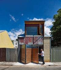
The rear laneway is a hybrid of fences, garages and a few small houses that front the laneway directly. Consequently, the face of the studio needed to be part front elevation, part service lane frontage. An articulated wall framed in steel with pivoting copper and glass louvre infills can be partly operated to let light and air in when the studio is used as a living space, or it can work as a folding door should it be used as a garage. If only we could replace all the roller shutters in our back lanes with solutions like this – our laneways could become so much more than the service corridors many of them currently are.
After six years of thinking and designing, and three years of construction with the help of Kat’s son Jake and carpenter Sam Proud, a generous, lively, site-specific home has flourished. In the narration of one of their films, Charles and Ray Eames once said, “The details are not the details, they make the product.” This noble sentiment celebrates the role of attentive design and is a perfect summary of this inspired inner-city home.

