Homemaking
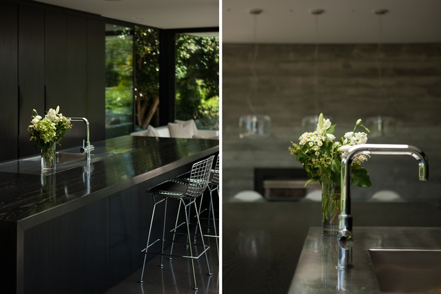
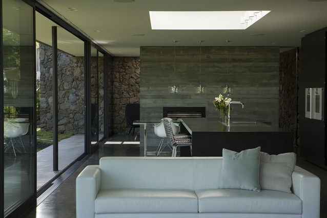
When we visit this house in the Auckland suburb of Mount Eden, Lottie (5 years old) and Stella (8 years old) are having an early supper on a black-stained American oak kitchen counter. Sunshine cascades through a skylight above this space only to be tamed – and slightly diluted – by the vesicles on the scoria wall and the polished concrete floor.
The girls and their parents – Mark and Miriam, finance service professionals in their late thirties – have breakfast there on weekends while leisurely reading newspapers.
“My must-have was a house that made our entire family – including my parents, who live across the back fence – happy,” says Miriam about the home, which was finished in 2013. “We enjoyed the process of design and construction and got through it without a divorce, which was one of our main criteria!” jokes Mark.
The kitchen where Lottie and Stella sit acts as the heart of this lower level (reconstruction of the upper floor is to be completed at a later stage) and is undoubtedly an epicentre of social and family activity. “There was considerable time and effort put into getting the kitchen’s material, the colour of it, the texture of it just right,” says David Ponting of Ponting Fitzgerald.
“We stripped back the oak surface just slightly to reveal the grain a little more, so that it didn’t feel too pristine,” he continues about the cabinetry – which can be closed down to hide the food preparation areas and create a feature wall. Much like the rest of the home, the kitchen is a fine balance – both in form and materiality – between elegance and rawness.

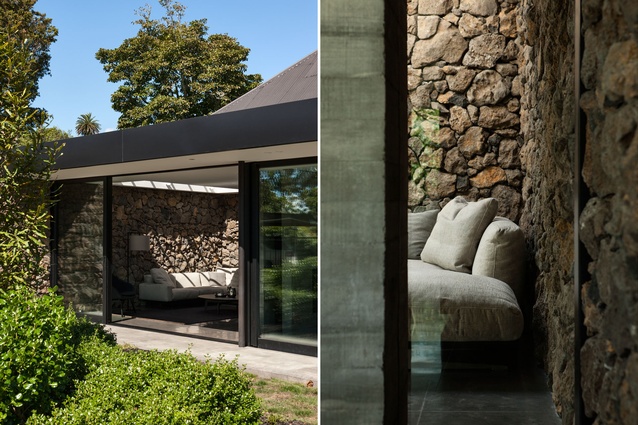
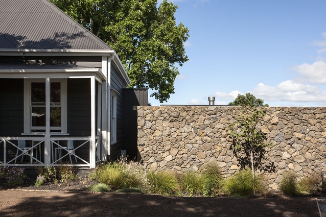
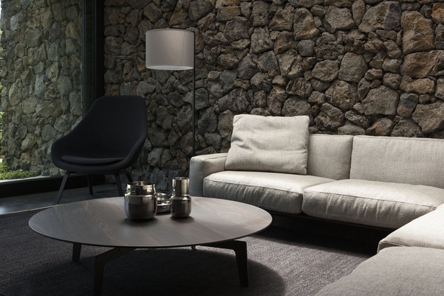
The backbone and most noticeable material of this lower level is a is an L-shaped, 3m-high and 45m-long wall made from rough volcanic stones extracted from the site during construction. On it, the pumice-like scoria in its natural state seems almost lightly brushed by muted, organic colours: oxidised-red, moss-green, grays, and ochres.
It begins on the street side, or the south east end – of the triangular 1200m² site and creates a striking contrast beside the old bungalow that – at least until stage two of the rebuild – acts as the second floor on this house. From there the wall ebbs its way down a small hill (this renovation involved digging into it to construct the lower floor), onto the back of the building, ruptures through the glass wall and goes on to define the new interior spaces.
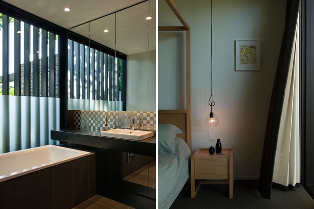
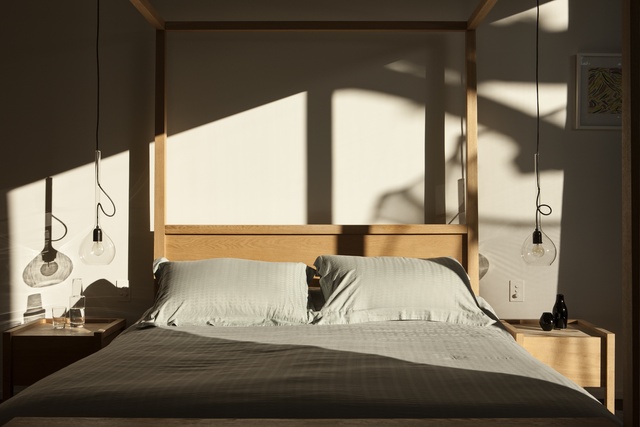
The layout here is simple: on descending from the old bungalow through the internal stairs one can turn left onto a thin hallway. There is a secret entrance to a cloakroom, a closet, and the master bedroom dominated by light timber cabinetry and furnishings. Much like the rest of this floor there is a considered and regular connection to the garden achieved via tall horizontal glass strips interrupted by battens. Unexpected windows give one depth and sight lines to other parts of the home and garden.
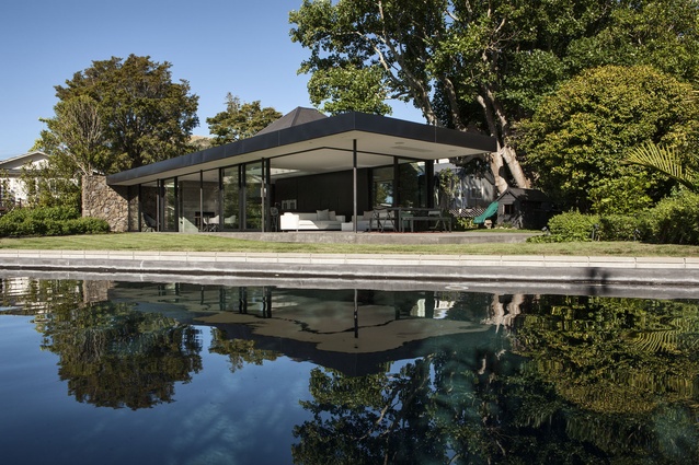
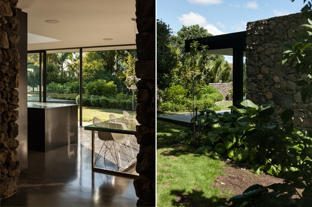
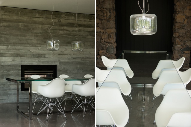
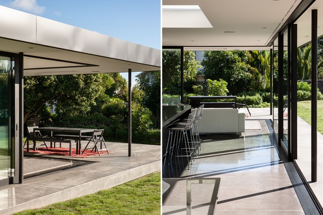
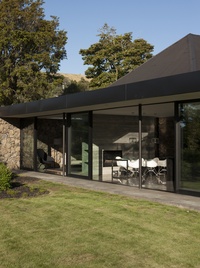
There is a constant play between transparency and privacy here, between a sense of sheltering while enjoying nature. If, after the stairs, you turned right you’d be received by the kitchen and social area: a vast open space with impeccable 180-degree views of the Xanthe White-designed garden and a swimming pool. Rather than the usual safety glass or fencing , the pool is surrounded by a sort of moat. The interior’s only division – between the social spaces and a cave-like snug – is created by a concrete fireplace. The scoria wall quietly dominates this whole floor.
Ponting says, “You have to be very careful with what you put next to that [material] because it really is such a powerful starting position that you need something strong, but you don’t want to get too many cooks in the kitchen!” The use of the concrete as the floor plate and for the fireplace adds a lot of richness and character to the vesicular stone, but, as the designer puts it: “without arguing with it”.
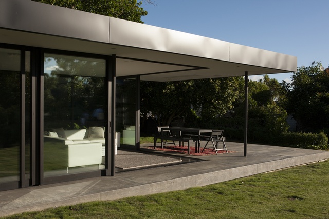
From the garden looking in, this palette of strong materials also seems to anchor the house to the site – their solidity grounding the otherwise ethereal and almost fleeting nature of glass walls and the thin, simple roof that hovers above the new pavilion.
Of the design process Mark says: “we went through many magazines and cut out pictures that we liked.” Mark recalls how the designers noticed consistent themes such as the need to enhance the connection between the garden and the interior, a predilection for horizontal open spaces, and a truly structured building to which stables (garage, additional bedrooms) could later be added. Battens are one of the design elements expected to tie both vertical spaces.
Stella and Lottie reappear –at full speed and with a great dollop of charisma –and are quick to explain their favourite parts of the home: the large tree beside the chunky green plastic slide, the swimming pool, the sparkles on the cloakroom’s wallpaper.
“We love that sense of space, it is nice being close to the kids rather than have them tucked away in a wing where you never get to see them or hear them… we like them nice and proximate,” says Mark to a backdrop of giggles.

