Geometric carving: Light House
Peter Stutchbury’s ability to create a sense of place in the most challenging of settings is both poetic and uncanny. Little wonder, then, that he’s the recipient of the Australian Institute of Architects’ 2015 Gold Medal and an RIBA 2016 International Fellowship. But when his clients approached him with an open brief for a new house, he found the task daunting. “They said: ‘we just like your best contemporary work’, which makes it incredibly difficult,” reflects Stutchbury. “Because I don’t even know what that is!” Apparently, the jury at the New South Wales Architecture Awards does, as the resulting commission won the 2015 Wilkinson Award for Residential Architecture.
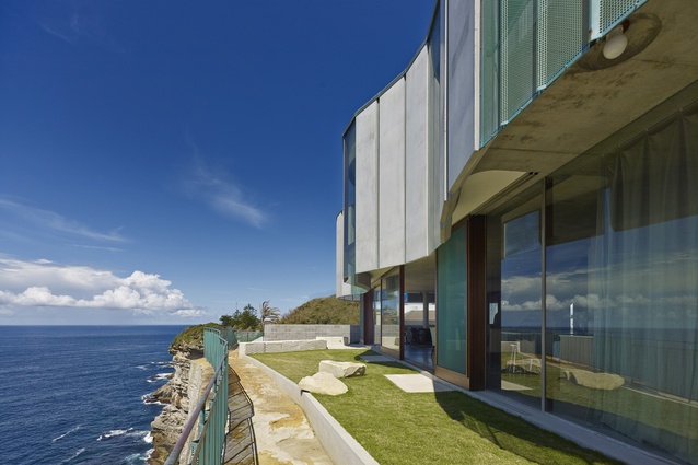
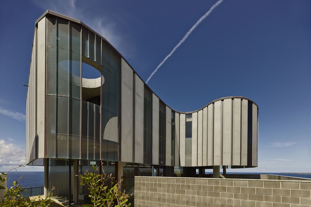
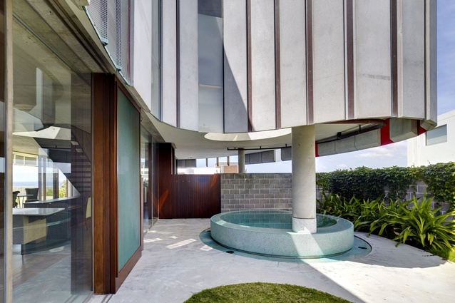
The three-bedroom home in Dover Heights is situated at the top of a sandstone cliff overlooking the Pacific Ocean. It’s a site worthy of an uncompromising monolith, because anything less simply couldn’t withstand the harsh weather conditions. An existing 50-year-old brick cottage had been mercilessly eroded by the elements prior to its demolition. Stutchbury wasn’t taking any such chances and designed the new home’s upper level as a concrete bunker – austerely ship-like, rigorously cantilevered and ostentatiously curved.
Stutchbury’s inspiration came from a home he has long admired: House Holman by fellow Sydney-based practice Durbach Block Jaggers, which occupies a similar site in the same suburb. “What I saw in that building is the understanding that’s brought to a tough cliff face by a soft line, as opposed to a hard line; it allowed me to think a curved line is better,” he says.

Although cutting into the sandstone to anchor the ground level was, by Stutchbury’s admission, emotionally difficult, the decision was made with a view to further add to the site. “We used all the cut sandstone as walls and seating,” he explains. “If you were to take the building away you’ve still got this lovely geometric carving in the sandstone that’s seen in its positive form above the ground.” The home’s 326m2 footprint was minimised in order to maximise the outdoor living space, something the clients – a couple with grown children and grandchildren – welcomed.
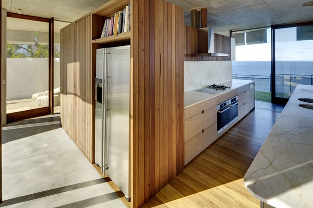
“Project architect John Bohane and I created four very different courtyards, allowing the family to move between them depending on the weather patterns and time of day,” says Stutchbury. “I wanted the experience to be about mobile living, not enclosed living.” This thoughtful scheme succeeds in extending the rectangular open-plan of the ground floor, unpacking the compact footprint. Not only does it support cross ventilation during the summer months, but it also creates a seamless visual flow between inside and outside. The ground floor, as an elegantly resolved, Modernist-inspired glass box, is in stark contrast with the upper level’s hulking form and this duality is what lends the overall concept its most dynamic design expression.
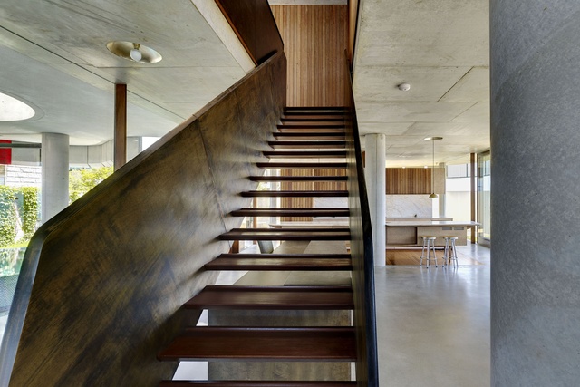
Concrete was always Stutchbury’s building material of choice, but its use as pre-cast cladding was initially problematic. In terms of construction and buildability, the most effective way to clad a curve is with small vertical segments as they’re easy to join. “The idea was to have the upper level express the cliff’s strata, so we took a big risk putting vertical lines on that floor because it’s not reiterating what’s being spoken about in terms of the horizontality of the site,” he explains. It only worked because the concrete floor and ceiling plates are visually strong enough to accommodate the vertical intrusion.
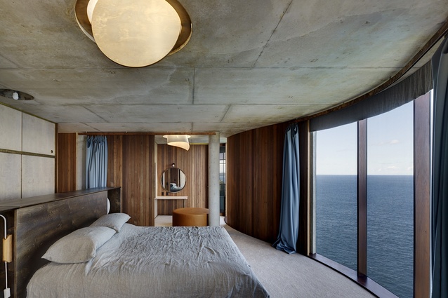
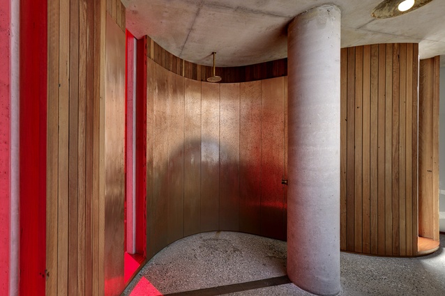
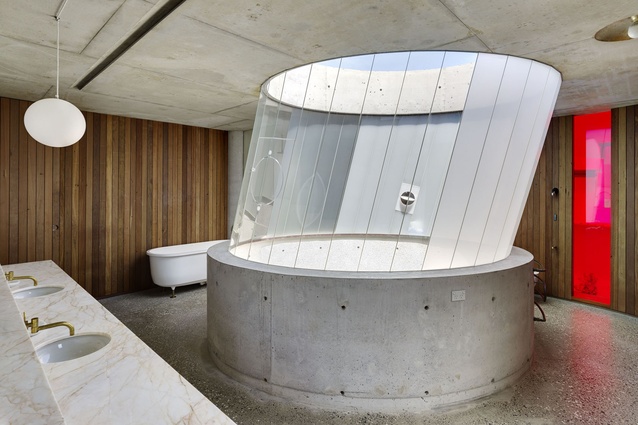
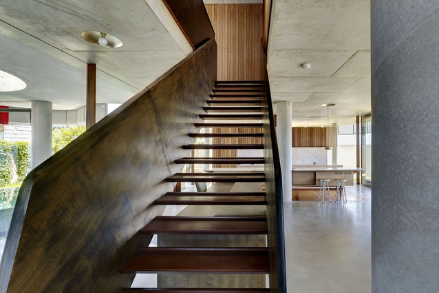
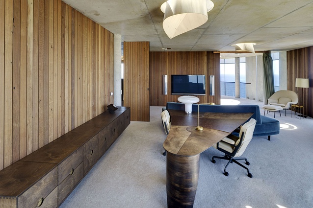
Stutchbury essentially set up a skin on the building that requires no attention and could potentially last for hundreds of years. The exterior’s armour-like quality isn’t echoed in the interior, however, where he introduced single-skin timber walls and bespoke timber furniture to soften the upstairs bedroom and study areas. There’s quite possibly no more appropriate way to describe the overall effect than by comparing it to an oyster. “The outside is incredibly tough and durable,” Stutchbury says, “while the inside is fine and polished, and obviously of a different order.”

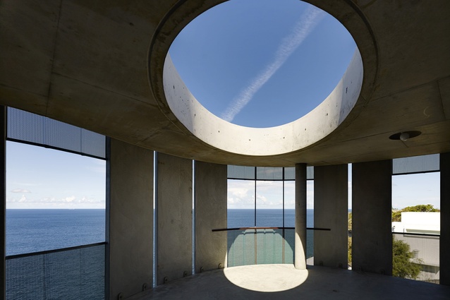
The upstairs plan is a maze-like arrangement, adding a sense of theatre each time a new room is revealed. By varying the way light is brought down into the different spaces with a series of curved serviette skylights, Stutchbury changed the scale throughout, and created warmth and ambience. This is reiterated in the use of surprising finishes – alpaca carpet, and copper sheeting – introducing a sense of luxury into an otherwise robust material palette.
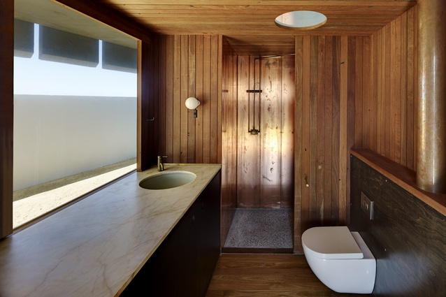
Of all the home’s features it’s the upstairs bathroom’s skylight that best expresses design innovation. A through-penetration that moves from the sky down to the plunge pool in the main courtyard below, it serves to unify the top and bottom floors, and its window system alone involved 16 prototypes. This may be a tough building, but Stutchbury’s attention to detail imbues the house with an unexpected charm.
For an interview with Peter Stutchbury click here.

