Hot House: Melbourne hiro-en
This home in Melbourne’s Barrington blurs the spatial boundaries between inside and out.
In Japanese architecture, an engawa is a transitional area that is neither inside nor outside the house: similar to a porch or a sunroom in function. The traditional purpose of the space is to allow the house to be open in rain or shine, while preventing rooms and objects from weather damage. It is often at a height that invites sitting along the edge to enjoy the surrounding landscape.
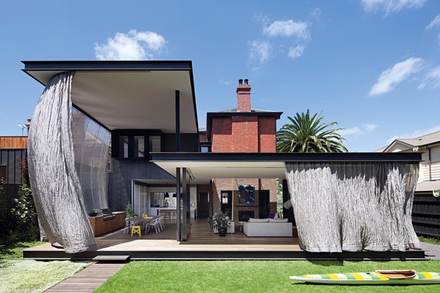
A hiro-en, for which this Melbourne home was named, is an enclosed version of an engawa. Here, this relates to the rear of the house, which can be enclosed using stainless-steel-mesh curtains.
These are not only functional but are also visually captivating and dynamic, explains architect Matt Gibson of Matt Gibson Architecture and Design. “The curtain can envelop the whole rear perimeter providing not only a sculptural quality that extends the internal spaces but a free-flowing and kinetic counterpoint to the permanence and solidity of the heritage structure of the house. The woven stainless-steel mesh shimmers like a silk taffeta dress providing a functional outcome and a fascinating spatial blurring of inside and out.”

The house is situated in a heritage area of Melbourne called Barrington, which is known for its high-quality historic villas built within garden settings. At some time in the past, an ill-planned addition had been made to the home, which, while providing more floor area, denied the home connection to the outdoors. These additions were removed and replaced with the hiro-en, and the remaining heritage areas of the home were repurposed and reconfigured to offer a more flexible and fluid spatial arrangement.
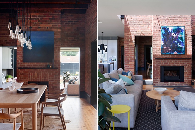
The front rooms on the ground floor have been updated, as have the children’s bedrooms upstairs. These contemporary spaces sit alongside the traditional villa fabric, which is allowed to shine in its original state. The dining room is enclosed within a red-brick box, lending reverence to this social space.
Gibson says that the heritage mandate for the project was to ensure all new work did not detract from the culturally significant aspects of the house. “The strategy within the existing part of the dwelling was one of restoration and sensitive upgrading, where a careful balance is struck between the architecture of the original and the new intervention,” he says.
“The process of renovation allowed for the act of revealing and exposing the history of the existing building, celebrating the trace of original materials and the history of alterations over time.”

Adjacent to the dining room, the living area and kitchen have been opened up and glass panels slide aside to access the hiro-en, with its rippling curtains providing shelter for this western orientation and allowing it to be used year-round. Tiling around the top edges of the walls in the updated areas of the home make the white ceilings appear to float: an effect which is echoed by the roof over the hiro-en.
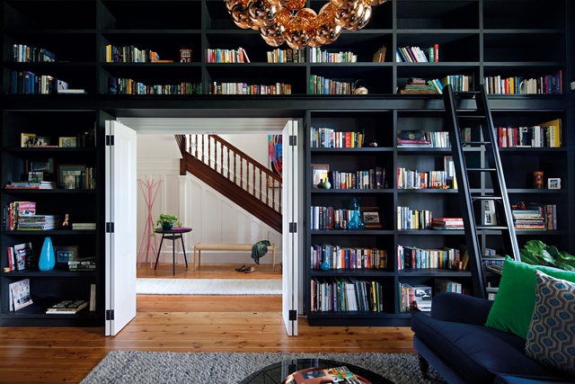
The juxtaposition of old and new here is not jarring but, instead, the two appear to bleed into each other, with details, such as oversized floral wallpaper and contrasting walls, skirting and door frames, providing references between them. Furniture and fittings were also chosen to bridge this gap, with vibrant velvets, warm metals and organic forms.
“We loved that there was something very honest and deeply Australian about this project,” says Gibson. “In a sense, it tracks the history of the home in Australia: the inheritance of the traditional at the front transitioning to a more open, flexible and contemporary way of living at the rear. Each space, while unique, continues a dialogue that is integral to the story of the whole.”
This article first appeared in Urbis magazine.


