Architects in Profile: Dorrington Atcheson Architects
In the fourth exclusive Houses Architects in Profile series, supported by Resene, Justine Harvey talks with Tim Dorrington and Sam Atcheson, who have used their passion for contemporary design and admiration for mid-century modernism to produce numerous award-winning buildings for their clients.
During 10 years at the helm of their own firm, Tim Dorrington and Sam Atcheson, and their team, have specialised in residential design through a highly collaborative methodology, engaging with clients, site topography and budget to ensure the end result is the perfect combination of all factors.
This honest approach is reflected in the materiality of their buildings where natural and crafted products are celebrated and functional spaces are enhanced with measured proportions, simplicity of structure and just enough surprise to delight.

Justine Harvey: Did you always want to be architects?
Tim Dorrington: I’ve always liked drawing; however, during school, my parents wanted me to do all the maths and science subjects and I wasn’t allowed to do art, so I had to do it in my spare time. After high school, I wasn’t ready to get a job and was more interested in being a student. Through a process of elimination – I didn’t want to do any of the other degrees – it turned into architecture. When I went through Architecture School, acceptance was based on how well you had done in your intermediate year and your art portfolio.
Sam Atcheson: For me, I was always good at maths and science, as well as art, so it just kind of became the logical choice. My dad’s a mechanical engineer and my mum’s a maths teacher and there was definitely that side to it, but there was also the love of art, so when I was exploring my career options, architecture was the consolidation of those skills.

Justine: So did you guys get to know each other at university?
Tim: No, not really. We do have some friends in common from that time, but Sam was a couple of years below me. We actually met after I had graduated and while Sam was doing work experience around the corner from where I was working.
Justine: How long have you guys been working together now?
Sam: A good 10 years.
Justine: How has the practice progressed since then? Was it just the two of you initially?
Tim: It was, yes. It’s slowly grown to the 10 of us now.
Justine: Did you have a strong philosophy or idea of where you wanted it to go when you started?
Tim: For where we wanted to go, probably not; we didn’t think that hard about that back then. It was probably about doing good products. Philosophically, we’ve always been into the honesty of how things are put together – we don’t like to hide things away or use faux materials. We developed this idea of a reduced aesthetic, which was not straight-up minimalism or the most pared-back thing but that you don’t layer up any more than you need.

Sam: I guess it’s simple and humble as well. We don’t get too ostentatious with stuff. A lot of our clients are not massively dissimilar to us in that thinking. It’s about getting the forms to read fairly, while not being afraid to use some colour and tactility.
Justine: Are you wanting to grow the practice?
Tim: I guess, more of the same. There are now more opportunities to do medium-density housing with the Unitary Plan [Auckland] and we have had several projects come in recently. There are the projects that are a lot more socially aware as well.
Justine: During the design process, how much would you say was down to skill and knowledge versus something more intuitive?
Tim: With design, you always have a whole set of priorities and you’re defining those priorities or laying them out in order. So, you have all that input but, when it comes down to it, you do instinctively put that all together.
Justine: It’s like there’s always an aha moment.

Tim: Always. Whenever there’s a successful result, it’s due to that.
Sam: I’m not confident if I haven’t had that moment. If it’s not there, I’ll keep working at it and it can be something as simple as a postage-stamp-sized sketch that embodies a project.
Tim: You can’t force it! Design and all these strands come together and it’s all revolving around this one little five-second moment – that aha moment where it starts to make sense to you.
Justine: How much freedom does the architectural process offer you with that?
Tim: The process we go through with the client is a collaborative one. Even when you’ve have your aha moment and it’s perfect, you still have to present it to the client and you know it’s going to change because of their input. But it’s their house, so you can’t be too precious about it and, often, the design becomes richer.

Sam: That’s right, you’re all working towards the same goal. It’s one of the aspects that I wasn’t fully aware of coming into architecture – that it is all about the personal relationship. You’re with a client for the better part of a year, and you’re really getting into the details of their life, personal things like who gets up first in the morning and things that perhaps even their really close friends don’t know because you’re working on something together that really has to work into their lives.
Tim: It’s intimate because the client has to be happy with the process as much as the final result. If you’re not good at relationships or communication, then you’re not going to last very long as an architect.
Justine: Do you think you learn more from designing the budget-conscious projects?
Sam: Building is a very grey thing; it’s not black and white, and so you have to be creative around solving issues, rather than just making the budget bigger – so that can be harder.
Tim: Often we are working with someone’s life savings and, more often than not, they’ve never done this before, so there’s an obligation there to ensure you do it right. It’s good fun too.
Sam: Yeah, it all sounds serious but it is good fun as well.
***

Lot 101
Kawau Island, Hauraki Gulf
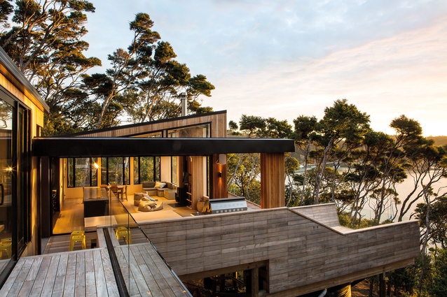
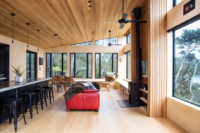
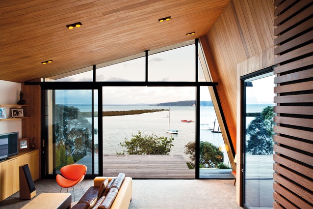
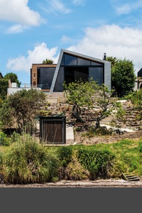
The orientation and design of this family holiday retreat on Kawau Island makes a hero of the view that stretches from the headland across the Bon Accord Harbour and out to sea.
The owner of Lot 101 (2014) is one of a twin who’d been holidaying on the island since childhood and ended up buying a headland and splitting it into sections. “We had already built a box house for one twin right in behind this plot,” explains Tim. “And the other twin and his family wanted a design that would accommodate fishing, diving and watersports.”
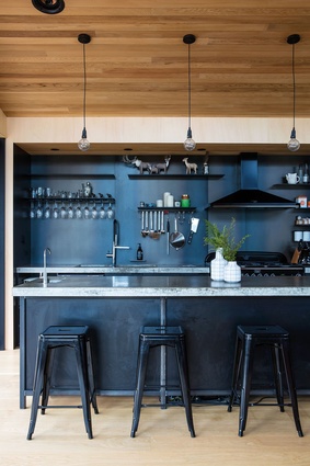
On a steep ma-nuka-clad site, the architects have created two blocks: one is a social hub, a pavilion that contains a modest kitchen, living and dining area; and the other, a block of similar size, incorporates as much sleeping facilities as possible. “The owner jokingly said he wants to ‘rack and stack people’, so a bunkroom caters for lots of people, alongside a family room and another bedroom, while the toilet room is separate from the shower room, the basins and the changing area – it’s like a camping ground.”
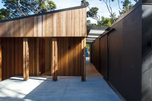
The design also includes an outdoor fire and terrace area, while a service spine links to a dive-gear room, storage room, laundry and a huge walk-in outdoor fridge for bait and fish.
Tardis
Tim describes the building as working “a bit like a tardis”, being small in built form but expansive including the outside spaces. “You have to walk outside to go everywhere – from the bedroom to the lounge room to the laundry. It’s intentionally created to free things up and to make it feel relaxed,” says Tim.
Easterbrook House
Titirangi, Auckland
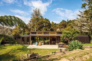
Easterbrook House (2014) is a compact Titirangi home that has been designed for an extended family that wanted to escape urban living in central Auckland. “Basically, they wanted a simpler life and to get out of the city and into the countryside,” explains Sam. “They found a pretty amazing site with a house that had been partially burnt which, uniquely, allowed them to remove the house and clear the land.
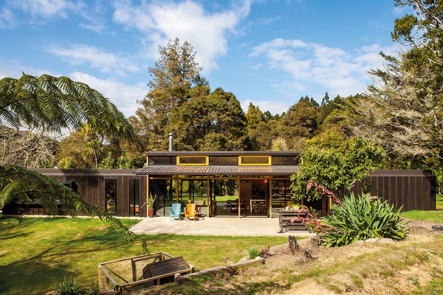
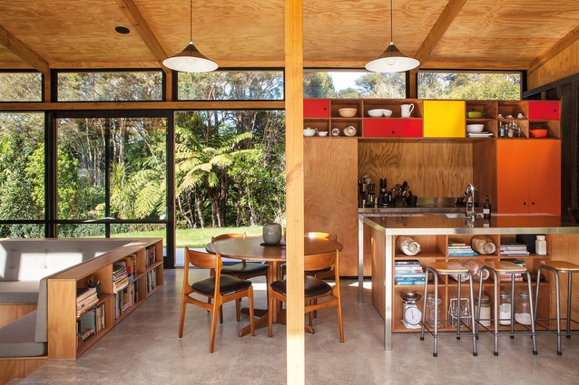
We decided to design the simplest form to fit the budget so it’s a very long 27m-long form but only 4m wide. It’s like a train with the master bedroom at one end, the caboose is the children’s bedroom and, in the middle, is the kitchen, living and dining space. The most cost-effective forms need to be squares and rectangles, so that’s why we came up with that idea.”
To the side of this block is a mini-house for the children’s grandparents. “Really the main brief was for an urban bach,” explains Sam. “They wanted to feel like they were living in a beach house with the feeling of relaxation and informality, so we’ve been playful in terms of the arrangement but created really good privacy between the buildings.”
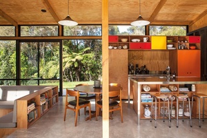
Composition
A floating roof is like a tarp within the trees. There are no walls around the kitchen, living and dining room besides the two bedroom walls that come into either end of that space – there’s just glass looking out onto the native bush.
Godden House
Mission Bay, Auckland
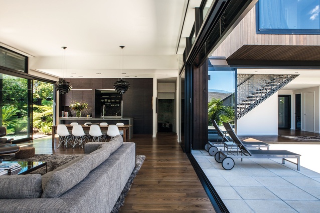
Located on top of a hill in Mission Bay, Dorrington Atcheson Architects has designed this family home to feel like a sanctuary. “It’s all about being its own private oasis,” states Sam.
Within a beautiful established garden on a large teardrop-shaped site, this courtyard house (completed in 2012) has a swimming pool as its central focus and an established garden as
its backdrop.
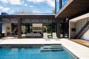
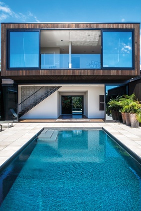
“The house is almost a ‘c’ shape in which you journey through a sequence of three outdoor courtyard spaces,” says Tim. “You come in via an entry garden to a pool courtyard beside the big glazed pavilion – which contains the main kitchen, dining and living space – and through to a really big green park-like backyard with sweeping lawns and existing mature trees.”
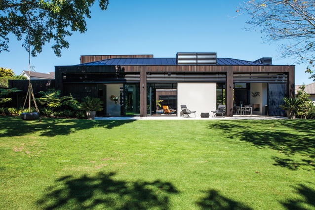
“Formally, the pavilion space is like a table with oversized columns or table legs,” explains Sam. “Inside, the impressive 4m-high stud is an impressive space to occupy, and it opens up on three sides to the various outdoor spaces, which includes a dining terrace, a living space with an outdoor fire and the pool and spa courtyard. You can moderate the light by occupying different areas of the house depending on what time of day it is.”
Park life
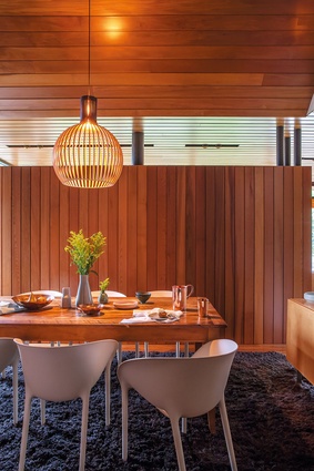
The house is designed to catch the sun within its park-like setting. The backyard features large mature trees that create interesting shadows across the lawn. In the house, the light is moderated with sliding screens.

Marine Parade House
Herne Bay, Auckland
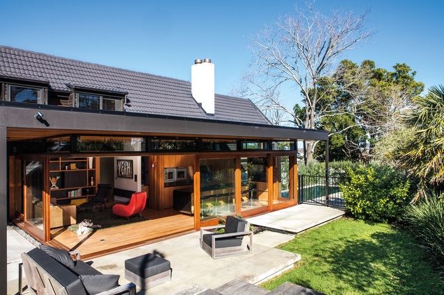
“This project is a family home for mum, dad and three kids,” explains Tim. “It was a two-stage alteration project, including modernising the interior of an existing home and building a new addition, which was completed in 2013.
“The original cedar-clad home was designed in the 1970s, but it was a complete labyrinth – dark and compartmentalised. It had good bones but the relationship between rooms didn’t fit with how we live our lives these days. It didn’t feel relaxed and you want to feel like you’re having a holiday at home when you’re at home and not living in a hard workspace.”

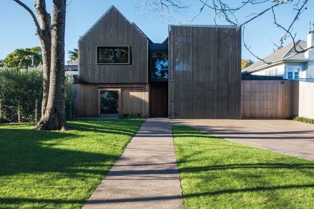
The house sits on a cool urban site, but it lacked privacy. “We wanted to shroud it off to the street so we came up with the idea of a big wrap around the building, along with some vertical screens that engage with the wrap, allowing light in as well as the view of the picturesque front yard with its massive trees.”
The design process was a complex planning exercise of working out how much of the existing house to retain. “We wanted to bring it all up to date but to keep the soul of the original house. Renovating doesn’t necessarily make it cheaper to build but, environmentally, it’s better to keep what’s there; you’re essentially recycling the house.”
Floating
The architects essentially blew out the kitchen and living area into a pavilion form and inserted a flat roof onto it. Existing floating planes of concrete in the backyard were revamped with new landscaping, including a collection of paving stones and a swimming pool.
Winsomere House
Westmere, Auckland
Winsomere House (2012) was a complex renovation project on a waterfront site, within 10 minutes of Auckland’s CBD, with a substantial new addition.
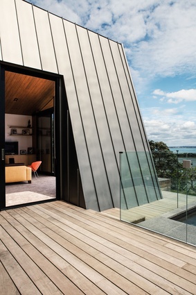
A new zinc-wrapped pavilion has stepped floors from the kitchen down to the lounge and then to the kid’s bedrooms in the original brick part of the house. “For environmental reasons, the client wanted to retain as much of the existing house on the site as possible,” explains Tim. “By no means was it a budget decision but, philosophically, it was better to do that and, as a result, you end up with this rich layering of materials.”
Privacy was a big issue on this urban site, with neighbours close on either side. “We screened the house on each side to channel the view out to the sea. The whole main bedroom block has a timber screen for privacy, and I understand from the clients that even when standing behind the kitchen bench, with the neighbours just two metres away on each side, you can’t see them so you feel like you could be anywhere. Your experience is of the sea and grass and green rather than the neighbour’s picket fence.”
Asymmetrical
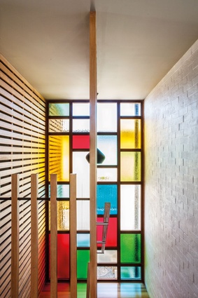
There were already traditional stained-glass windows in the original house so the architects created these big gridded contemporary windows, which are scaled-up versions of the older windows. Intentionally, there are very few clear panes in the colourful composition – to maintain privacy from the neighbours and to let plenty of light come through into the interior.
Our Palette
Materials and Concepts
Dorrington Atcheson Architects is known for its honest design approach, exposing structure and creating as much functionality as possible.

Exposed structure and cabinetry
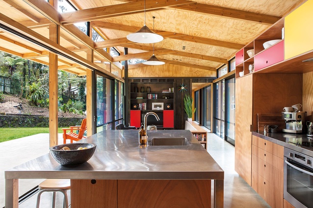
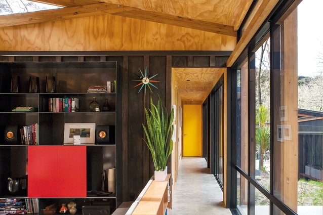
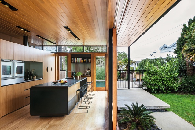
“Built-in components are just as important as the cladding or the roof,” says Sam. “They let you be as efficient as possible… We also like to expose the structure. There’s something honest and comforting about being able to see the structure, where nothing is hidden.”
Material transition
There is an art to effectively blurring the line between the external and internal materials through the glazing line. According to Tim, “We like to ensure the glazing is not the ‘full stop’ between the inside and outside.”
Screening
The architects have used screening in a variety of different ways in these houses: externally, to provide privacy; internally, to define a space without having to insert a wall into the plan; and, also, to moderate the level of light into particular areas.
Efficiency of space planning
“It is important to make spaces as complete as they need to be without just making them bigger. We like our designs to have enough flexibility so that the house works well into the future,” says Sam.

