Houses Revisited: A beachy bach
Gerald Parsonson’s holiday house at Paraparaumu, first published in 2007, is a triumph of substance over style.
On a site right on the beach at Paraparaumu, Gerald Parsonson has built a bach for his family that draws on a long tradition and yet offers a contemporary view of beachside living that is open and honest. This is not an inner-city apartment relocated to the seaside, but a down-to-earth place to escape.
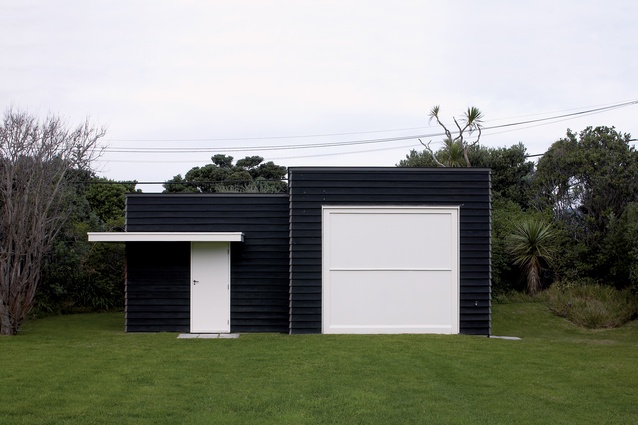
The site drops down slightly from the road with the house lying like an island in a large patch of grass. The approach is very informal and relaxed. Planting skirts the double section in a lazy, haphazard fashion. By the road are two small outbuildings, both of creosote with roofs pitched westward to the sea. One houses the boat and tractor; the other is a small bunkhouse with a garage for the blokart and other toys.
This is a site that has evolved over nearly twenty years of ownership. It is not pristine and lacks precision; as a result, it avoids the common pitfall of the modern beach house: the priority given to style over substance. This is clearly a place where people come to relax, not to display.
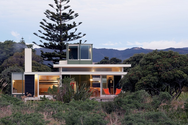
The house turns its back on the street with a low-slung roof forming a simple carport alongside a green box that rises from the grass. A timber-slatted boardwalk leads to the first of a series of boxes: the tower, which houses the entranceway, around which the house pivots. This, and the adjacent bedroom wing to the east, are on a concrete slab at the lowest point of the land. To the west, the building rises up to a timber floored box on piles, which houses the living areas.
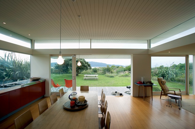
The additional height brings Kapiti Island into view, squeezed between the dunes and the ceiling. This viewing strategy has the effect of foreshortening the view, making Kapiti, the object, appear much closer than it is.
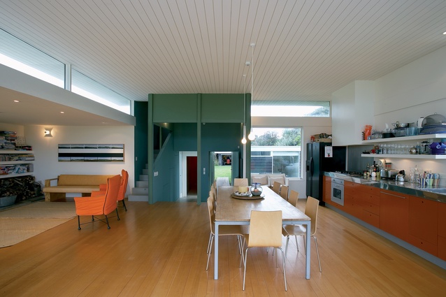
Victorian Ash floorboards lead up into the main room and out through big sliding doors to a deck with a pergola that filters the strong afternoon light. The lines of the boards and the pergola force the perspective and make the space unusually dynamic, by both compressing the space and extending it. The ceiling is white-painted, grooved plywood – a colour and a material that accentuates the linearity and lightens the room.
To the south, an orange kitchen lines the wall – a throwback to the colours of a bach that the architect, in his youth, stayed at in Awaroa. With the doors thrown wide, the inside doesn’t so much flow to the outside as merge completely. The ceiling of the living room is low at 2.3m, but this creates an appropriate intimacy to a room shaped mostly by a wall of fireplace shelves and window seats. Almost as much as the architecture, the puzzles and games stacked without ceremony establish this as the beachy bach it is. A high slot window delivers additional light into the room.
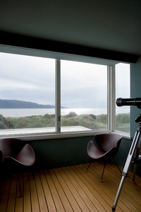
The entrance tower which intrudes slightly into the living room brings with it exterior materials – the outside comes in. Stairs lead up to a lookout with large windows that give the full view of the island with an expansive sky above. Here there is release in the view where downstairs it was carefully controlled. The floor is slatted timber open to below – an internal deck that continues the indoor/outdoor ambiguity. This room is smaller than a bedroom, yet, in its connection to the view, it engages with the epic.

The bedroom box to the rear is of a different language, and appears as if it could have been a later addition. This subtly suggests the evolution of the house as a place that grows and adapts. From outside the roof form isn’t apparent, as a parapet rises high to obscure it. Clad in fibre-cement sheet with joints expressed with vertical boards, the form refers directly to old fibrolite baches. Compared to its light living room partner, this is a solid box. It draws light in and allows the occasional view out. Tall windows in the bedrooms rise higher than the ceiling plane which cheekily slopes up to accommodate the difference in height.
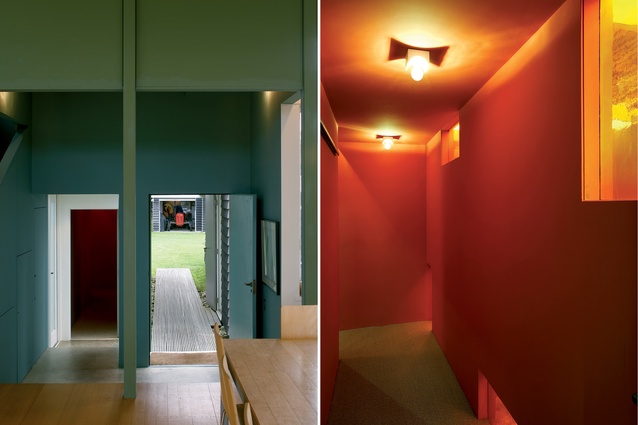
Access to the bedrooms is via a lurid dogleg corridor, a near-perfect exercise in misdirection. Both dark and light, obvious and unclear, the corridor forms a link of ambiguity from the entrance to the bedrooms. Small high windows of German hand-blown orange glass heat up the outside light, throwing a magical glow on the watermelon red walls. It is at first disorienting and then strangely comforting. This part of the house is warmer, fleshier, with a richness to suit. Carpet subdues the sound and the colours are more intense than the light white and cheery orange of the living room.
The bunkroom is utilitarian and yet intriguing. The room is slightly longer than a bed, allowing the bunks to have a bookcase at one end and a short wardrobe at the other. A small high window above the upper bunk admits fresh air. The main bedroom has large windows which look past the living room to its own angled view of Kapiti.

Continuing the enclosed feeling, the bathroom has three high windows, none of which directly reveal a view outside. A wide shower at the end of the room hosts a solid door to the exterior, allowing sandy-footed entry direct to the bathroom. The shower is clad in baby corrugated iron, with a timber-slatted floor sitting on a concrete base that can be hosed down. Throughout, colour has been used with both restraint and abandon, from the Tom Thumb green of the exterior to the orange kitchen and the watermelon corridor, yet none of it seems exaggerated or out of place.
Completed in 1998 and given an NZIA Supreme Award in 2002, this is a bach that endures – a house that reveals an understanding of coastal context and the local environment, and which exhibits an appropriate response. Three boxes assembled among the dunes, layers upon layers, opening out and closing in to suit – these are forms of contentment. It’s a long way from here to suburbia.
Click here to see more Houses Revisited. And sign up to our email newsletters to receive Houses Revisited straight to your inbox.

