Houses revisited: Arrowtown house
Subtle twists – a south-facing triangular site conjures a house of twists and turns. First published in 2013.
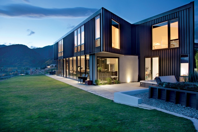
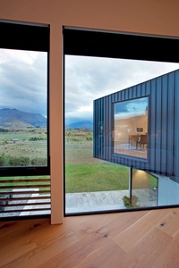
There’s nothing really straightforward about this house. Not only is the site triangular, and sloping, but the house itself subtly twists back on to itself while dropping down a level. The low profile contradicts its largesse, and the windows seem haphazardly placed. Yet in combination, harmony is created.
Not only this, but much of it was also designed and managed remotely. Gordon Gallagher from Fearon Hay Architects, that are located in Auckland, says it came down to a solid relationship with the owner, a local of Arrowtown who had worked with the architects before.
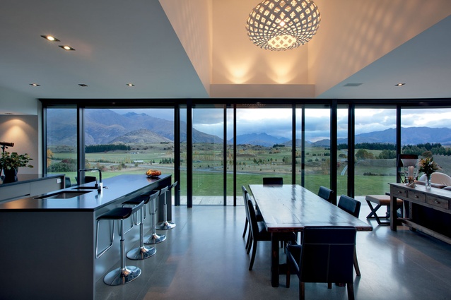
As is the usual brief for homes in the Wakatipu Basin, Tony the client, wanted to make the most of the view, however the house is located in town, smack bang in the suburbs. And although modern architectural houses are not unusual, in this small, cliquey affluent community near Queenstown an outstanding home alone won’t buy you friends. So, as well as make a statement and consolidate the view, the client wanted to fit in.
“It doesn’t impose itself on the site or the view and it also doesn’t feel like it’s sitting in the suburbs,” says Gallagher.
“This is predominantly because it unfolds as you go back from the entranceway, creating the illusion of a single level building.”
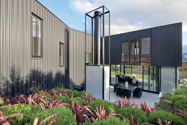
As the iron clad volume subtly twists and turns as it retreats, windows on the sides of the house turn toward the view, or back on the house, rather than the neighbours.
The winding shape also encloses a courtyard that is sheltered from prevailing winds. Cantilevered edges provide shade at the other end of the house.
The marriage of individualism and communalism is also evident in the long-run iron cladding, which according to Gallagher is one of the house’s greatest attributes.
“It references the historical rural buildings that used iron cladding, but in this format provides clean lines and reinforces the unfolding nature of the house.
“As well as being traditional, it is an industrial material and so it was important that the detailing was stripped back to create a more refined response, which I believe we have achieved.”
“It’s simplicity is its success,” says Gallagher.
The windows are also a feature of the façade. As well as responding to functional requirements of ventilation and light, their placement balances the proportions of the long volume.
In this sense the house settles well into the neighbourhood with just enough subtle details and the right proportions to personalise and distinguish it, pleasing both the client and the sensibilities of the neighbours.
Click here to see more Houses Revisited. And sign up to our email newsletters to receive Houses Revisited straight to your inbox.
Note: These are stories from our archives and, since the time of writing, some details may have changed including names, personnel of specific firms, registration status, etc.

