Houses revisited: Brick Lantern house
Brick Lantern is a humble renovation of a brick-and-tile house in Takapuna by Matter, now with a new addition that creates a useful internal courtyard. First published in 2016.
It’s the oldest conundrum in real estate: the location is spot on but the house is no longer fit for purpose. What to do: renovate or detonate? For the owners of this property on Auckland’s North Shore, the imminent arrival of their first child made the decision an easy one — renovate.
“The clients’ brief was quite loose and, other than keeping things as simple as possible while gaining as much space as the existing house would allow, they were open to most suggestions and were happy to consider going up or pushing out,” says architect Jonathan Smith.

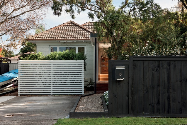
“The house is situated on a half-share site with the neighbouring property on the rear of the section. This leaves a perfectly adequate but rather small backyard for the clients to enjoy, so we realised that if we pushed to the north, we would take away that outdoor living. We had to also be aware of ensuring privacy from the street if we created an extension to the front of the house.”
Additional issues were identified during a meeting with council, as well, says Smith. “Along with the usual drainage, there was a flood plain on the site that wasn’t identified on the LIM. It was only when we went and had a chat to council that this came out of the woodwork, so we were lucky we discovered that. It meant that any addition had to be above the three-board level.”
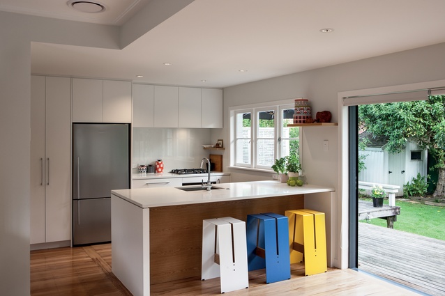
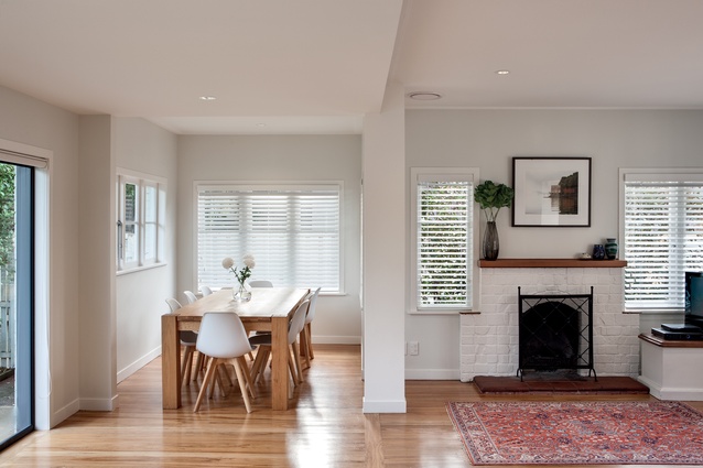
The original brick-and-tile house was very compartmentalised, says Smith, so the bulk of the renovation works was concentrated around opening up the house on the inside. Internal walls were removed while the addition of structural beams meant the resulting living areas are now much more open-plan.
“We were determined that if we were to affect the house in any way, we would do so with a very gentle touch. I think, in the end, we only affected two of the existing joinery units, which allowed us to make really minor adjustments to the brick cladding. When we did make those changes, we used the existing widths and then removed the bricks below the sill line and converted the windows into doors; so, now, you have an enhanced perception of space,” says Smith.

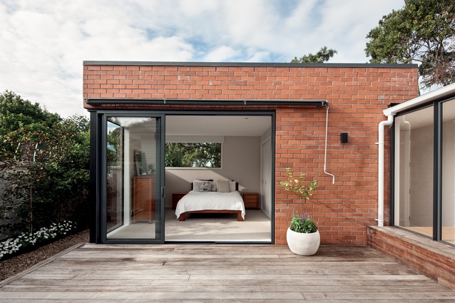
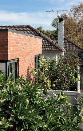
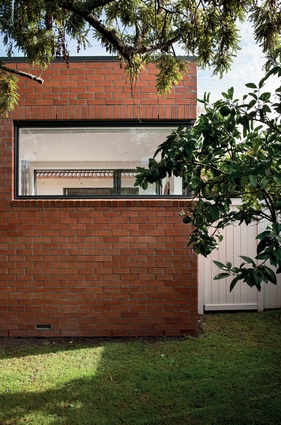
An addition, housing the main bedroom and an ensuite, was carefully inserted into the front yard, designed so that an existing tree could be retained. Clad in brick also, the addition references the existing house; but that is where any similarities end.
“I refer to the addition as the ‘brick lantern’ as it doesn’t have any of the eaves or the traditional hip structure that the roofline of the original house represents. I suppose you’d describe it as a more modern interpretation.”
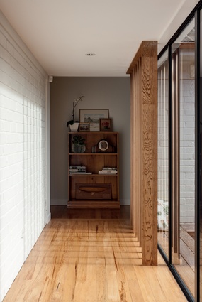
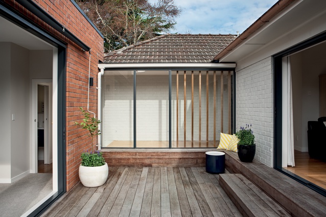
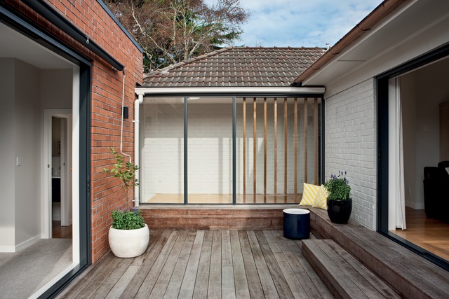
With the addition comes an internal courtyard space, which Smith feels is the most successful element of the renovation. “We borrowed that space from the site, so it came at very little cost. In return, however, it’s given them a vast amount of usable space, which, when covered, feels almost like another internal room.”
MATERIAL SELECTOR

Architect Jonathan Smith discusses his choice of brick cladding.
Brick cladding isn’t a common choice of material in contemporary architecture in New Zealand. Why did you choose it for this project?
The original house was clad in brick and we wanted to create a dialogue between the two.
Is it easy to install?
Yes, if you keep things standard. The detailing that we originally tried to achieve was not accepted by the council site inspector, so this solution was based on an alternative and open pattern to create permeability within such a heavy cladding.
Is it easy to colour-match new cladding with existing brickwork?
Yes, although the colours change over the years and from batch to batch, but we embraced this difference.
Click here to see more Houses Revisited. And sign up to our email newsletters to receive Houses Revisited straight to your inbox.
Note: These are stories from our archives and, since the time of writing, some details may have changed including names, personnel of specific firms, registration status, etc.

